Ageism Interactive Explainer Page
Illustration | Interaction Design | Visual Design
Elearn Australia wanted an animated explainer page as an intro to their eLearning course on Ageism. My point of contact was the developer who was working with them to create this page. She provided me with the project information and collaborated on the layout and assets, while I created the design and animation sequences.
Interactive Ageism Explainer Page Video
Elearn Australia Ageism Explainer Interactive Webpage
Project Overview
A developer working with Elearn Australia reached out to me to design an interactive webpage explaining Ageism discrimination. The page was to be used as a lead-in to the free eLearning course on recognizing and combating Ageism. I was provided a script and asset examples to work with by the team.
My Role:
Visual designer creating illustrations and design for an interactive webpage.
Responsibilities:
Creating illustrations and graphics, laying out design in Figma and handing off assets to the developer, and providing specs for animated elements.
Concept
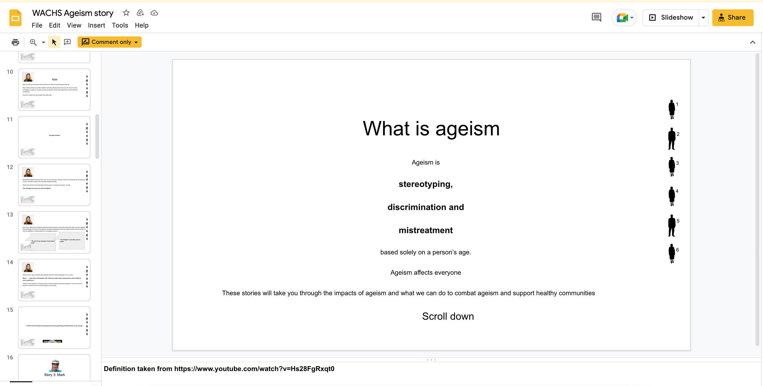
The team provided me with a script and a rough layout in the form of a Google doc. The concept was for an interactive “story” website. The user would scroll down the page and view gently animated text and images explaining three examples of Ageism discrimination, the effects of this discrimination, and ways to avoid being discriminatory. At the end of the page/story, the user could click through to the free eLearning course.
Google Doc with copy and layout direction.
Illustrations
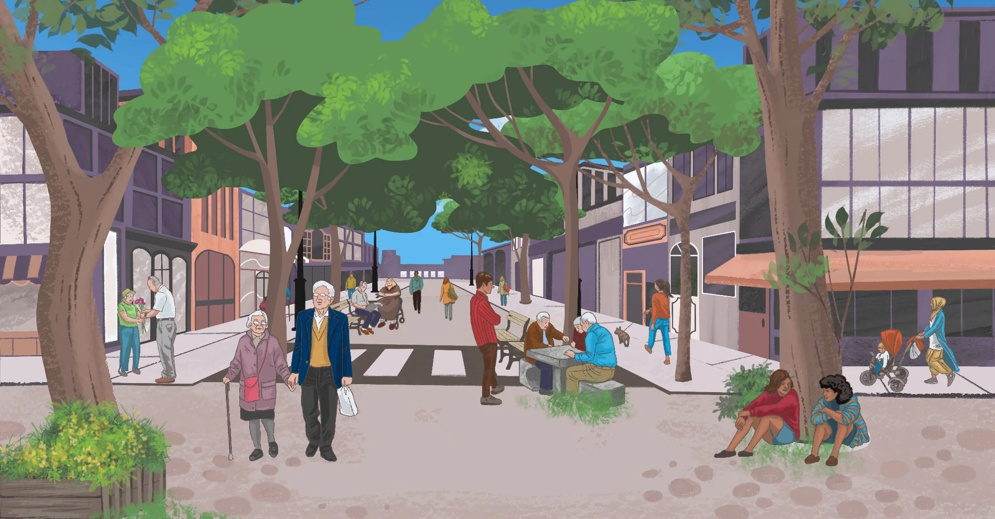
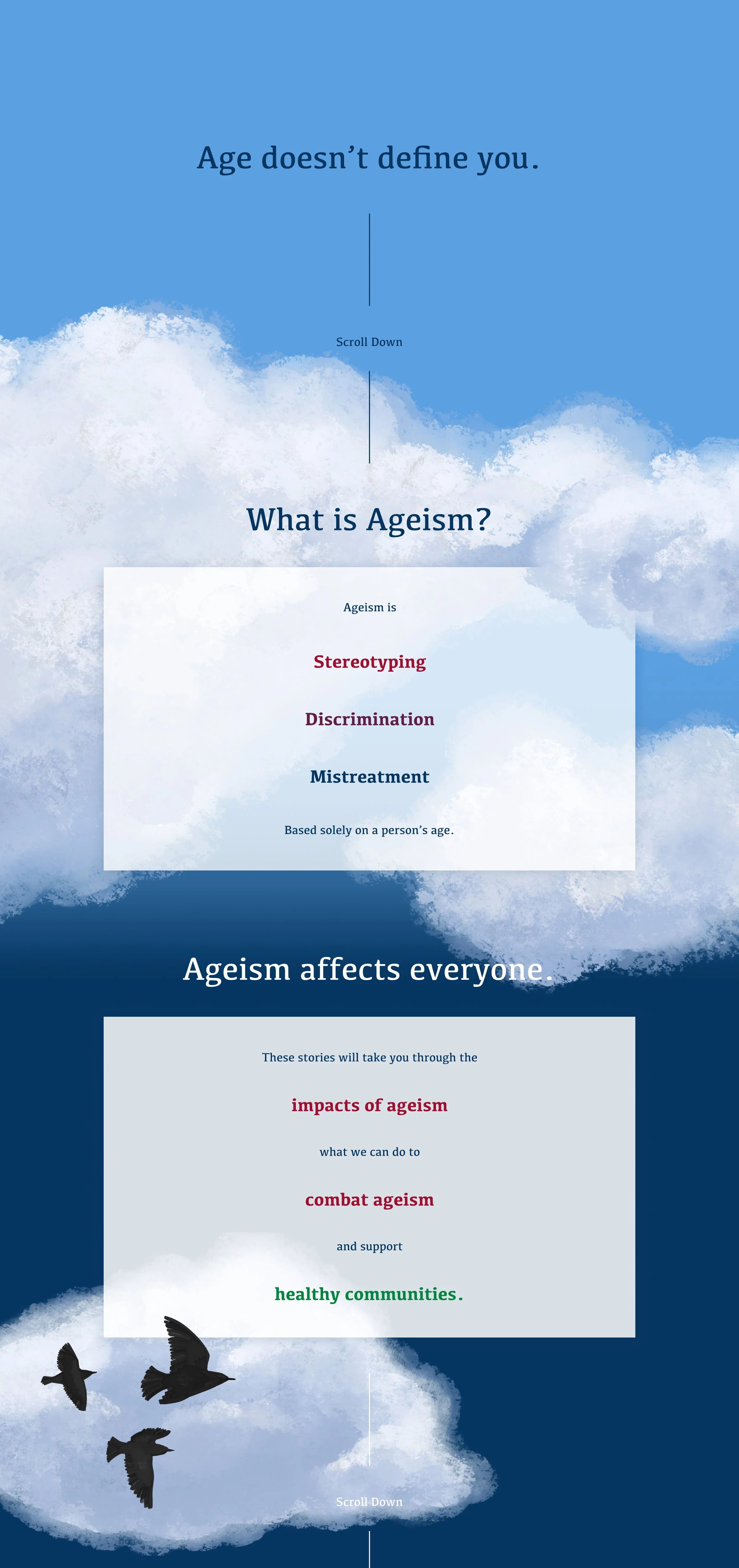
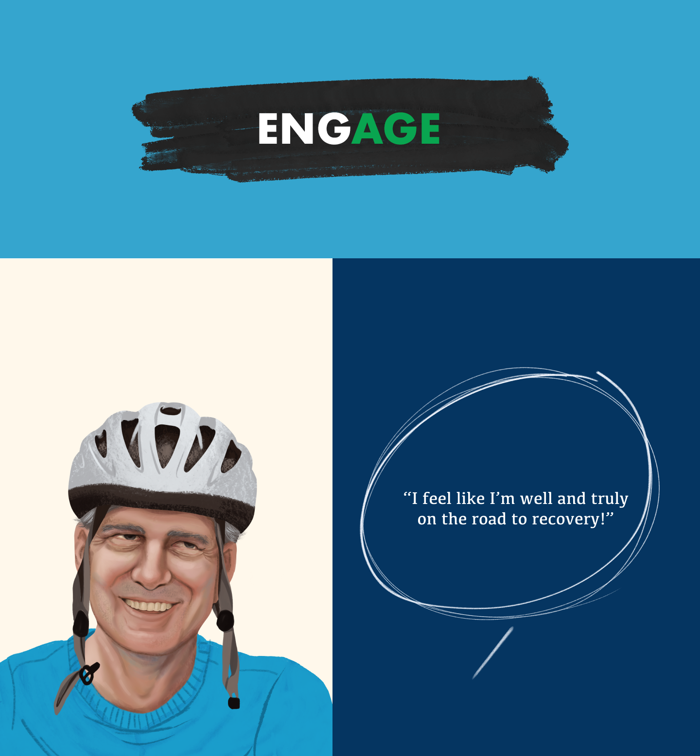
I first created a series of illustrated elements to enhance the visual design of the page. I created a cloudy background for the intro section, with some birds in flight that could be animated. The team provided me with low-res stock photo images of the “characters” who were to be used in the story and some clip-art backgrounds. To make these more visually appealing and useable at high-res, I used Procreate on my iPad to create illustrated versions of these images and background textures.
I chose to use a soothing color palette with shades of blues and creams throughout, with hand drawn and painterly elements.
They also provided some mockups for the main screen layouts & icons, as well as ideation for different palettes.
Animation Direction
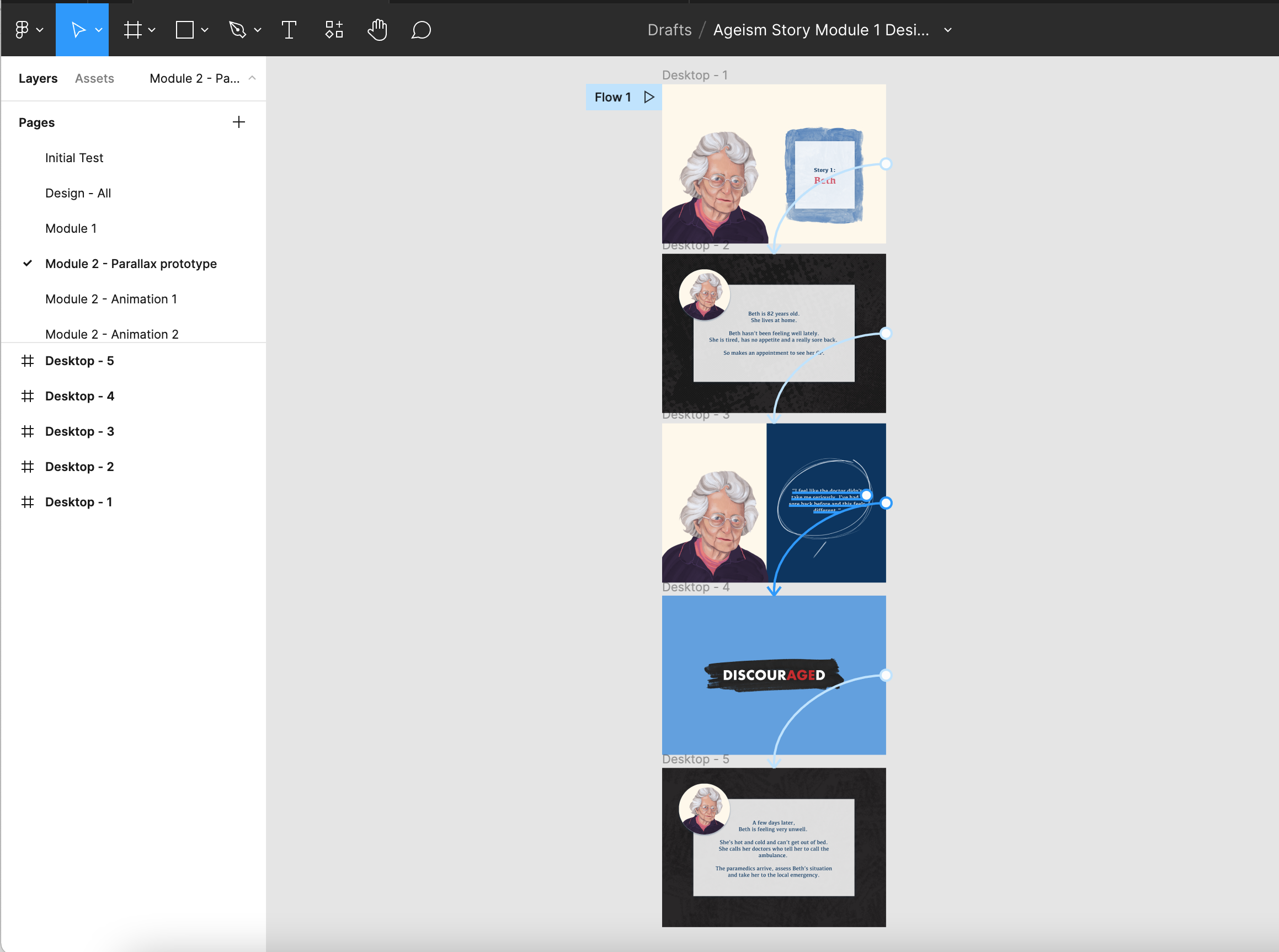
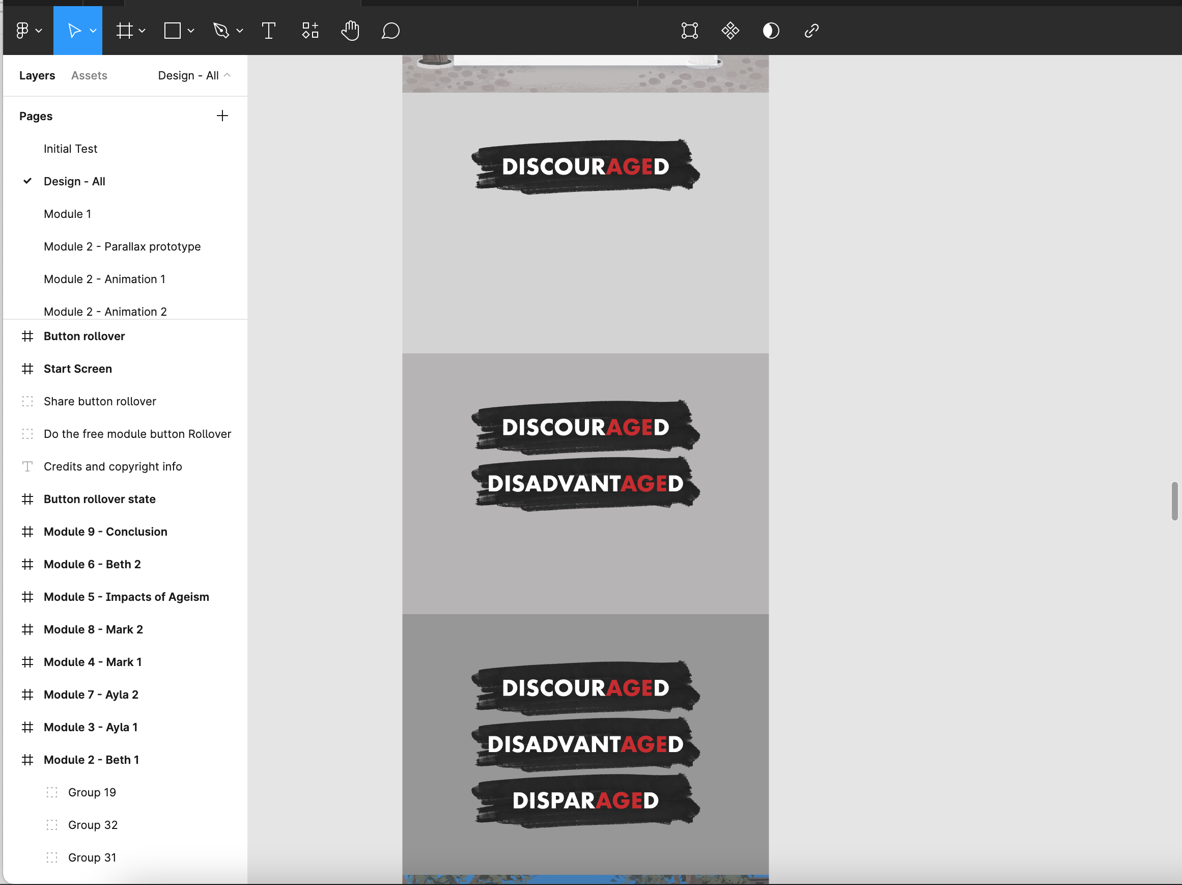
The idea was to present the ongoing storyline in a more engaging way by introducing new segments with animations. I worked closely with the developer as we went to create buildable animations that were smooth and not jarring to the reader. I demonstrated these in various ways - some required building simple prototypes and some with simple “frame by frame” layouts.
This simple prototype allowed the developer to replay the animation so she could pull the timing data and tweak it as needed.
This animation showed each subsequent word coming onscreen one after the other, so a simple layout to demonstrate was sufficent.
Result
The developer and I discussed the graphics and flow with the client as we went. After a few tweaks to copy, layout and pacing, the client was very happy. I handed off all files in organized folders to the developer and she did her magic!
The Interactive Ageism Explainer page is live here.
I recommend you scroll through and learn about Ageism discrimination!


