Website Design Epic! for Kids
Visual Design | Responsive Web Design | Art Direction | Graphic Design | UX Design
As part of my hybrid visual designer role at Epic! for Kids, I worked with my team to redesign several of our evergreen “Front Door” web pages - that is, the pages users see before they log into our product experience. The company had recently done a rebrand, and there was a need to rework these pages to reflect the new branding guidelines. Since this is a children’s product, the defining brand elements are “quirky” and “colorful.” My direct contributions included using UX design principals to make suggestions about layout, messaging and user flows, creating responsive designs, defining interactions, and creating graphic assets.
Company Overview
Epic! For Kids is the leading digital library for kids. I was a hybrid visual designer on the Brand Creative Team, which operated as a mini agency within the company. We served a variety of cross-department creative needs with an eye to brand consistency. I worked with my co-designers and a copywriter to create these designs.
The Challenge:
The company had recently complete a rebrand and needed to update some evergreen web pages to better reflect the new “quirky” and “colorful” branding. Additionally, this was a good opportunity to optimize and improve some of the UX patterns and flows.
The Goal:
Update existing webpages to align with research learnings & brand guidelines. Improve usability based on research and guidelines from other teams. Streamline design elements such as buttons, cards and font usage.
My Role:
Visual designer creating wireframes, prototypes, interactions, and high fidelity web designs based on research and business goals, while staying true to branding guidelines.
Responsibilities:
Identify pain points in the current layouts and improve flows and interactions. Create wireframes, prototypes, graphic elements, illustrations, and high fidelity web designs. Present to stakeholders, synthesize feedback into design best practices, and hand off files to dev.
Homepage Redesign
Research
My team was tasked with creating a re-design of our homepage. The company was in the process of optimizing sign ups for users discovering our product by landing on our webpage. The goal was to improve day 0 sign ups by alleviating pain points for our top 3 user personas, and optimize the design for mobile-first viewing.
We were provided with a creative brief and a variety of user research findings to inform our design:
Hypothesis: Updating the remainder of our homepage with clear and distinct sections that help prospects understand how Epic can serve their needs with a mobile first format will drive stronger account creation.
We want to help parents answer “is this the right experience for my child” and “what action can I take next?”
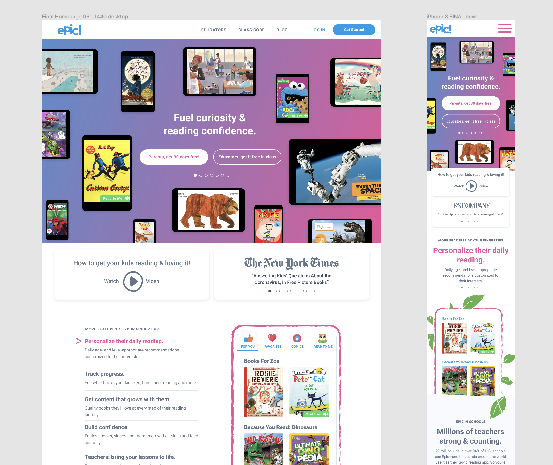
Previous Homepage Design
Redesign Strategy
We designed the homepage with a mobile first approach. As part of this approach, information is condensed and refined to show only the most relevant and impactful messages to users. The goal is to increase subscriptions by helping users learn everything they want to know about our product while reducing confusion and overwhelm.
From the brief: “According to homepage best practices, we only have less than a second to capture a visitor’s attention before they hit the back button and leave.”
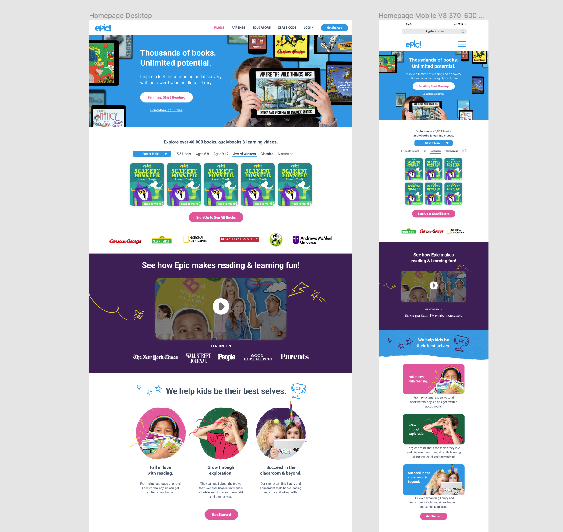
Following the creative brief, we redesigned each fold as a content block with a specific goal. The most important information is located at the top. Each section has it’s own CTA.
What is Epic - existing design, no changes.
Brand Promises - These cards speak to the specific needs of the three main personas we are designing for - Eager Bea, Tiger Tom, and Reluctant Rama. The card designs feature titles crafted to call out pain points for each persona, with a short text giving more details. Our lifestyle photos enhance the messaging in a fun, kid focused way. Next, we have a fun, organic image to break up the structured sections, with a message reinforcing how Epic helps kids enjoy reading.
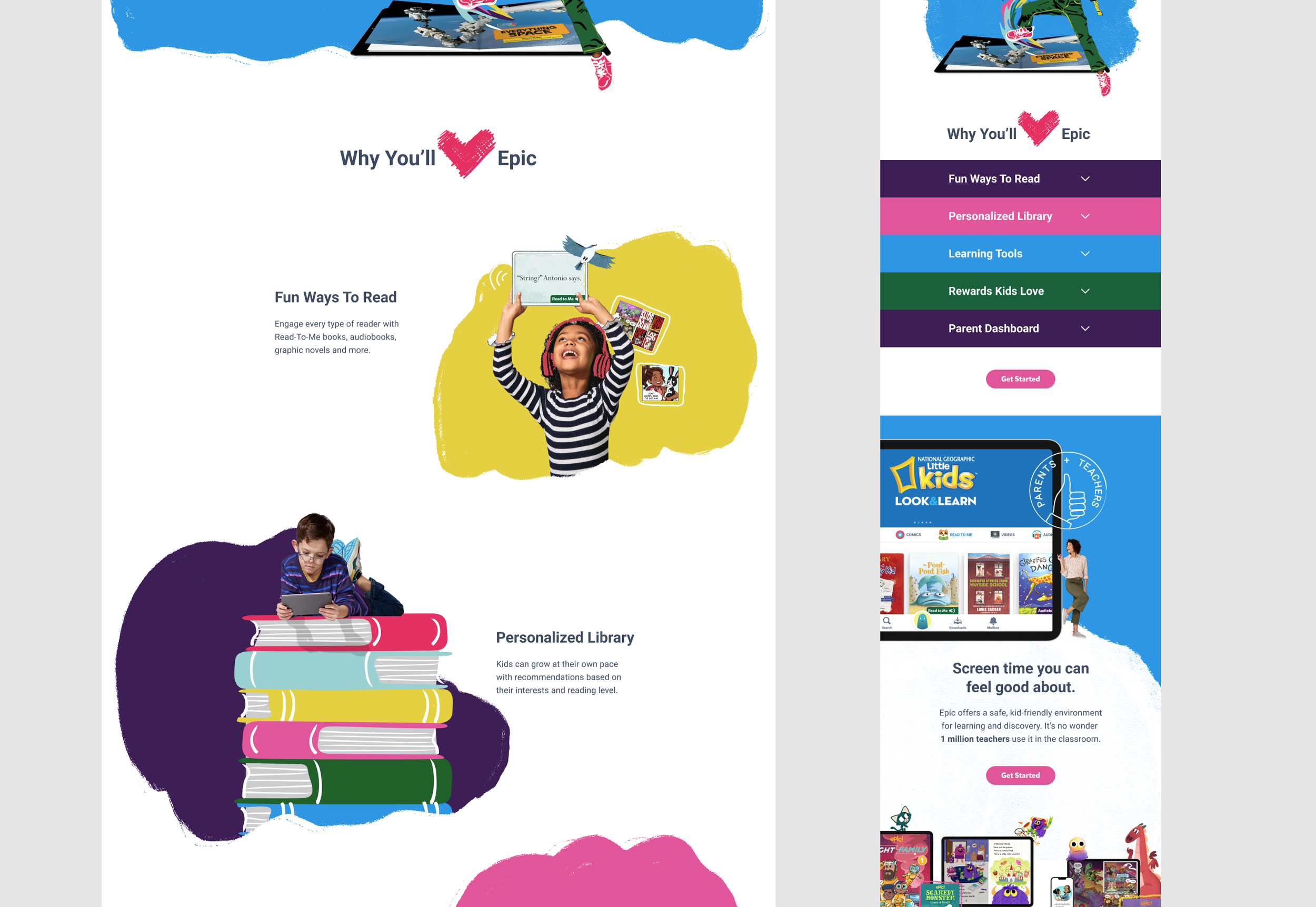
Features - This section speaks to each of our specific product features, and the benefits they offer. Because there were so many, we decided to design a collapsible menu that users can expand to see relevant content. Inside the dropdown, users can read more about each feature, while fun lifestyle photos reinforce our brand.
Healthy Screen Time / Originals - This first part of this section speaks to Epic’s excellent reputation with teachers. It reassures parents that Epic is good for kids. The second part gives specific attention to our only “unique” value proposition - our Originals books. The graphics chosen speak to the fact that Epic is a digital library that’s available on any device.
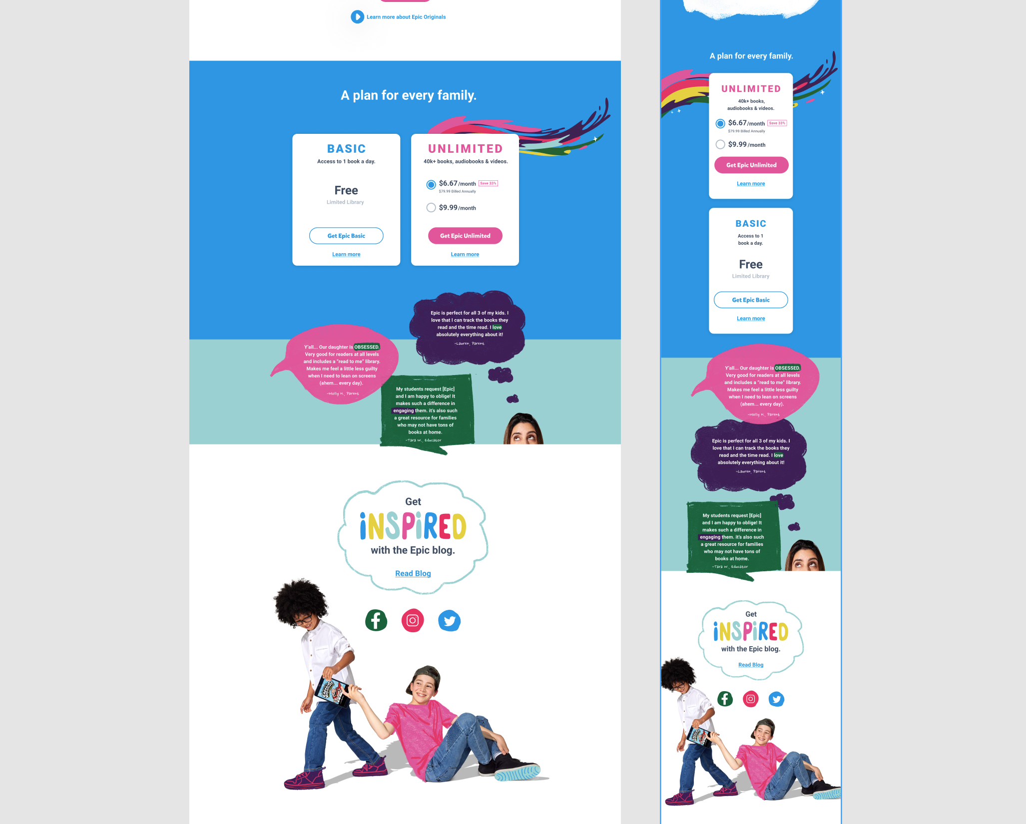
Plans section - We kept it simple here. We used 2 plan cards for simplicity, since the design is stacked. We pulled the existing card design, to keep everything consistent. A fun “swoosh” adds some branding.
Social Proof - We wanted to add some additional social proof after the plans, to reinforce that signing up is a great idea. We used a mix of parent and educator quotes. To emphasize positive emotional messaging, we used callouts on certain words in each quote.
Additional ways to connect - This 2 part section includes our email capture form, as well as a link to the Epic blog.
The Completed Redesign
The new design made use of Epic’s whimsical style of kid-focused doodles, illustrations and fun photography. Painterly shapes and textures, illustrated photo composites and childlike drawings are all part of the brand identity.
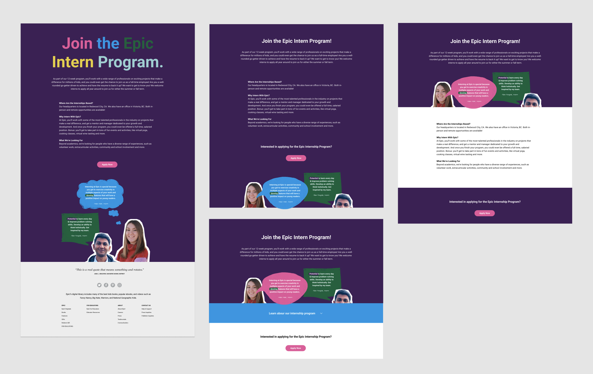
One of my direct contributions was to drive the mobile layout, as I had the most experience designing for mobile interfaces. Part of this was solving the “Why you’ll love Epic” section. For desktop and tablet sizes, this section featured an organic layout with fun animated illustrations accompanied by text. This layout took up a lot of space. A design that stacked the illustrations and text would take up even more space and be harder to read. As per the creative brief, the research pointed to reducing scrolling time for users.
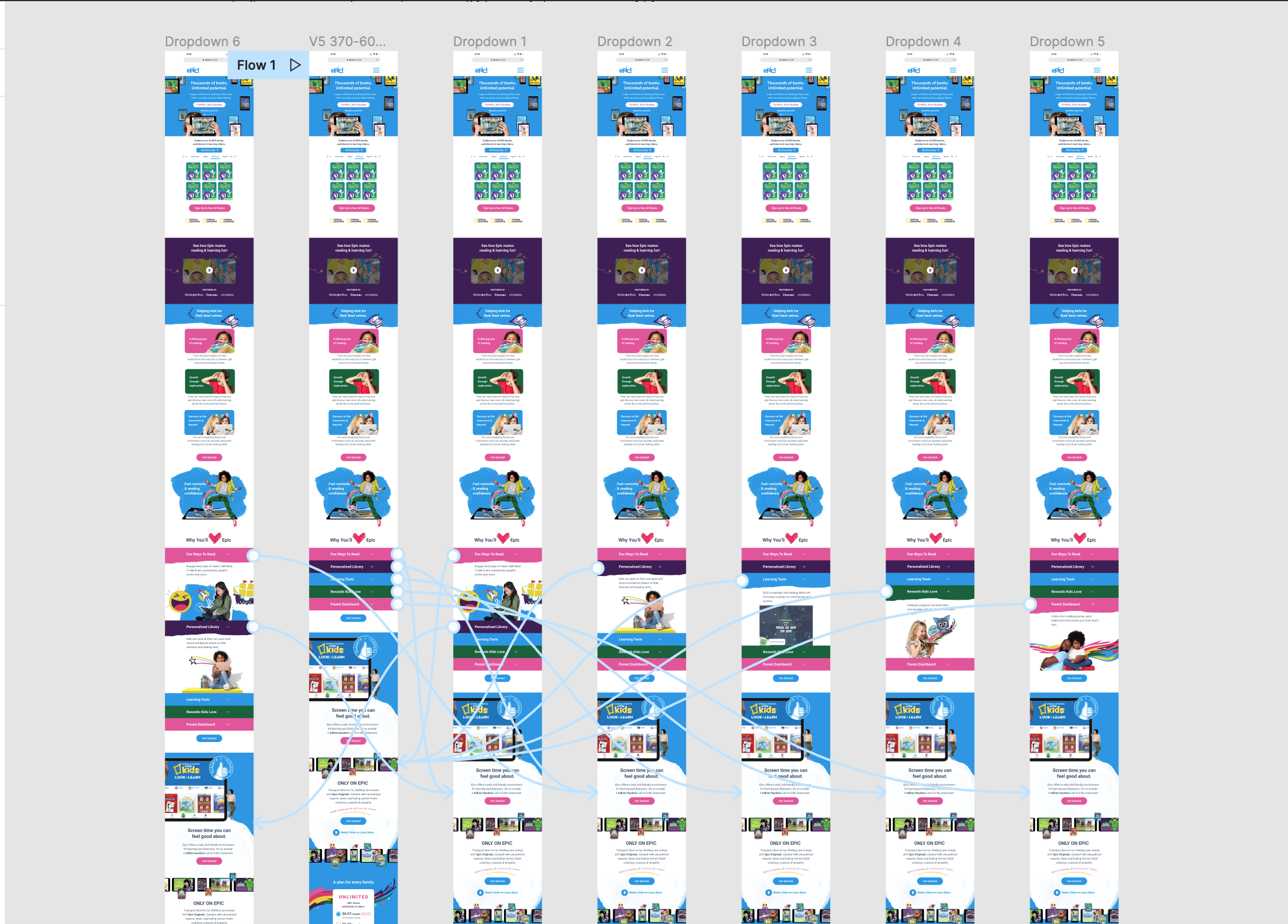
To solve this, I created a “dropdown” layout that saved a lot of space. Each color band displayed the main talking point, and users could tap the arrow to display more info and an image. We discussed a future update of the interaction in which the first dropdown automatically opened so the user understood the functionality without having to guess.
Dropdown Prototype
I created a prototype to share how the interaction would work in stakeholder meetings. It was also my role to hand off the Figma files to the development team after approval. This prototype was very useful to show the dev how the interaction worked. You can view the click-through video below, or click through it yourself here.
One of the takeaways that came from this project was a need to revisit and overhaul the buttons in our design system. The marketing team had been using different colors and sizes of buttons than the product team. In an effort to streamline the digital experience, I worked with a product designer to catalog all of the buttons styles that had been used across product and marketing, decide which ones we would use going forward, and update the system.
Parent’s Page Design
Our team was tasked with creating a new page for our website based on research with a cohort of parents. Some parents were ready to subscribe to Epic based on our homepage. However, there was a significant percentage that wanted more in-depth and specific information about our product offering.
We created a “Parent’s Page” to serve these users. As this page was had high conversion potential, it be linked directly in our top nav. I worked with our copywriter and my co-designers on this project.
Project Objective:
Dive deep into four core information pillars that parents have prioritized in order to sign up with Epic. Recommendations are based on competitive research and internal research (safety, parent dashboard/reporting, parental use cases, competitive advantage).
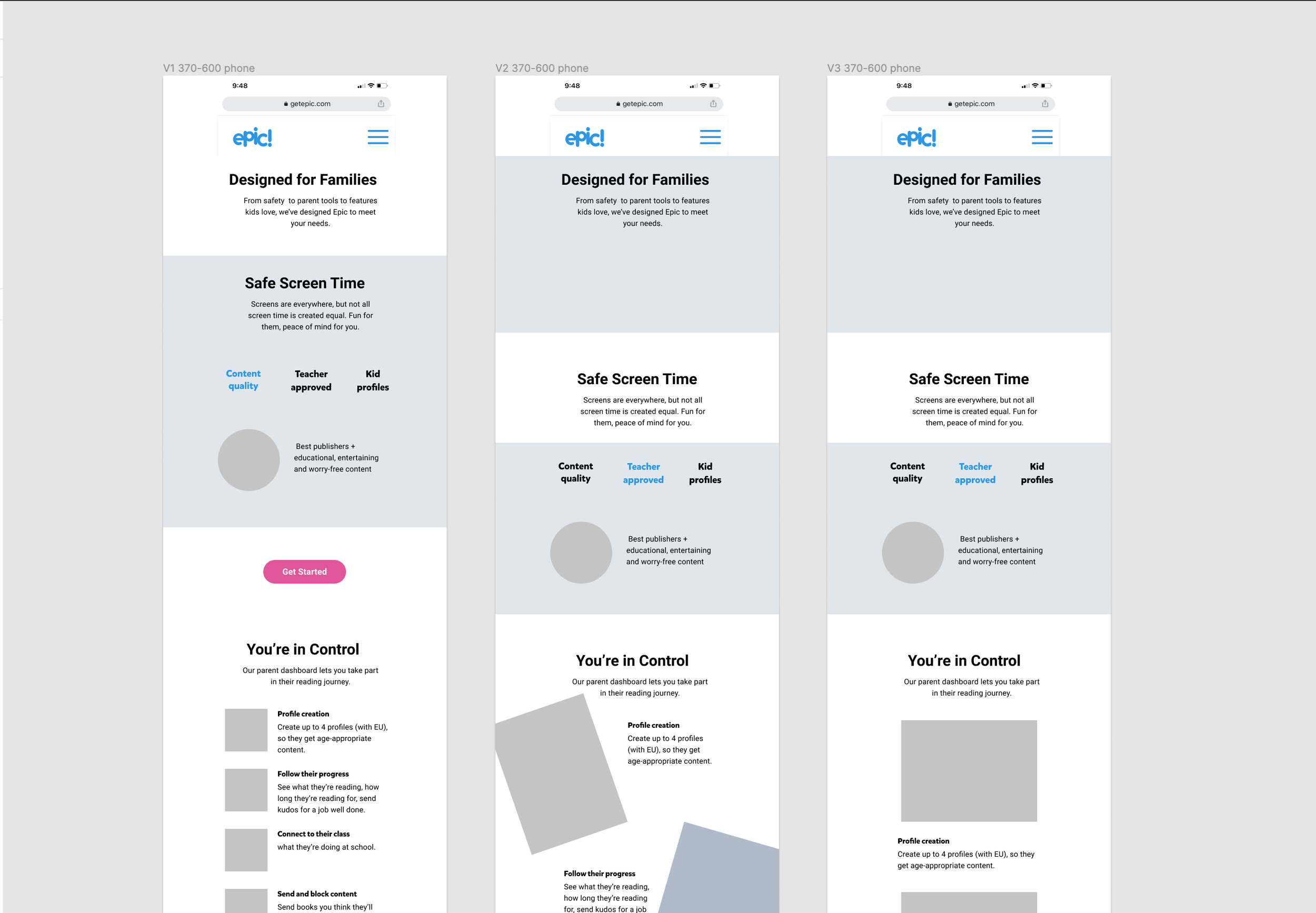
Wireframes
Our team was given a creative brief based on research with the overall strategy, pain points, and messaging hierarchy.
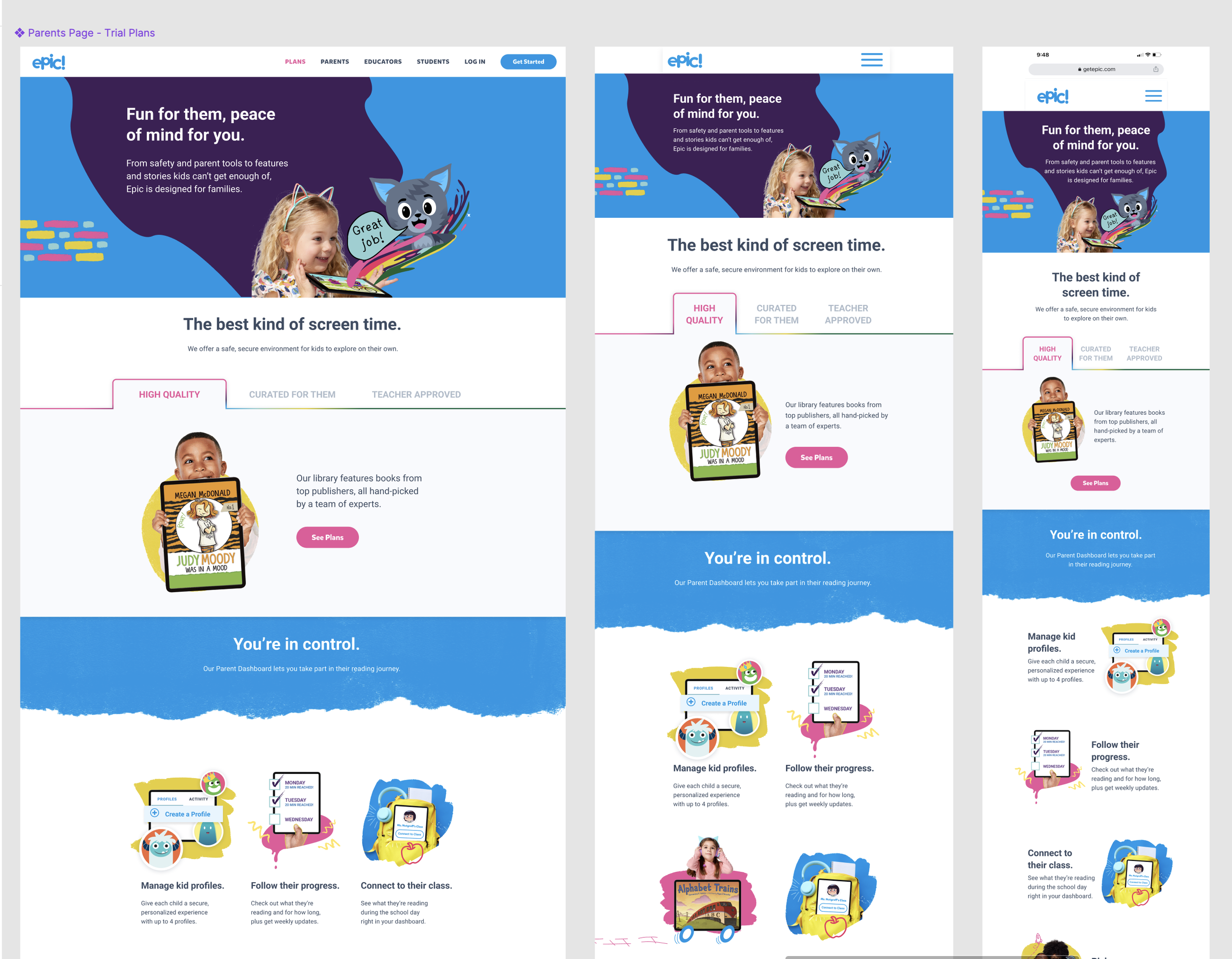
First, we created a variety of low-fidelity wireframes exploring different layouts and presented them to the project stakeholders. Although this page was geared towards parents and therefore more information heavy, we wanted to keep it visually engaging and playful.
Part of the problem to solve for was how much information was needed. We wanted parents to get the answers they were seeking, but not have to read through paragraphs of information. This is where our copywriter was critical. Myself and the other designers worked closely with her at every step to discuss how each section would be messaged, as this informed the layout design.
Explorations
When exploring layouts and graphics, my co-designer and I are highly collaborative and explore a wide variety of designs. Our “explorations” pages can look quite chaotic, but we find it helpful to have references to every iteration we have done.
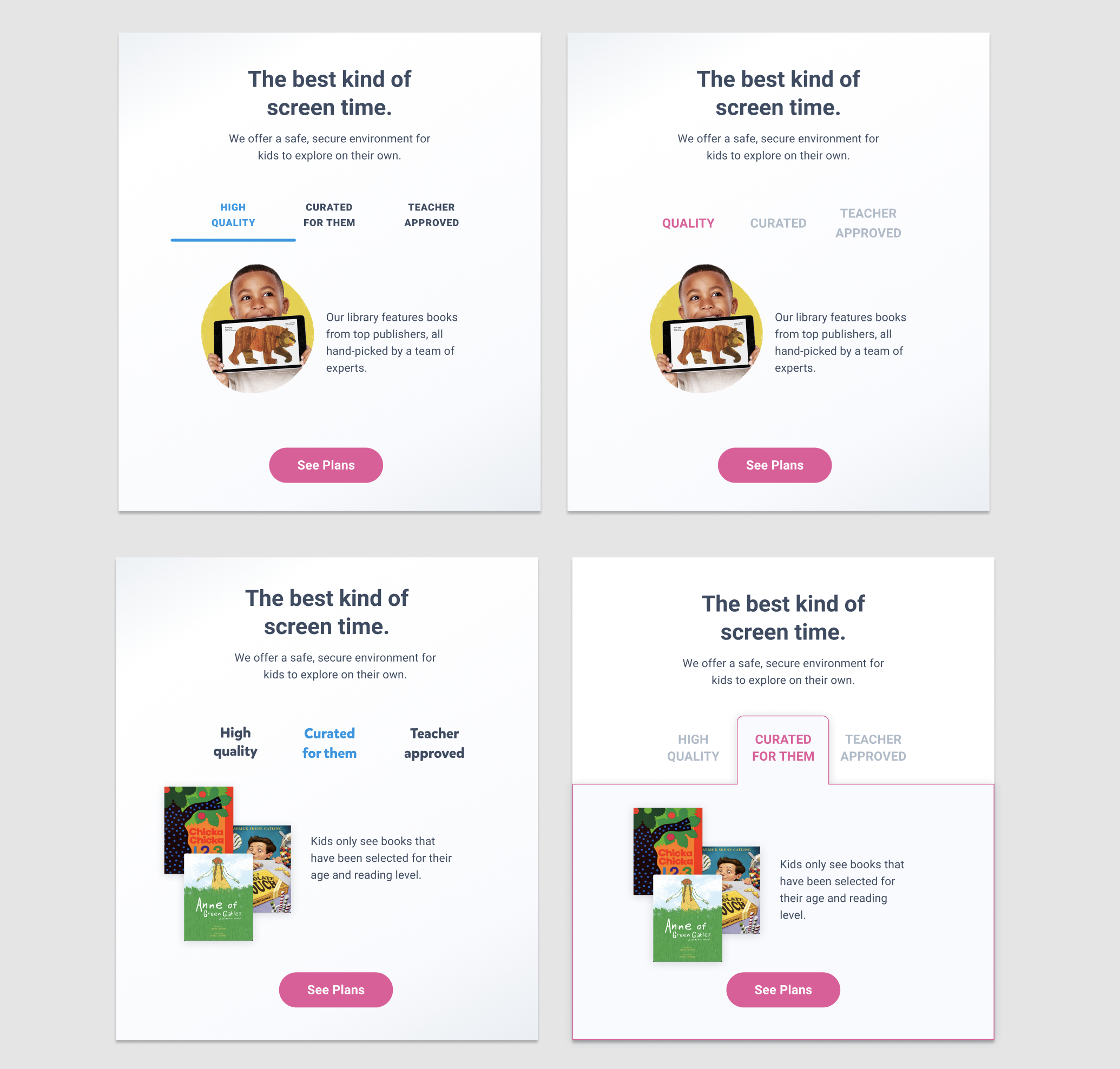
Tabbed Layout
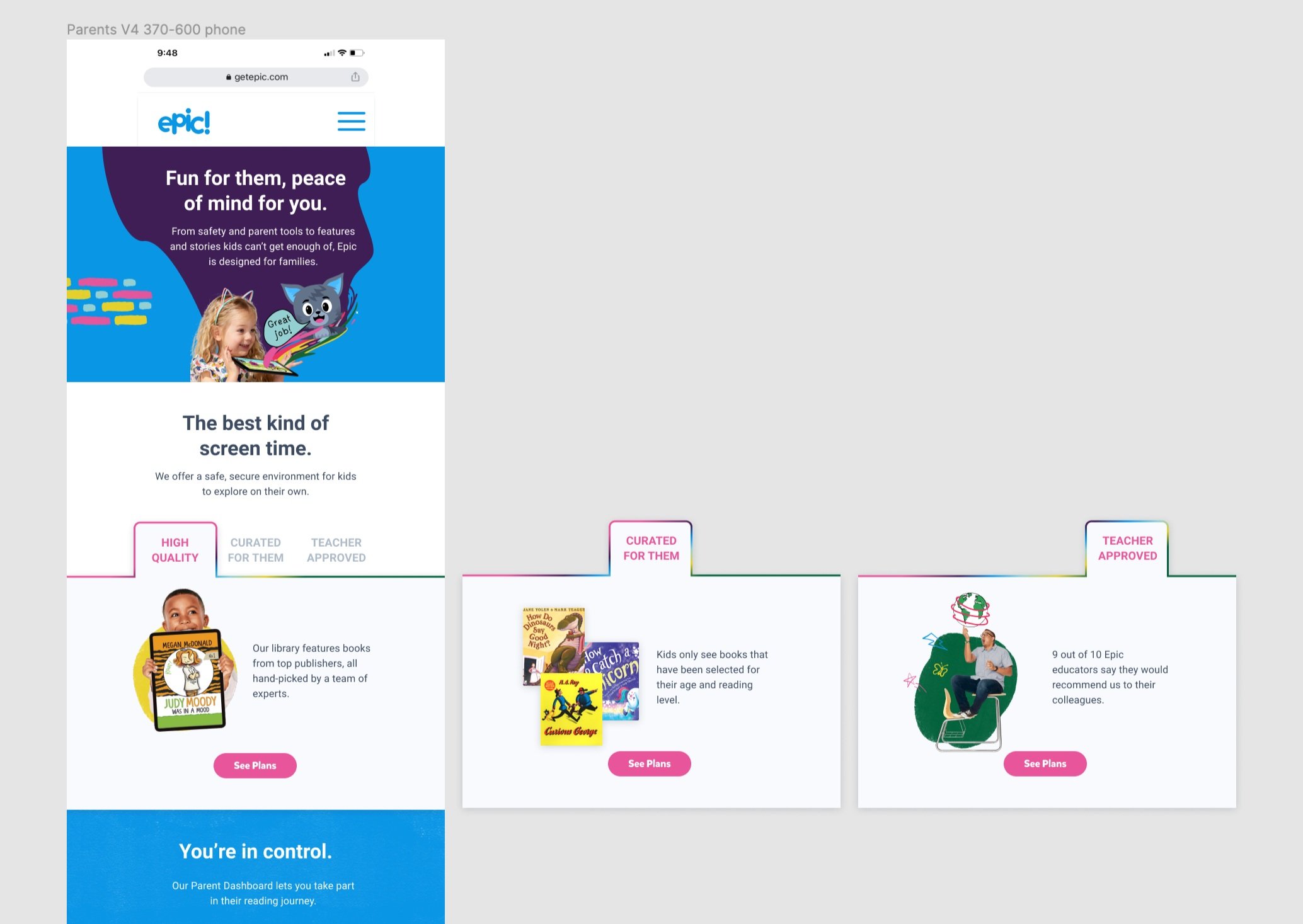
One of my direct contributions was to create this tabbed design. Although we worked with our talented copywriter to cut the information down to digestible sections, there was still a lot to read. Our stakeholders were concerned about users having to scroll too much. (I personally believe that users are used to scrolling and will do so without friction if the information is useful, but others had different opinions.) I was concerned that if we cut the information down any more, it wouldn’t be compelling to the parents who specifically wanted more detailed information about our product. So, I proposed this tabbed view where parents could click back and forth to read more about a specific callout. This proved to be a good suggestion and won stakeholder approval.
Prototyping
For the section that displayed statistics, I created a prototype to show how the numbers could “roll up” when users scrolled down. I felt that this would be a more interesting and impactful way to showcase numbers.
Final Design
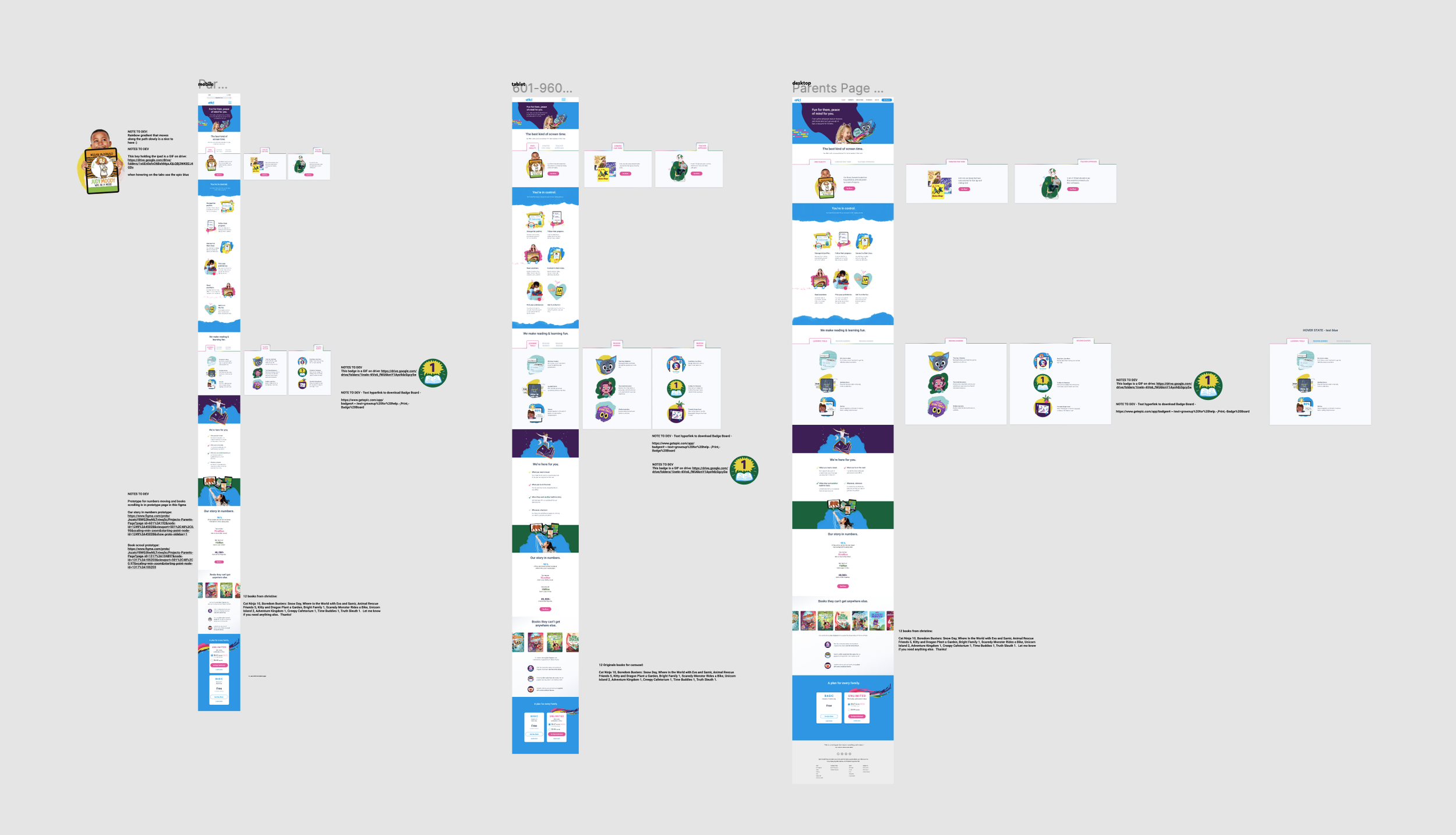
Our Figma files contain detailed notes for the dev team, as we have a bias towards communication and collaboration with dev. I always held a Friday handoff before the next sprint, where I could walk over the design files and answer any questions they might have about the design.
Careers Page Design
The HR team requested that my team redesign the (very bare-bones) Epic careers page. They were unused to creative design kickoffs, so I met with them along with my co-designer and copywriter to help them define the project goals. We collaboratively wrote a creative brief to define the goals, scope, and messaging for the careers page. We also gave them a list of data and images we would need to compete the project.
Wireframes
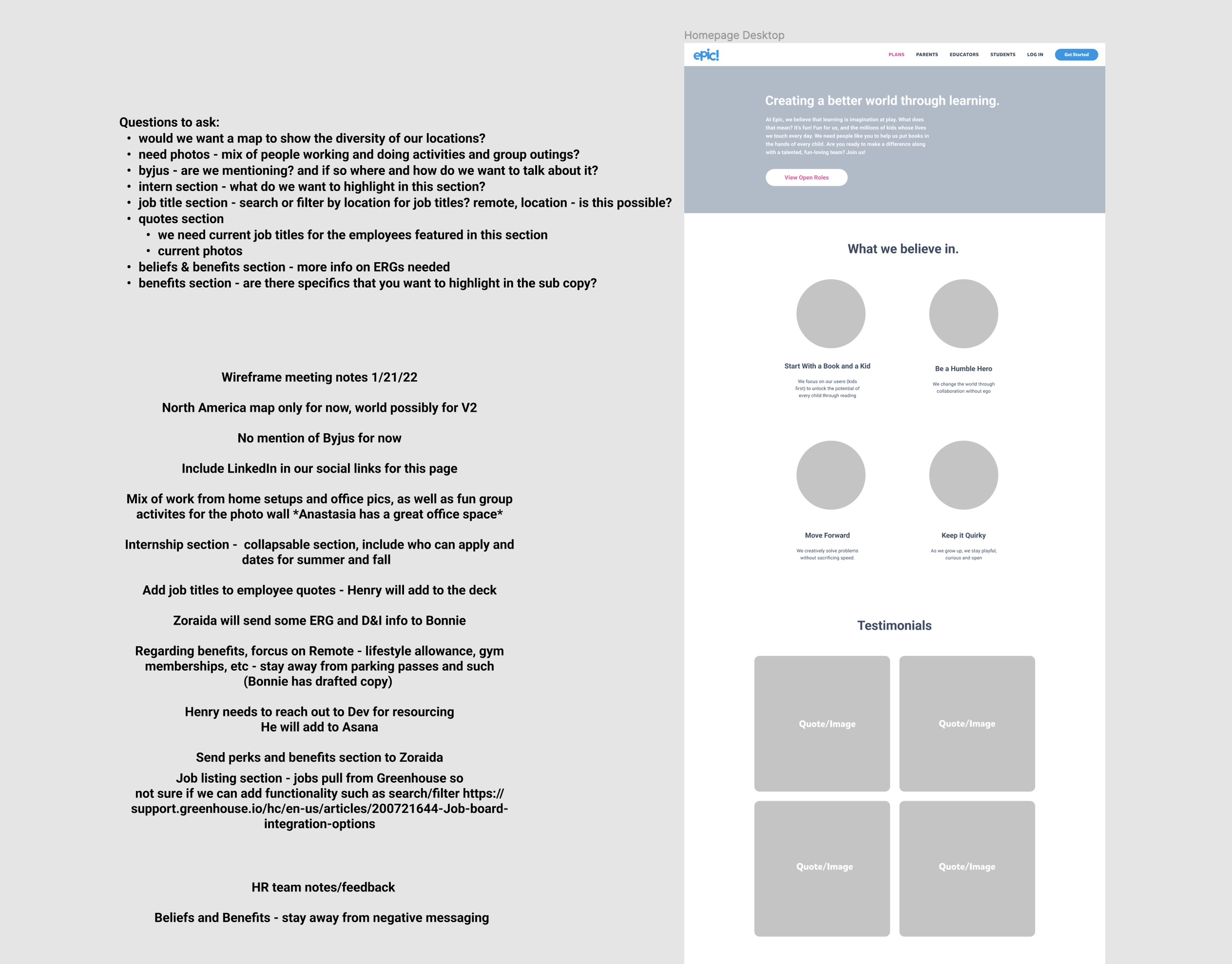
After this collaborative session, we were able to create a wireframe to bring back to them for review. We took detailed notes during the review session and got buy-in for our suggestions.
Design Explorations
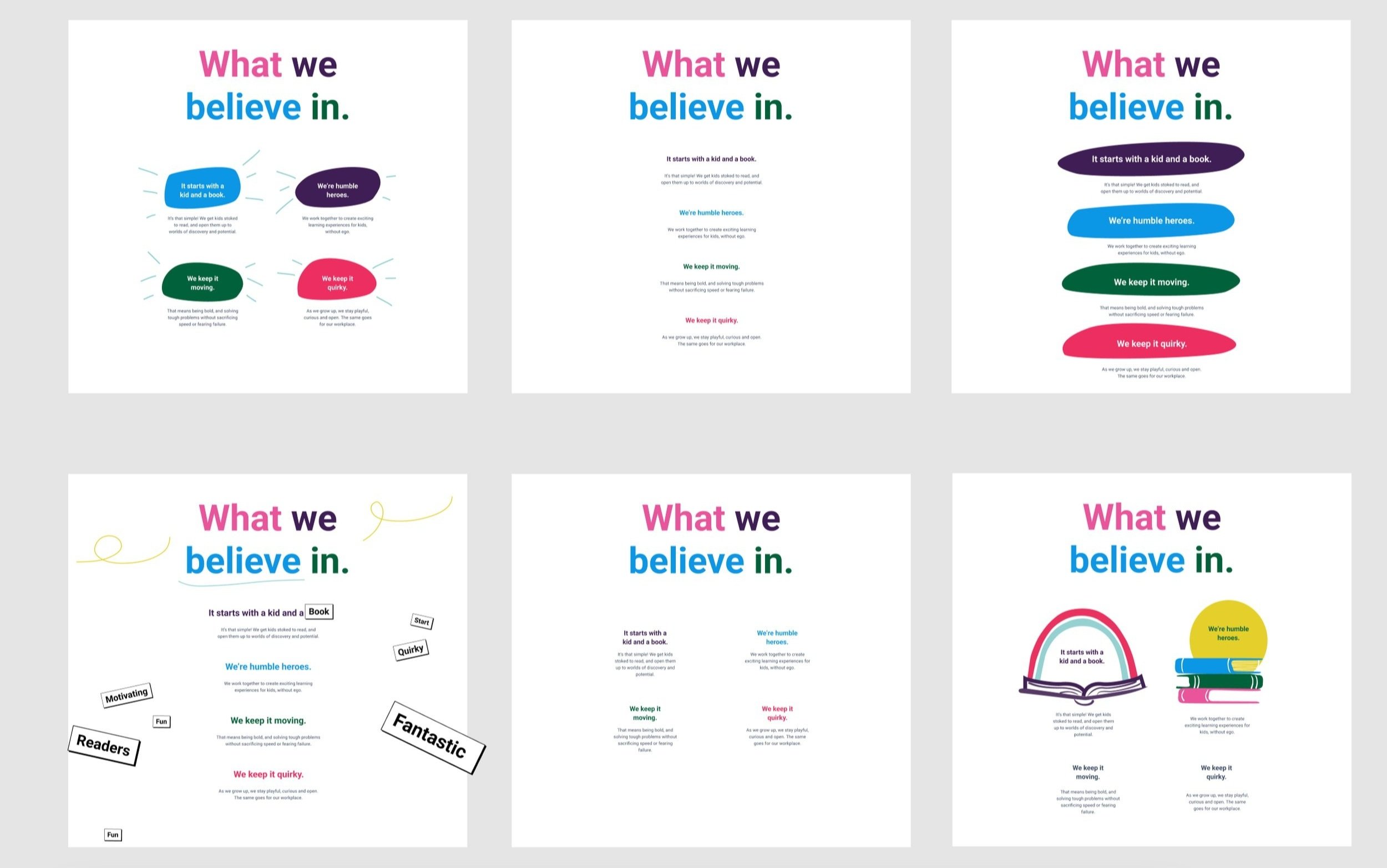
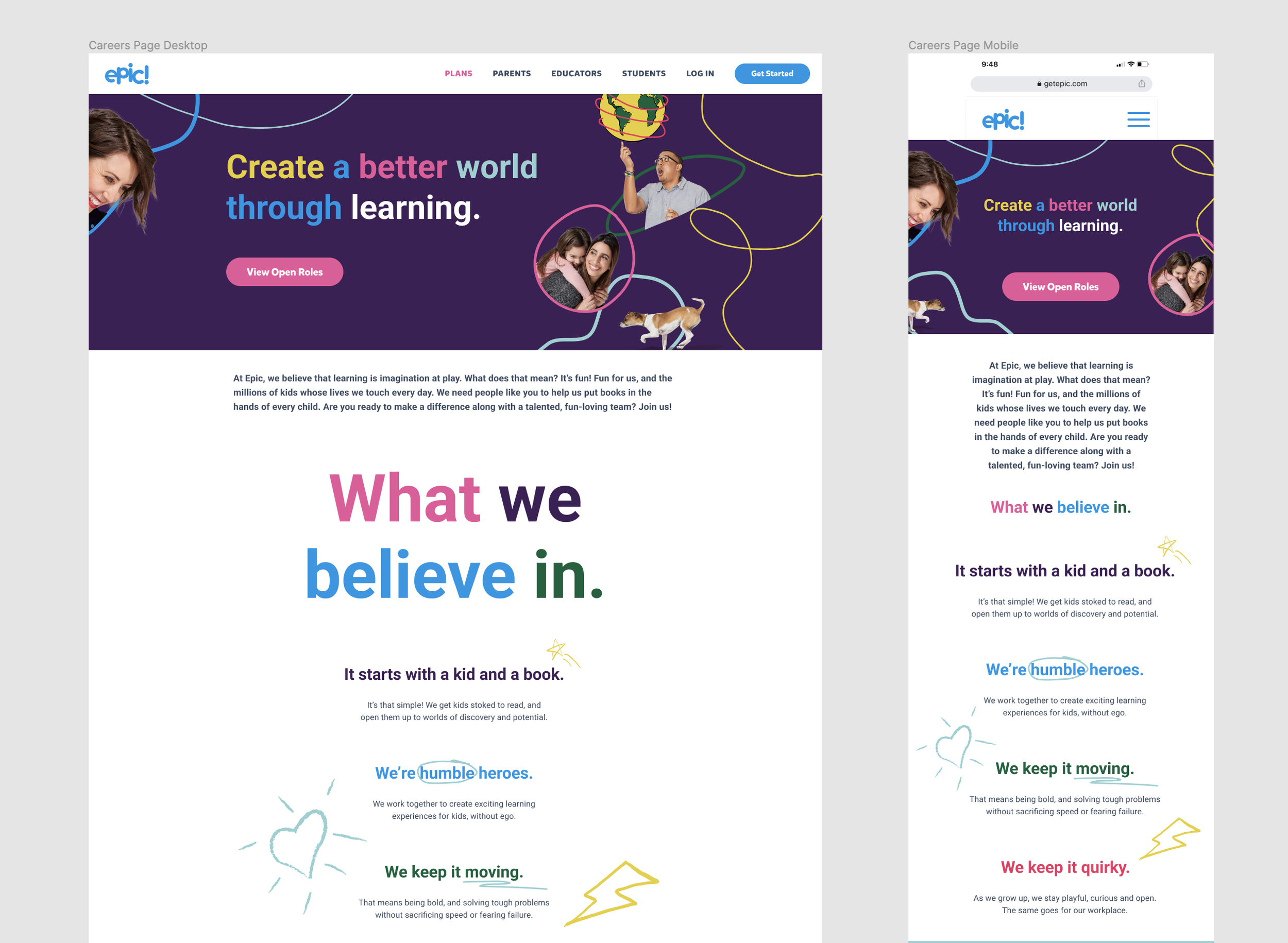
We were excited to create a design that showcased our quirky and vibrant branding to attract talent to Epic. We wanted to excite the HR team and any potential job seekers. We took advantage of our illustrations, doodle, and bold typography to create this web page. During this phase, we explored many different visual styles for every single section. This was a highly collaborative process, with my co-designer, the copywriter and myself all working together in a Figma file. We would all be on a Zoom chat, moving things around and adding copy to try different layouts. Very fun!
The Map
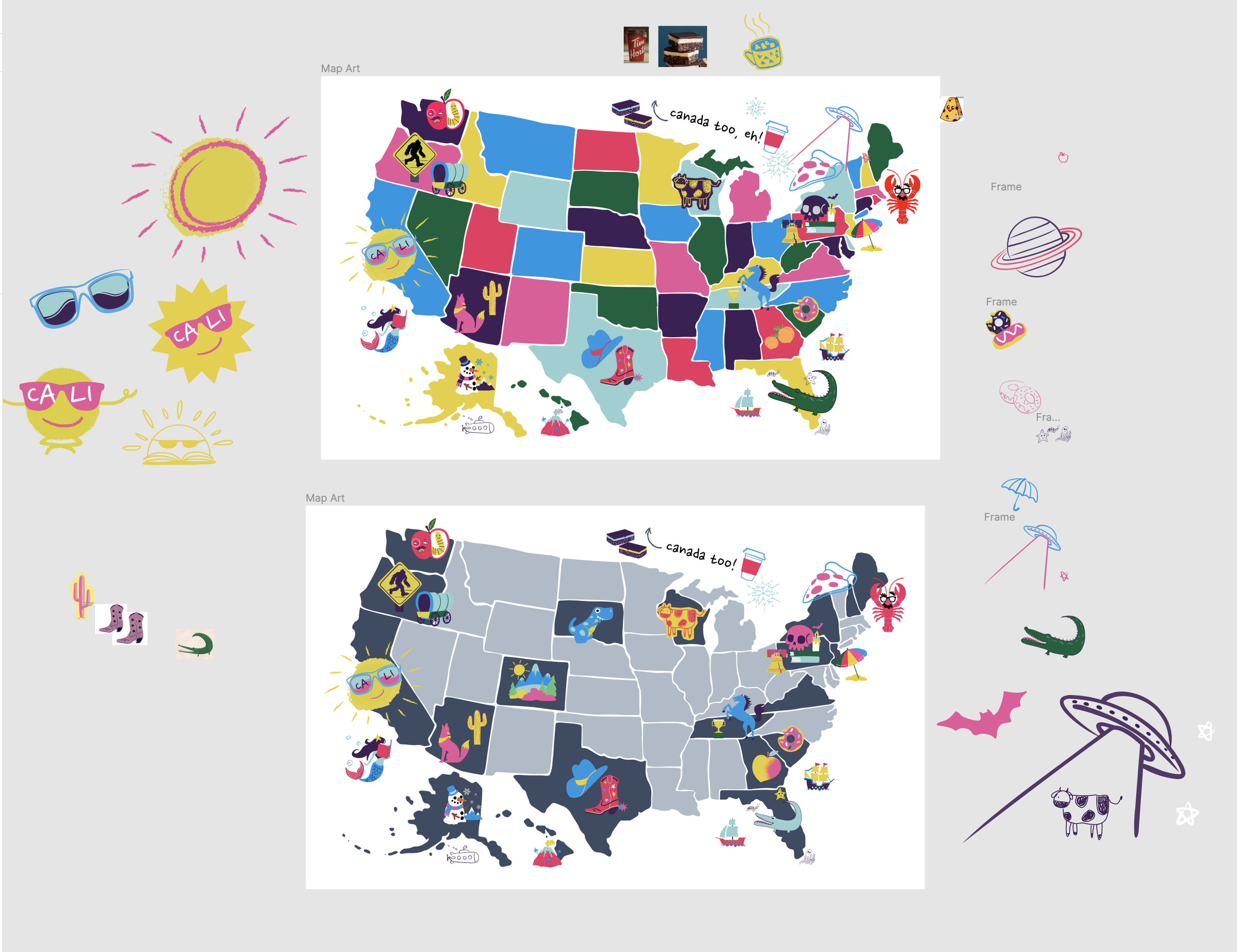
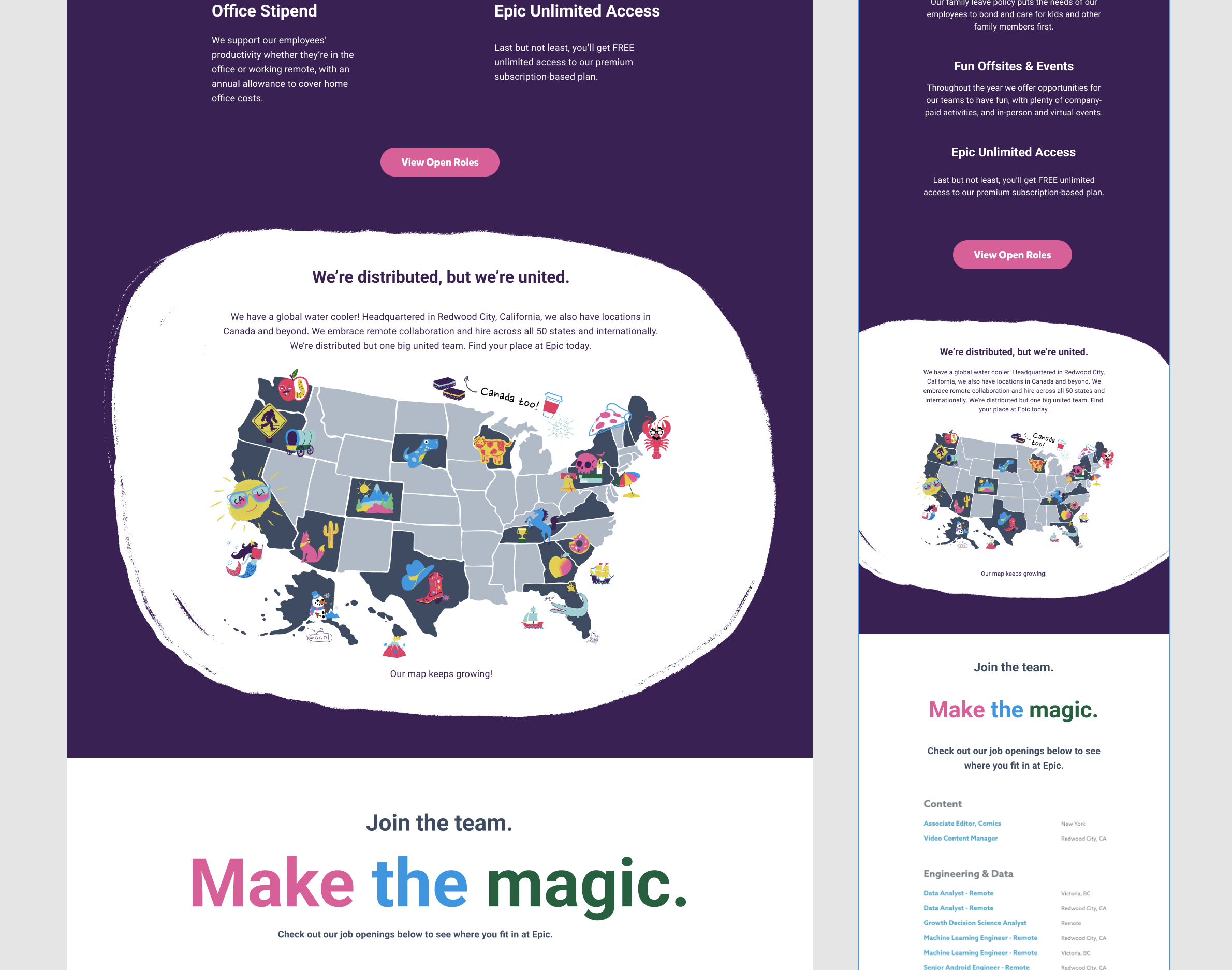
One of my direct contributions was the map idea. Part of Epic’s strength was the diverse and distributed team. I thought a map would be a fun and poignant way to show, rather than tell, our remote work opportunities. I created the base map and my two co-designers and I created all the doodles to show where our team members were located in a very fun collab session.
Prototyping
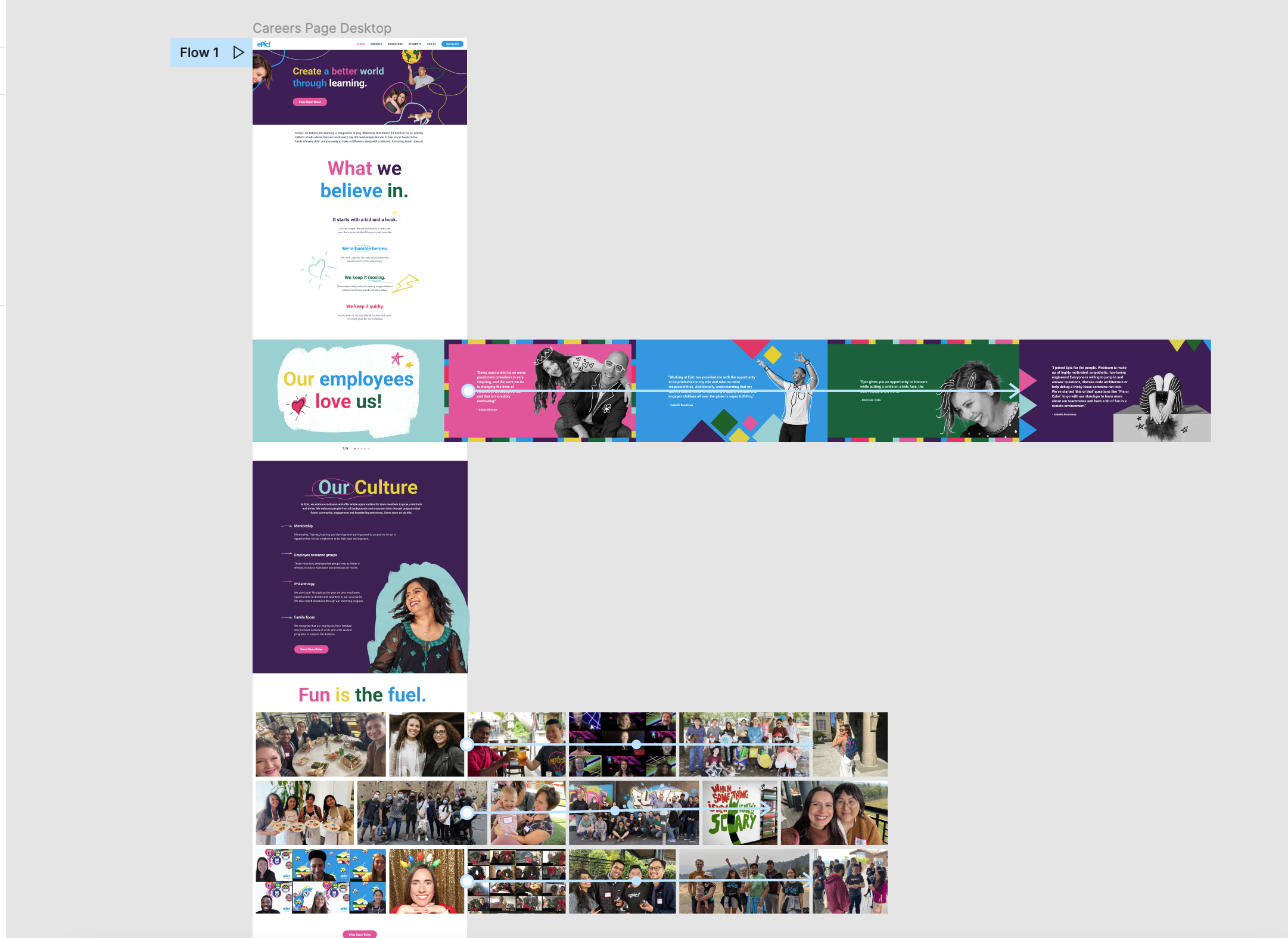
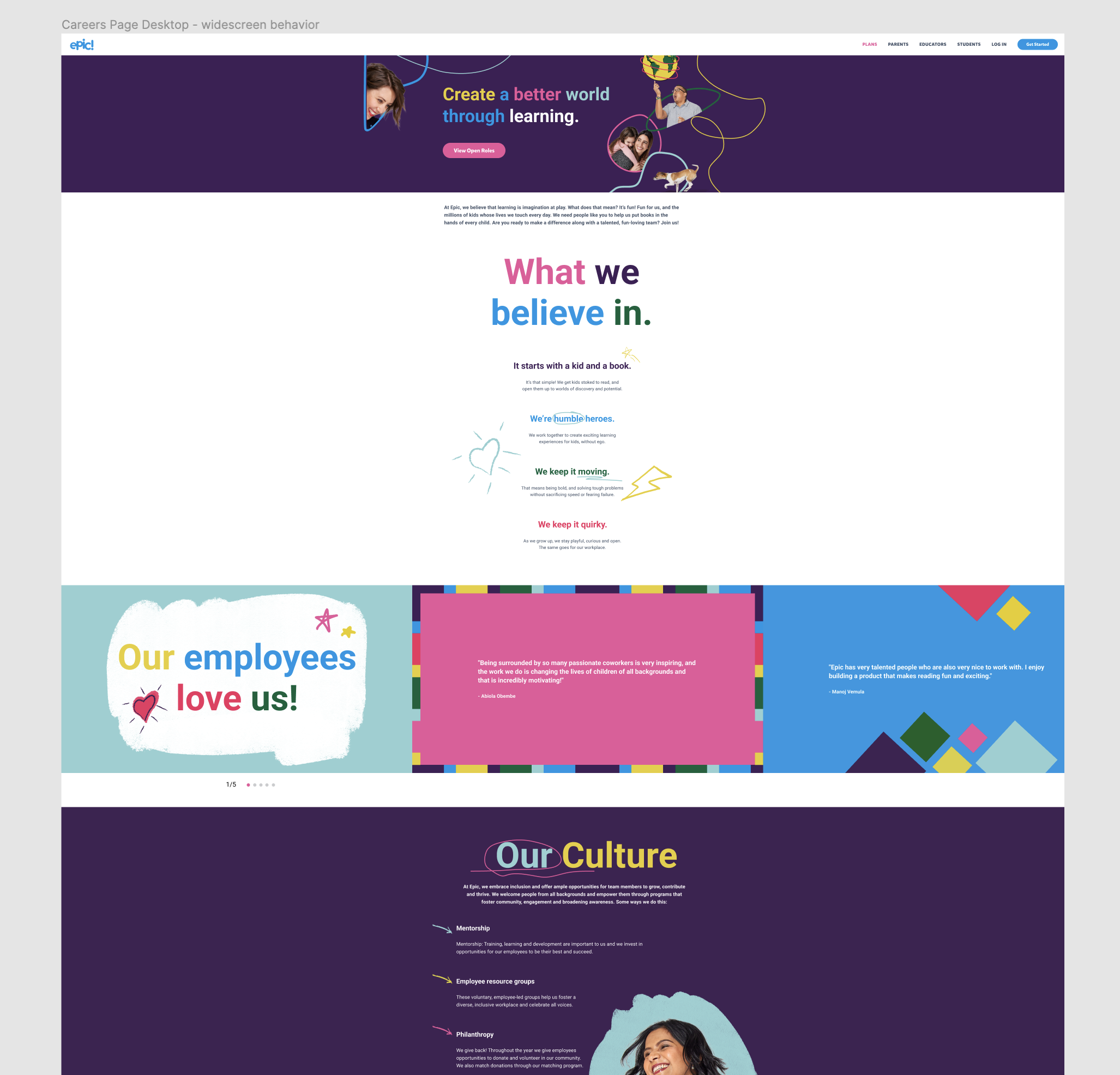
Another of my direct contributions was the design and prototyping of the “Our employees love us” slider and the “Fun is the fuel” photo grid. We wanted to have fun employee testimonials, but we didn’t want it to take up a lot of vertical space. I proposed the slider to address this. The HR team wanted to share out lots of our employee photos - but I thought a basic photo grid would be pretty bland. I proposed a photo grid that employed a slow, horizontal scroll in a loop to show a variety of photos.
Final Design
For this webpage, I made sure to define the widescreen behavior. I noticed that this was not a standard part of our team’s design process, and it had lead to some improvising on the dev’s part. The design team would not always be happy with the final result of the webpage, but there wasn’t time left in the sprint to resolve the issues and then everyone moved on to other projects. Obviously, it made sense to think about that up front - especially if the design included elements that went off-screen for standard views. This produced a much more satisfactory result!
