Go Anywhere marketing campaign & landing page
Visual Design | Responsive Web Design | Art Direction | Graphic Design | Layout Design
The Epic for Kids marketing team was tasked with creating a campaign to keep kids reading and beat the “summer slide” while out of school. We chose the theme “Go Anywhere with a book this summer.” The campaign centered around 6 weeks of curated book lists featuring engaging themes. I worked closely with my team to create visual assets for various marketing needs. I also did most of the design for the responsive landing page.
Landing Page Demo
Project Overview
The Challenge:
Kids tend to drop behind in their academic progress during summer. The marketing team was tasked with creating a campaign to run during summer to re-engage kids with reading on Epic’s app.
The Goal:
Design a marketing campaign that’s fun and encourages kids to come back to the Epic app to read books throughout the summer. Promote reading as fun and exciting through compelling visuals, curated book collections and fun activities.
My Role:
Visual designer working with a team to create a visual identity including illustrations, layouts, graphic elements and a responsive landing page.
Responsibilities:
Illustration, graphic assets such as logos and patterns, layout and design of printable activities and book lists, in-app promotional banners, creating and handing off a responsive landing page.
Concept Art
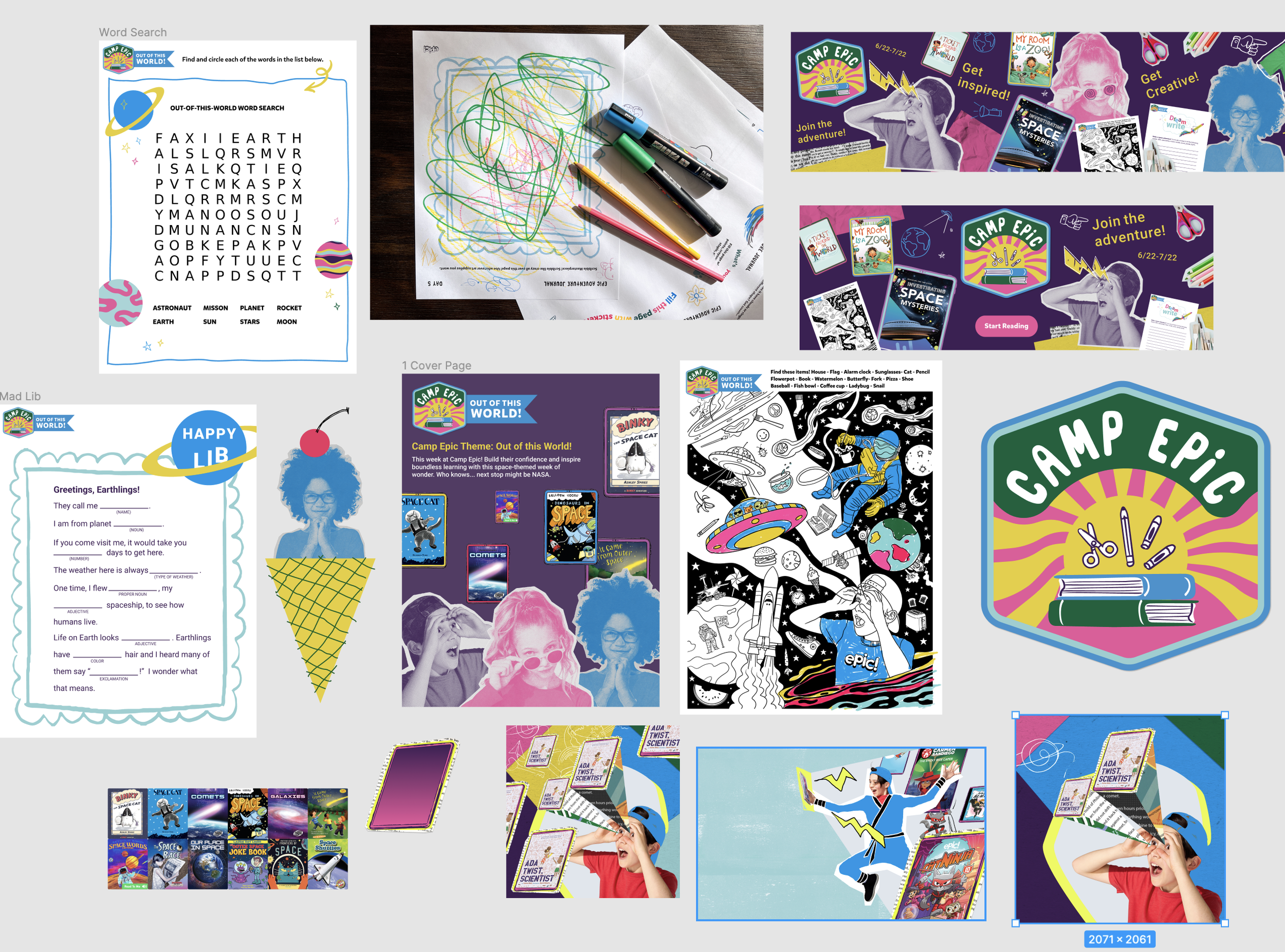
Our design team spent time ideating various concepts and ideas. I worked closely with a few team members to explore lots of different messaging, visual, and activities that would engage kids. My theme idea was “Camp Epic” and included lots of printable activities relating to the different book collections that kids could download and use at home. I imagined a “visual journal” that encouraged kids to engage creatively, that they could have as a keepsake after the summer. During this stage, we worked vey collaboratively in a big, messy Figma file. Later, we cut down our ideas to pitch to the whole team.
I created the “logo” for the Camp Epic concept, and we explored how different visuals and messaging might work in social posts, product, and web assets.
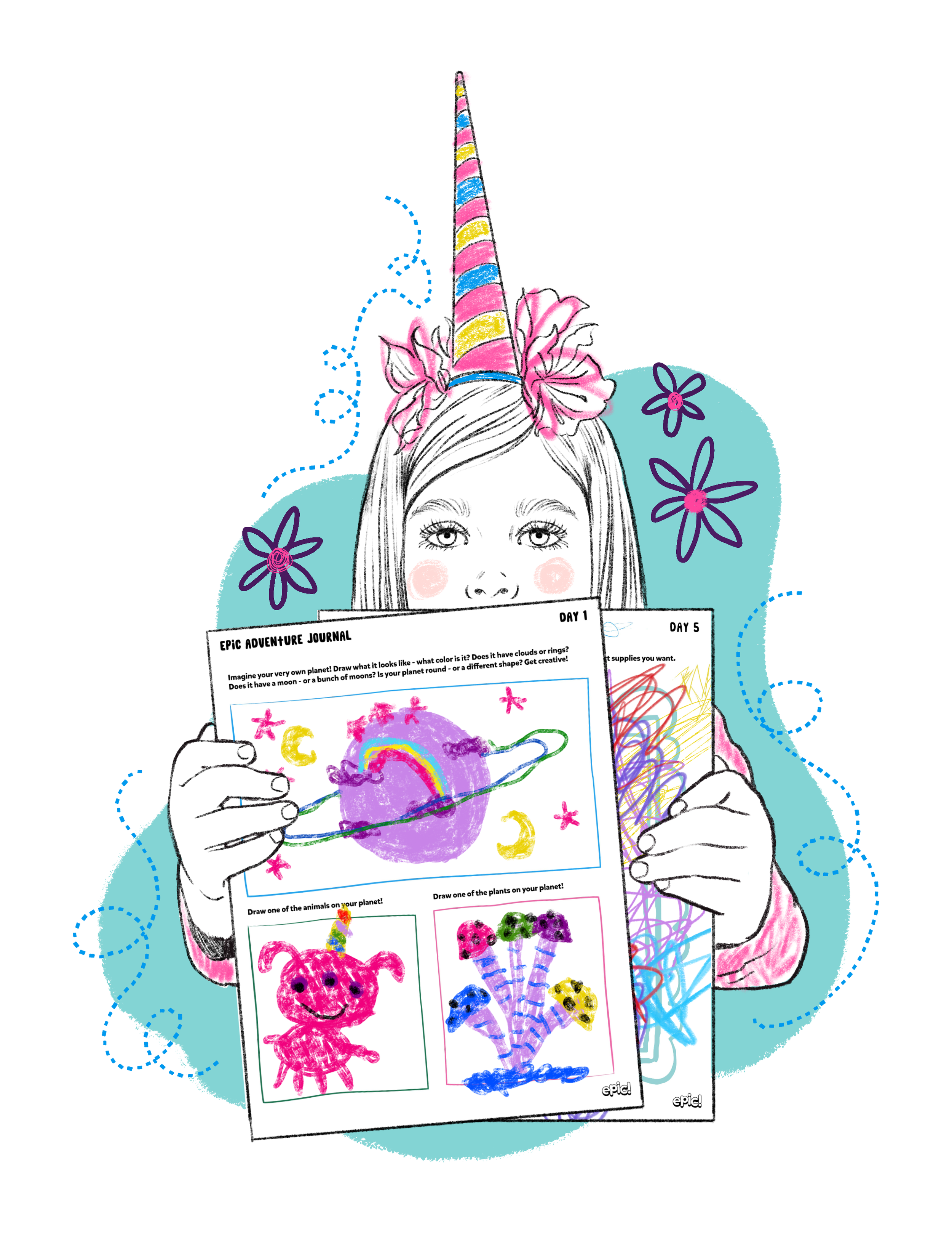
Sketch of child with completed activity sheets, visual style exploration.
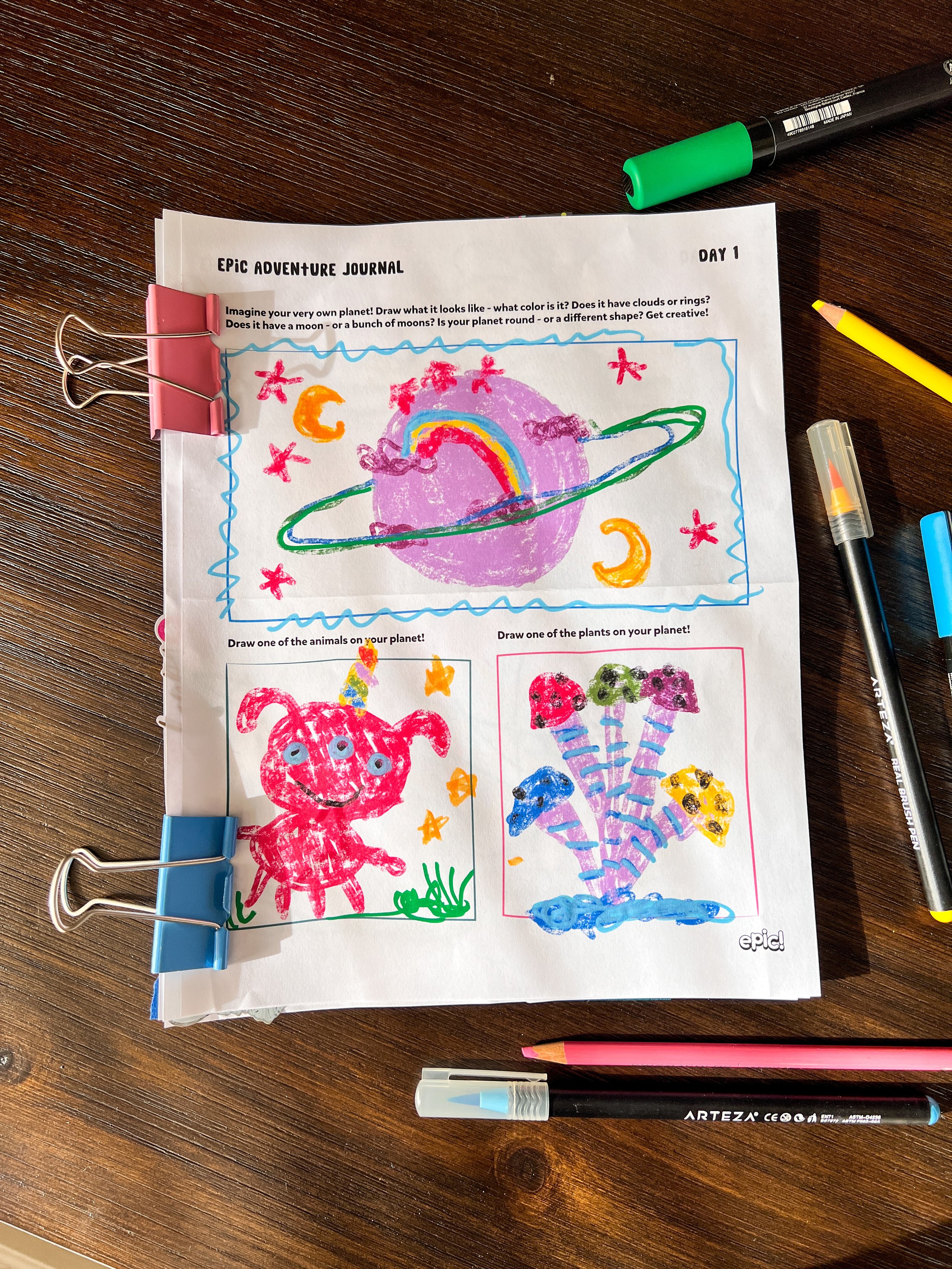
I envisioned that after summer, the child would have a visual journal to keep.
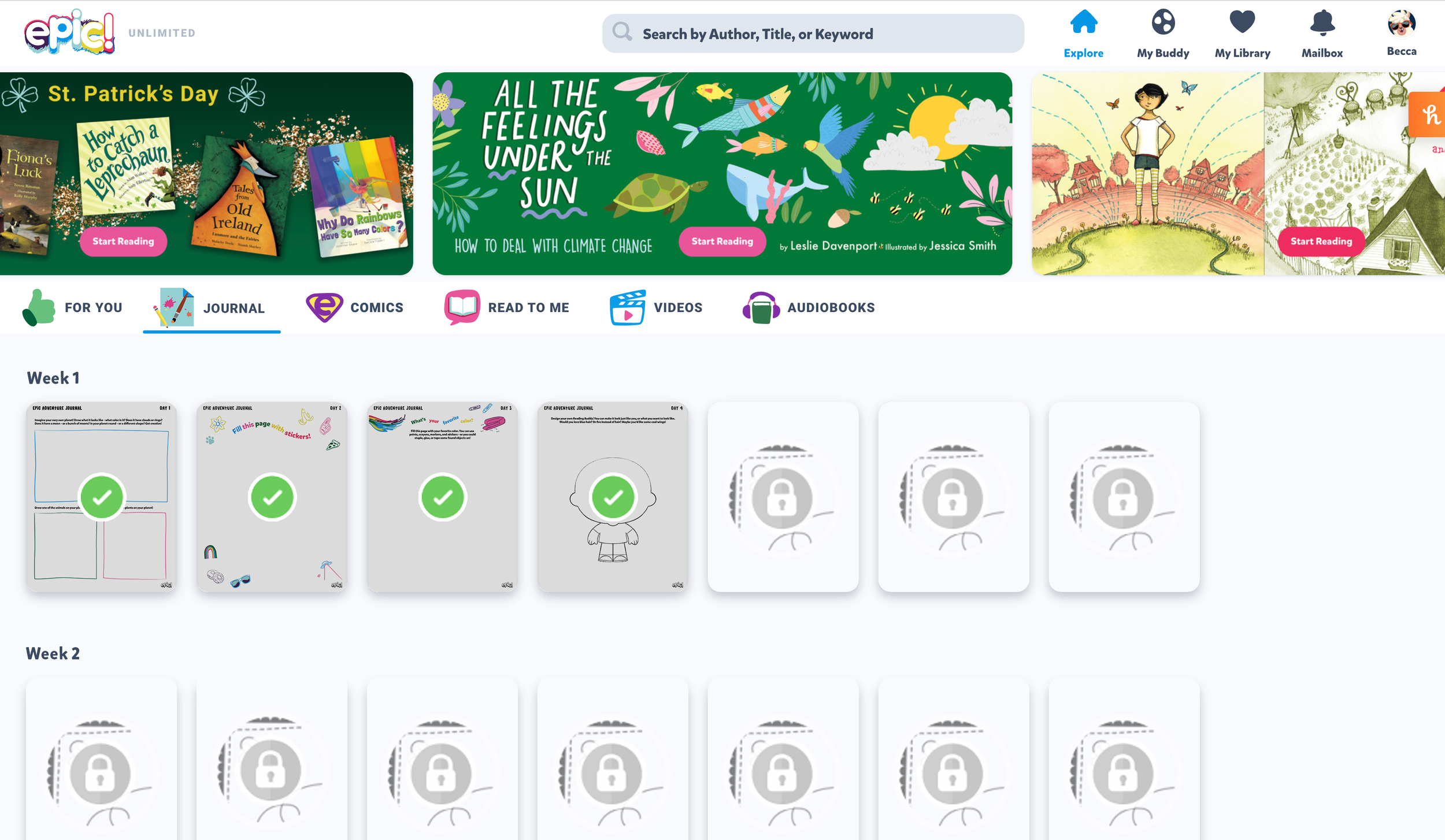
I created a quick mockup of how the downloadable activity sheets might work in our existing product dashboard. My original idea was that children could earn them after reading books.
Design Phase
After the entire team pitched concepts, the Creative Director selected elements from several ideas and we moved forwards with the “Go Anywhere…in the pages of a book concept.” My idea of using activity sheets was included, as well as the travel-themed visual direction from a co-worker. The campaign was to feature 6 weeks of themed book collections, with activities for each theme, all housed on a responsive landing page.
This project needed to be completed in a very quick timeframe, with limited staff resources. With that in mind, we tried to be efficient with our resources and make the assets work in as many cross-applications as possible.
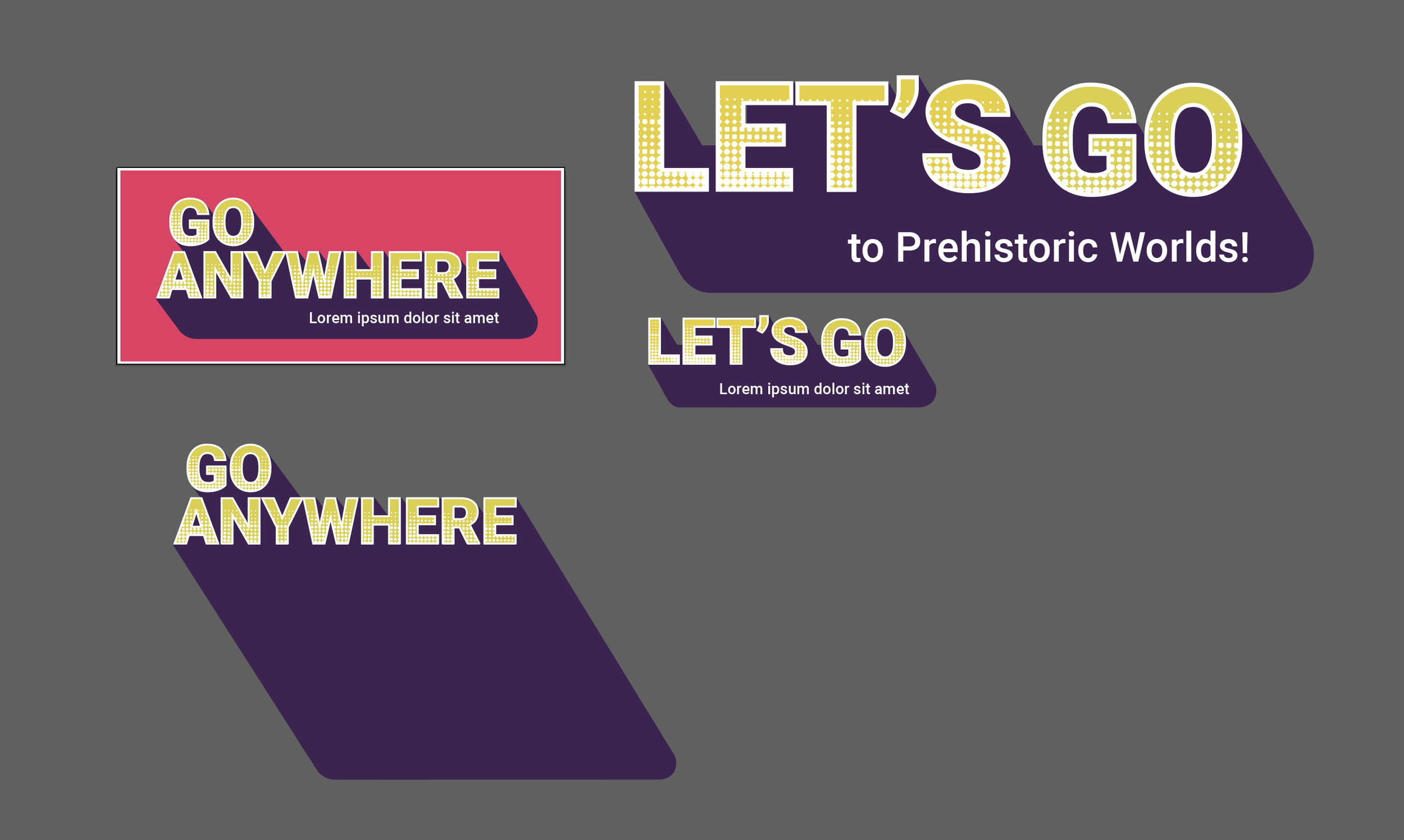
My co-worker created the initial Go Anywhere logo, and I adapted it for other design uses and created an alternate logo for specific assets based on his design.
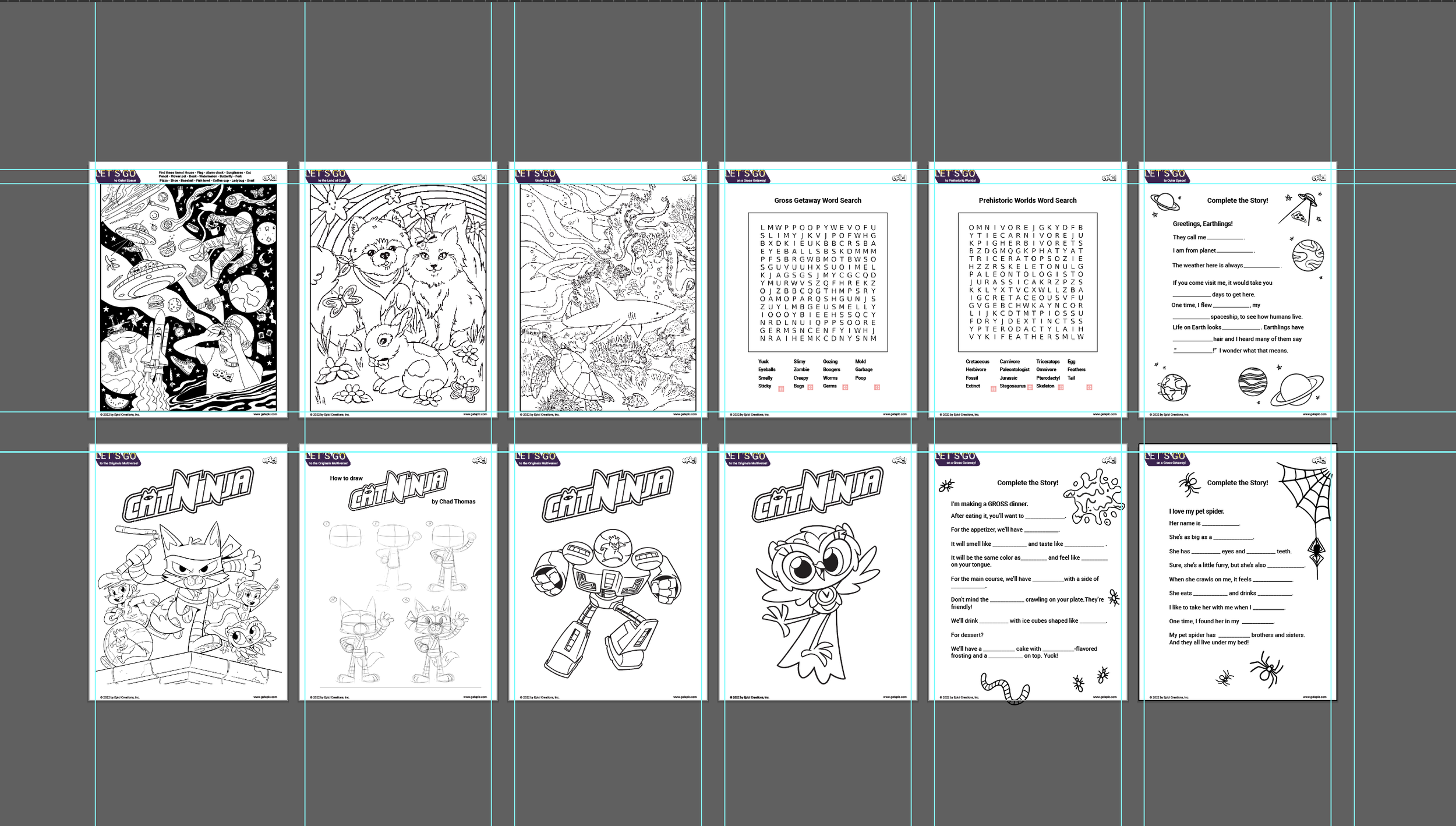
I created the layouts and designed the activity sheets in collaboration with our copywriter. The Cat Ninja sheets were re-used assets and were previously created by another team within our company.
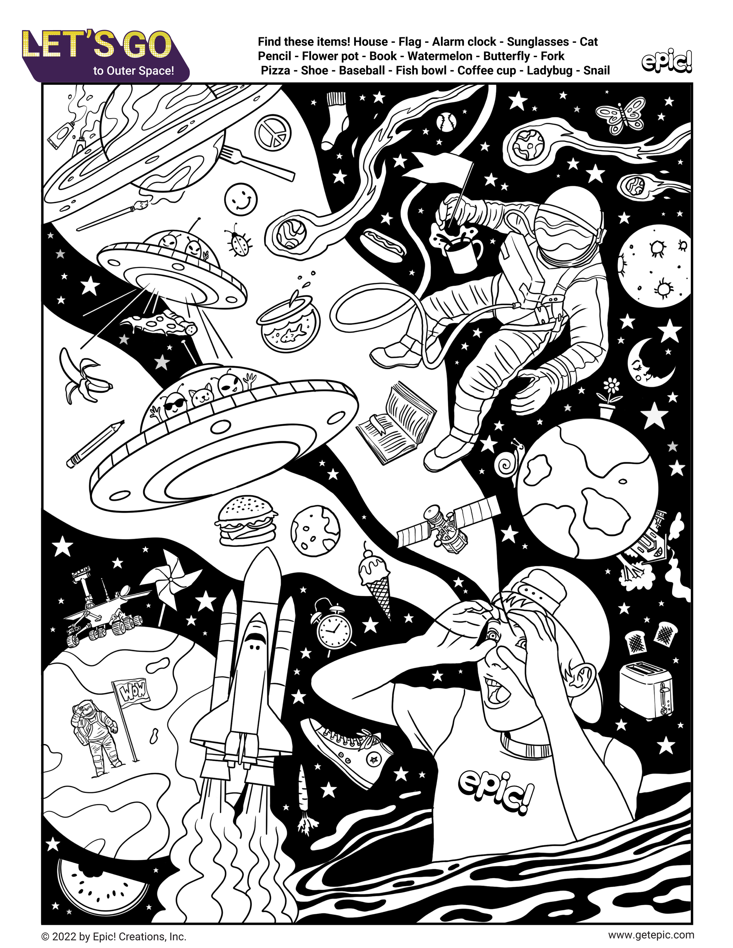
I illustrated this search-and-find coloring page in Procreate. The word list was created by our copywriter.
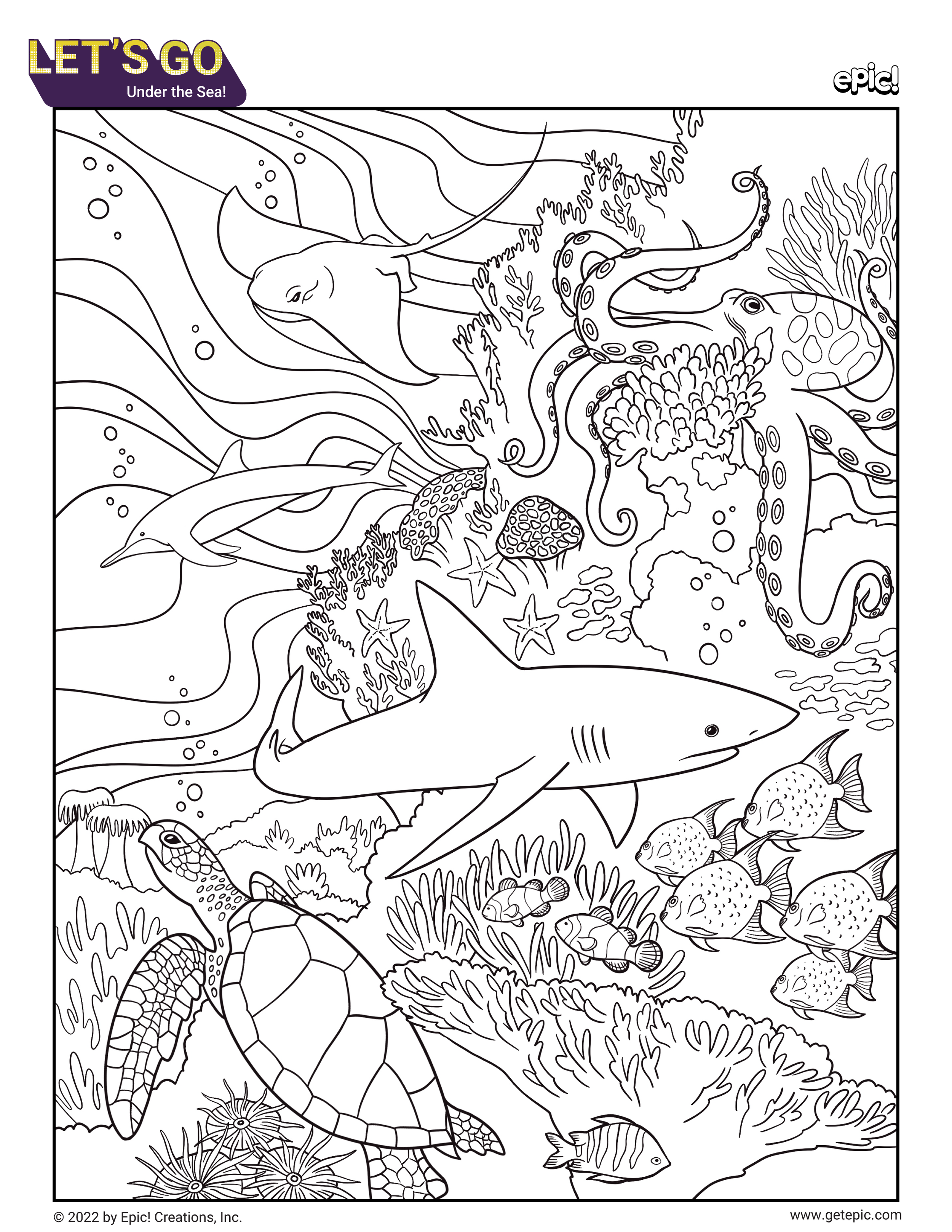
I illustrated this under the sea coloring page in Procreate.
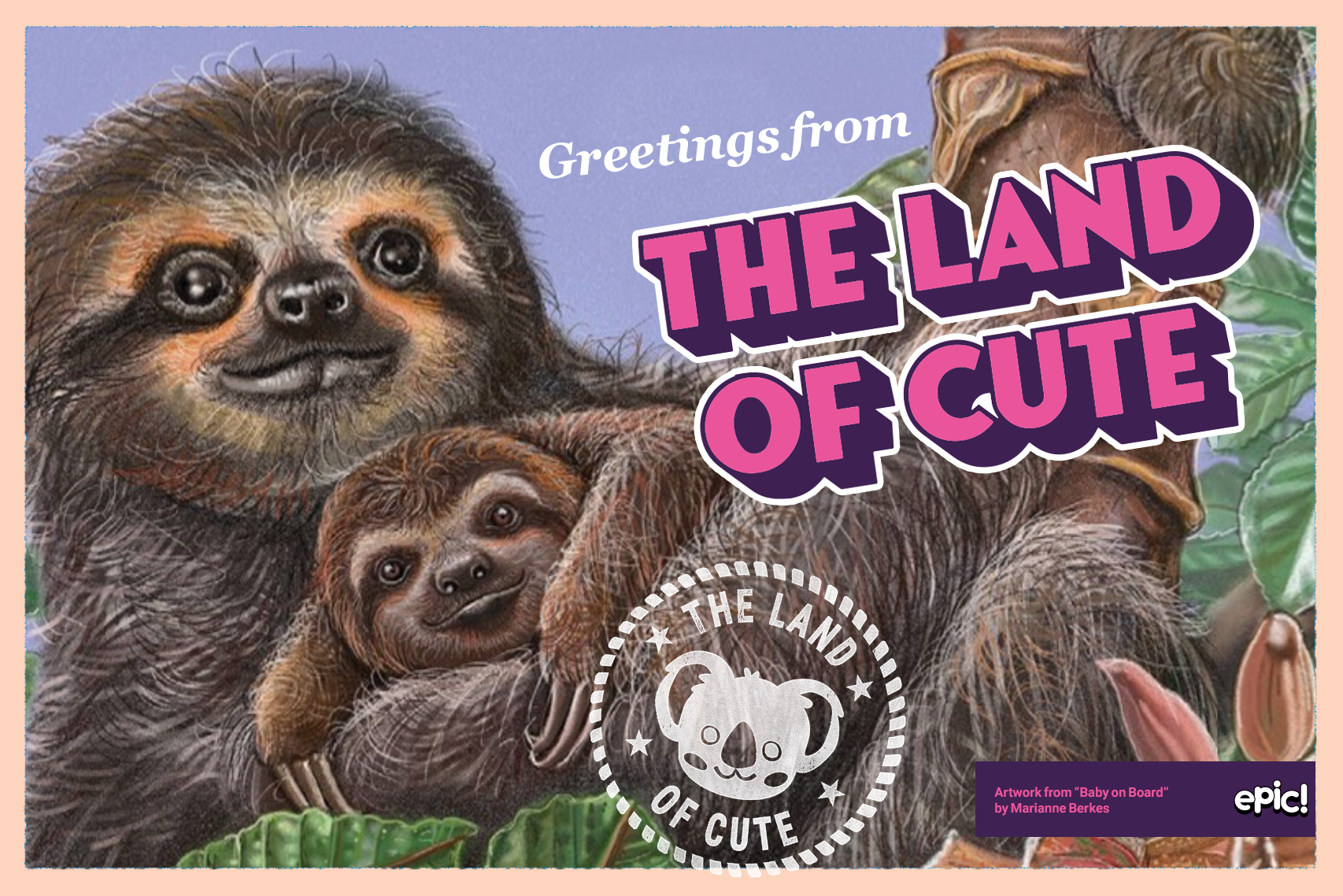
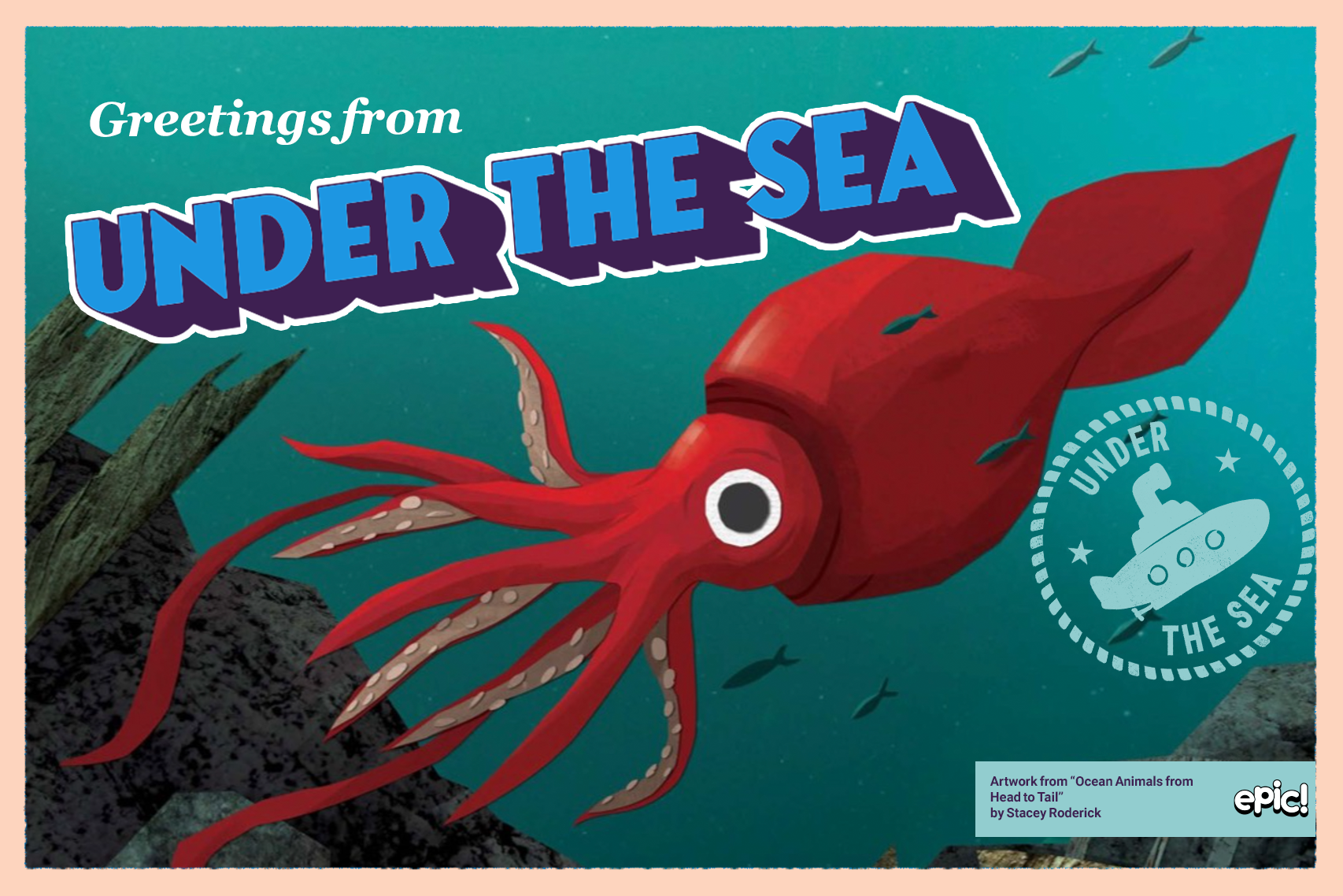
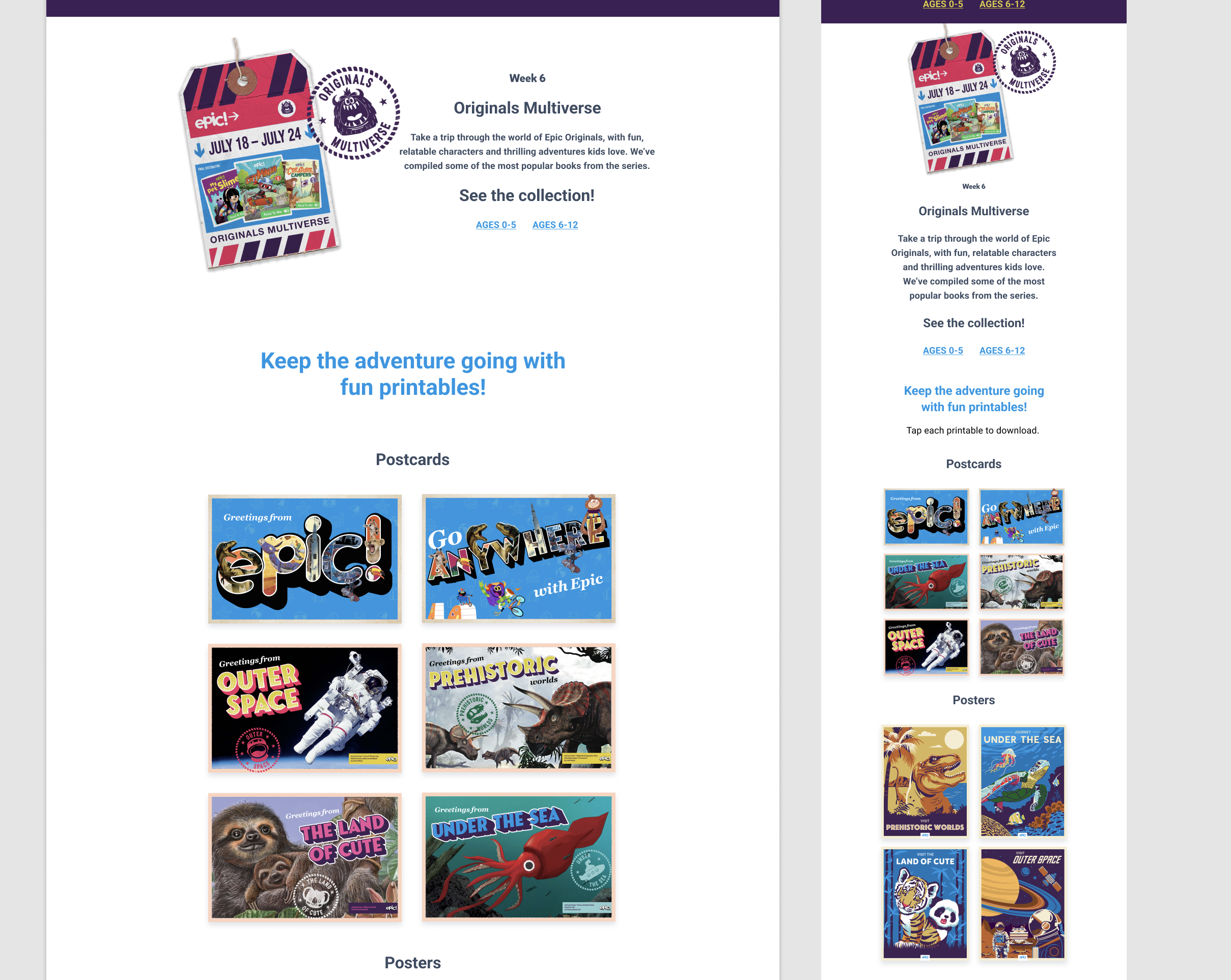
My co-worker created some initial postcard designs. However, he was pulled to another project so I created two more to match.
I used my co-workers template, stamp graphics and type style to create a similar design using book art from the collections.
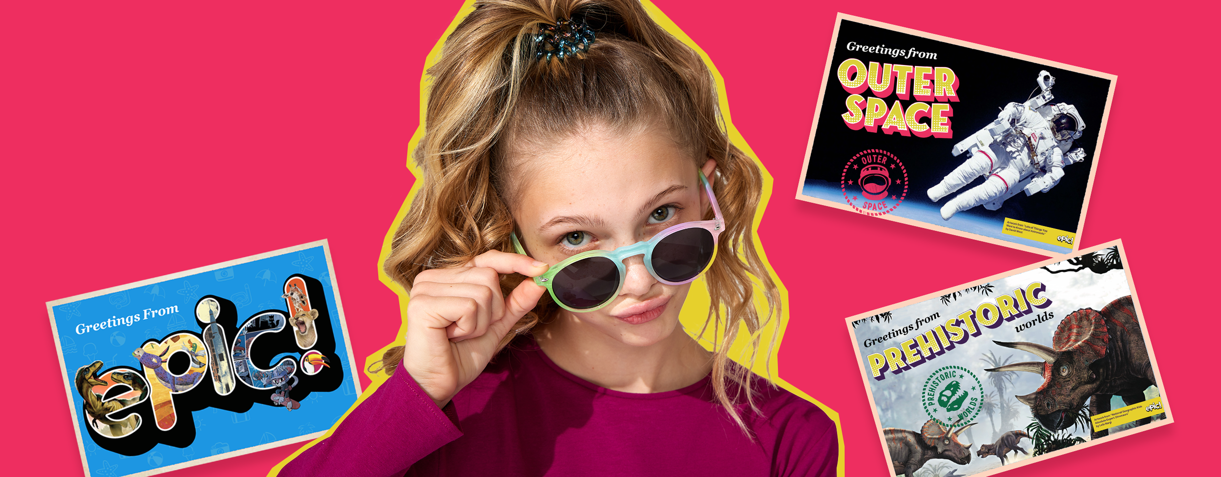
Image for our company blog post. I used my co-worker’s original postcard designs.
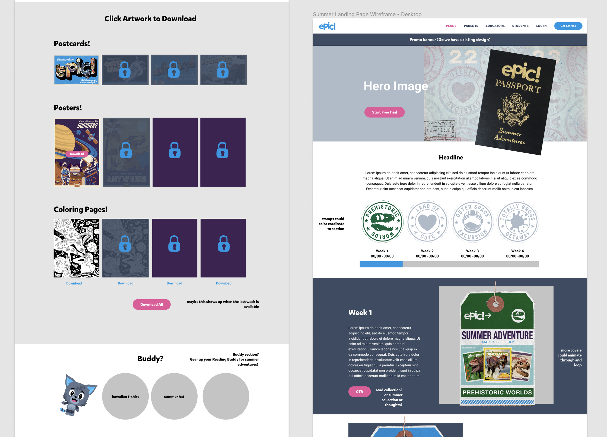
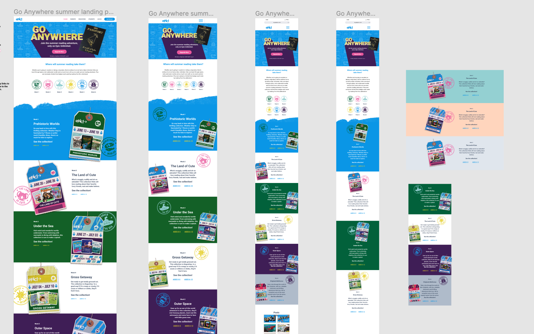
Landing Page Wireframe
Since this was a quick-turnaround campaign, we worked on the landing page concurrently with creating assets. First, we presented a wireframe to the stakeholders and developers to cost the project. During this phase, we explored how various assets and design elements could be used.
After deciding on the layout, we moved into the hi-fidelity design phase. Sometime during this process, I took over the design of the page, as my co-designer was called into another project.
Challenges Occur
After taking over the design of the landing page, several problems cropped up. Firstly, we had designed a desktop-first experience with a very customized layout, based on what was outlined in the initial project brief.
Sometime during the planning phase, the needs of the project changed to mobile first. Also, the original dev was not available and we were assigned a different dev with only a very short timeframe to rework and finalize the design. The developer also only had a short time to work on the build.
The original design featured a custom layout of alternating graphics in a unique arrangement. Each responsive size would have needed to be custom built to behave correctly. I worked with the dev to decide what layout made the most sense to build quickly, while my manager and art director were out of office.
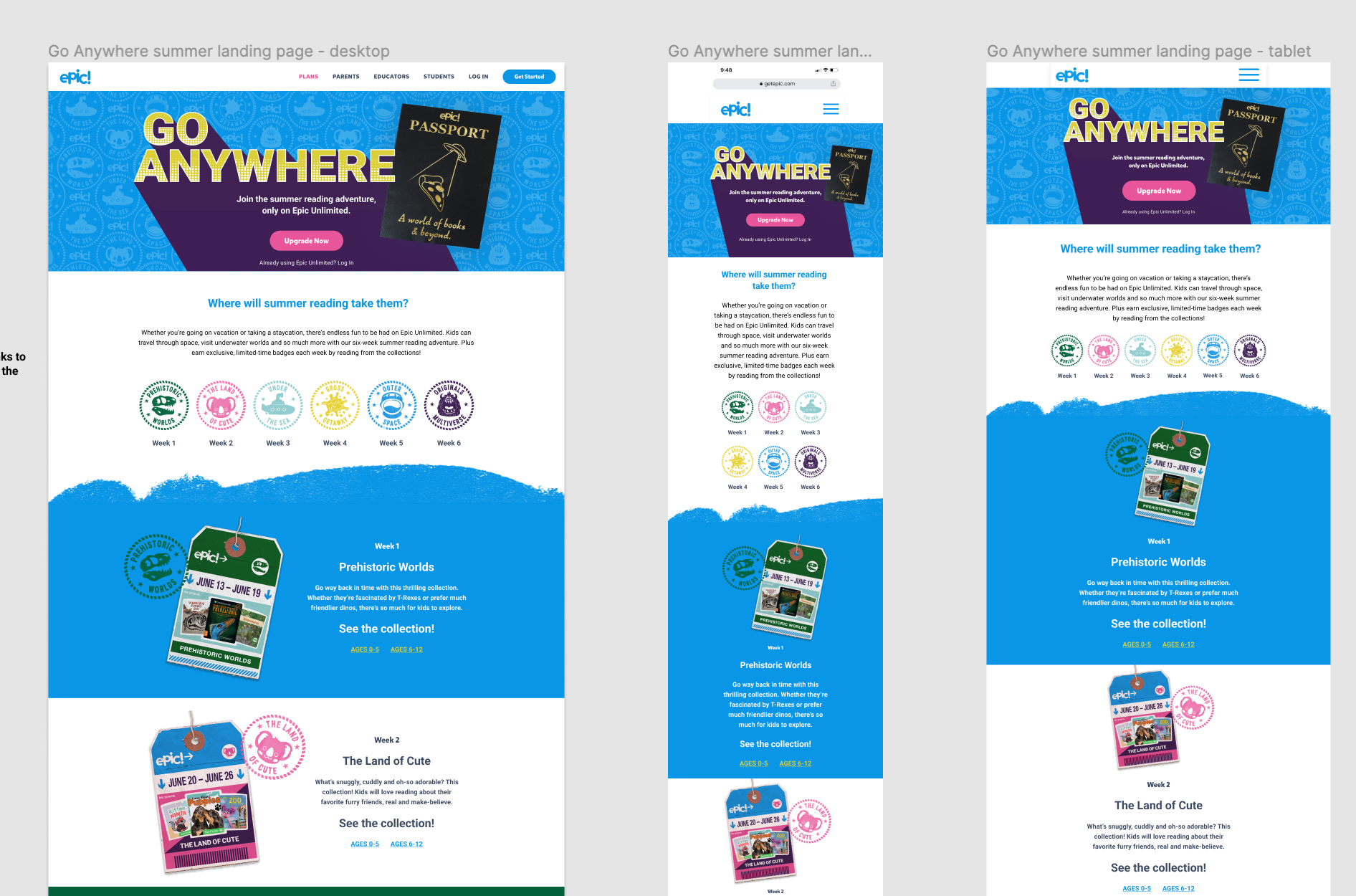
Final Design
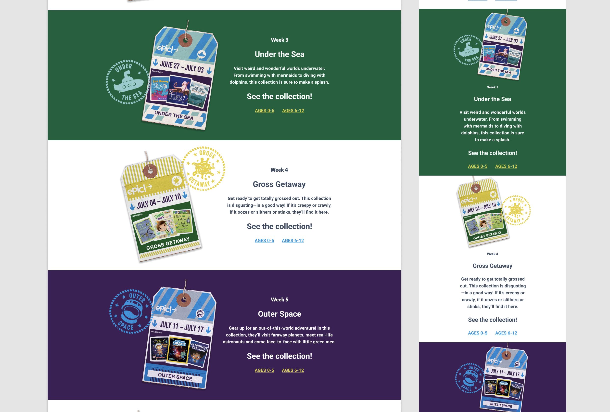
I was able to rework the design at the last minute to create a responsive design that didn’t sacrifice creativity and whimsy, but was buildable in the allowed timeframe. You can view it here. Please note, there was some miscommunication with the developer about how to implement the seamless pattern in the hero. Unfortunately, we didn’t have any time to create a fix for this and it had to go live with less than optimal graphics.
The completed layout for desktop, mobile and tablet.
In-App Banners
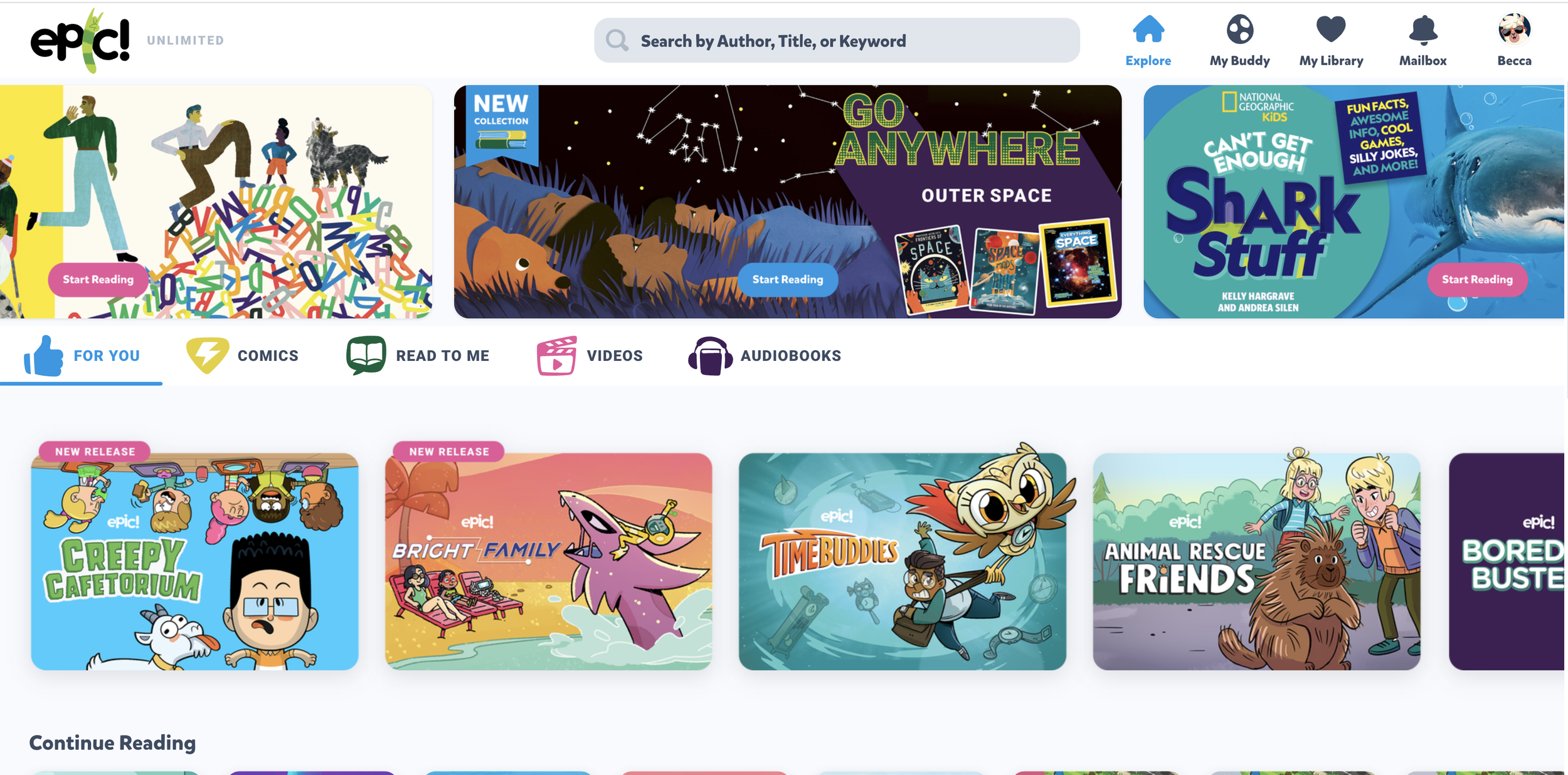
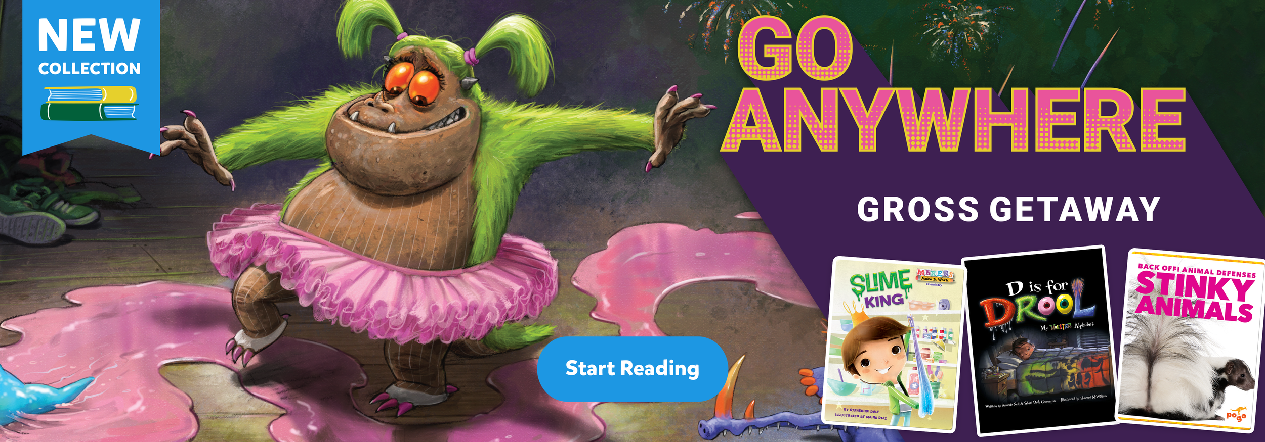
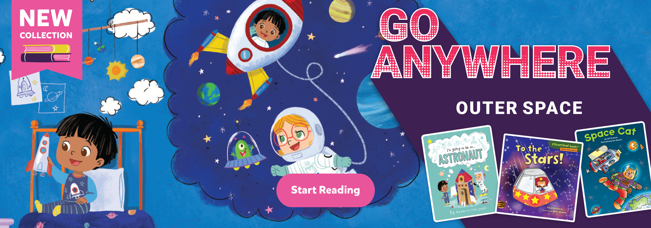
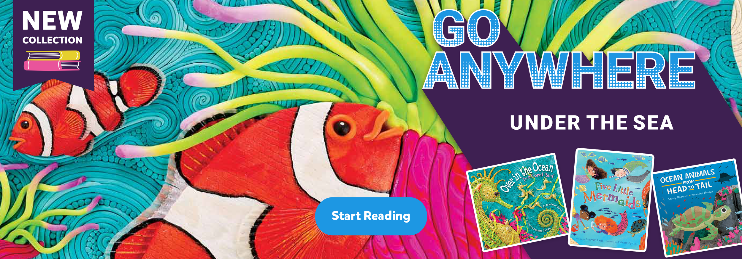
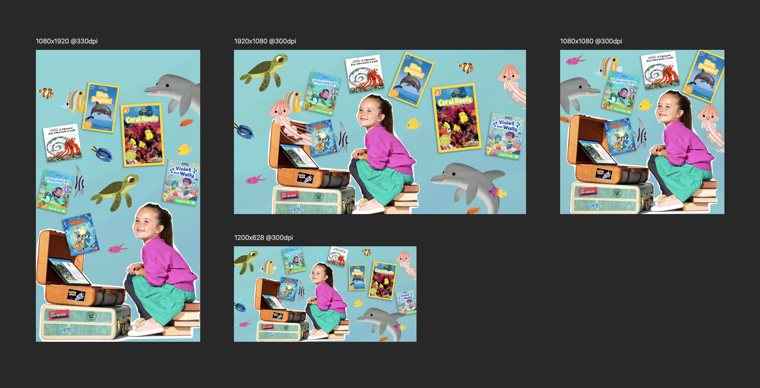
I own the creation of our “in app banners” which are changed weekly and showcase different things we are promoting - usually books and book collections. For the Go Anywhere campaign, I created banners targeting two different age groups for each weekly collection for a total of 12 banner designs. I utilized standout art from the books featured in the collections, as well as book covers and our logo lockup for each banner.
Additional Graphics
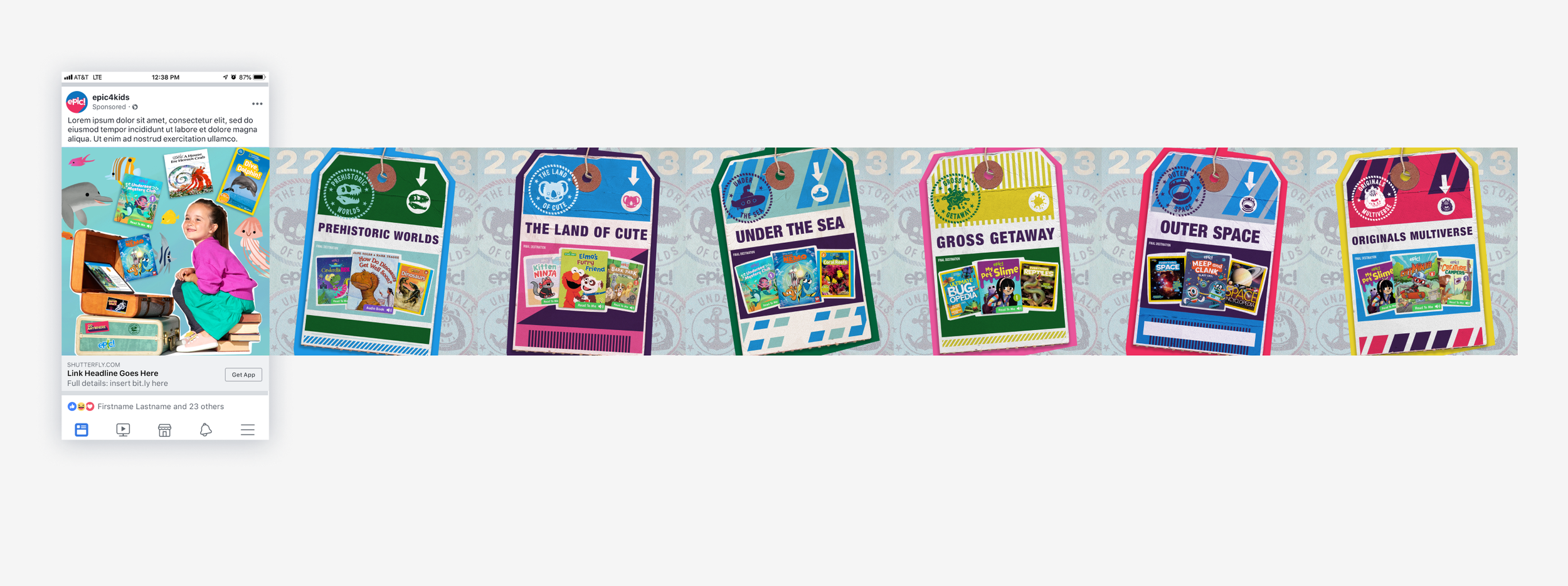
As a somewhat unrelated project, I was asked to create some acquisition ads using the graphics from the Go Anywhere campaign. This was not part of the overall campaign, but a good way to reuse graphics.
I reused the travel tags and seamless pattern created by my co-worker. For this project, the tag graphics needed to be reworked to remove dates and the books needed to be replaced.
Additional social media and email designs for the Go Anywhere team were created by other members of my team to round out the campaign. I did not include them here because although they contain graphic elements I worked on, I did not create the layout designs.
Takeways
While fun and creative, this project ended up being quite challenging at times. This was due to multiple changes in the project objective and scope as work was ongoing, as well as tight turnaround times. The design team ended up having to rework assets multiple times across various touch points, leading to confusion and inefficiency. I met with my team to define ways that we could eliminate friction in the future:
Establish a clear project brief and consult with all stakeholders, design team and dev team in the planning stages to identify possible issues.
Ask probing questions such as: “Is this desktop or mobile first? or “Have you secured dev resources?” before agreeing to a project scope.
Establish a backup approval system if the approving team member will be out of office during the project period.
Create fluid design systems: If a project has a lot of resources and a healthy timeline, we can build more elaborate, custom digital designs. If it’s a shorter turnaround project, we need to design in a templatized way.
No project is seamless! Working in cross functional teams can lead to miscommunication, but it’s a great opportunity to refine processes and practice communication.
