QENDO app
UI Design | Branding | Icon Design
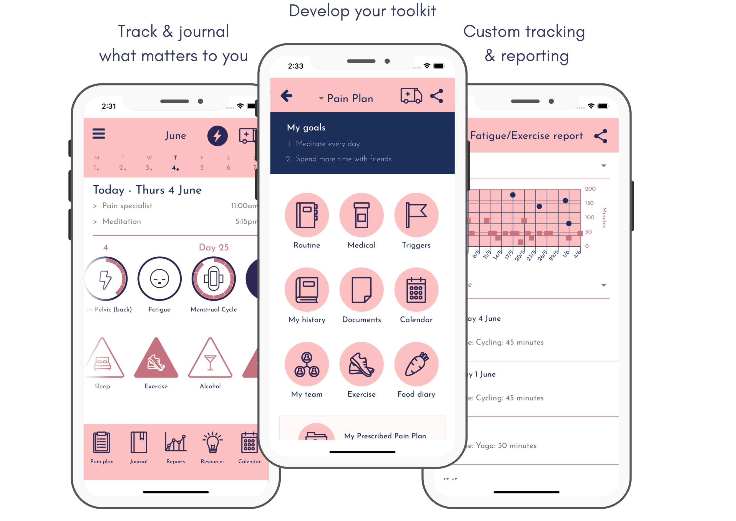
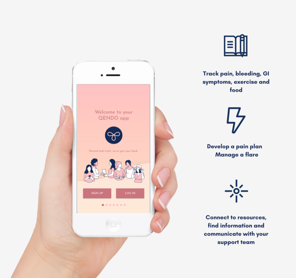
The QENDO app is an app produced for the Queensland Endometriosis Society (QENDO) to help people experiencing endometriosis manage and track symptoms.
Tutorial Video
Created by the Queensland Endometriosis Society team (QENDO)
Project Overview
The Queensland Endometriosis Society commissioned Australian dev team The Ageing Revolution to create an app for their users to manage and track symptoms. I was hired by the team as the UI designer. I worked remotely from the US while the rest of the team was located in Brisbane, AU.
My Role:
UI designer creating Android app
Responsibilities:
Designing UI including icons, layouts, interactions, and branding guidelines
Concept
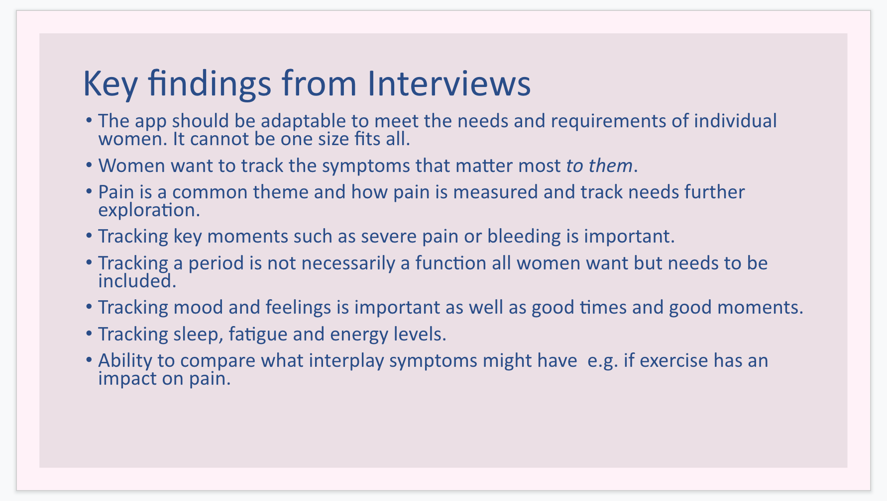
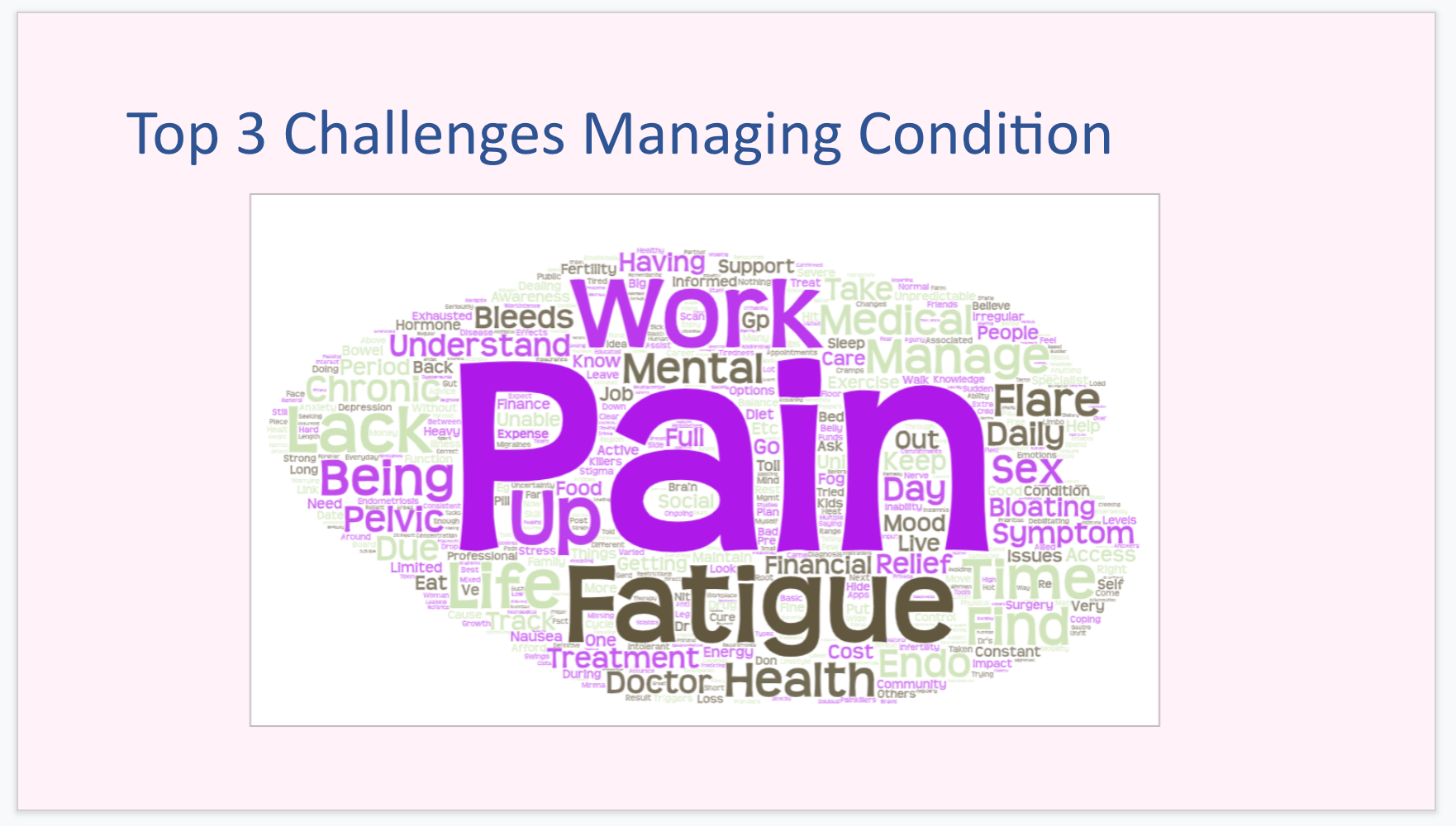
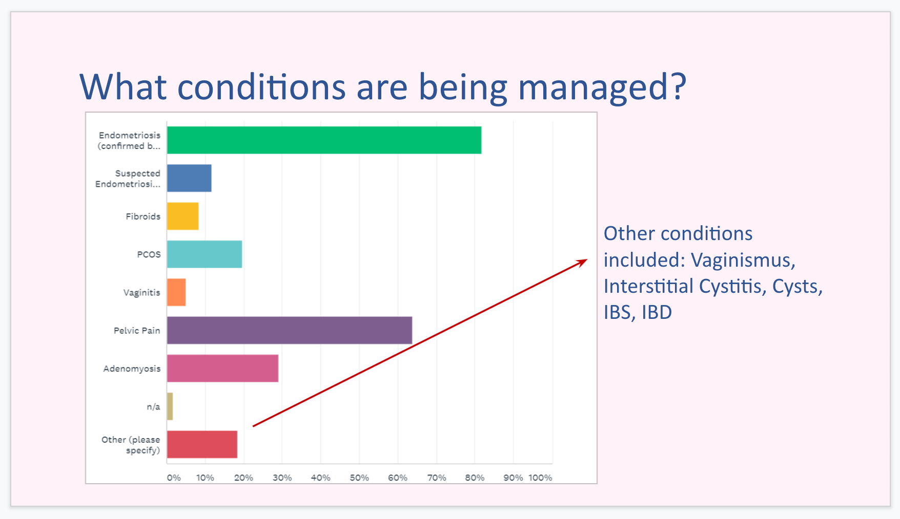
The Ageing Revolution team interacted with the client and conducted the UX research. They provided me with their findings and design considerations.
Design Considerations:
Designing for Android first would allow more users to access the app, as Android devices are more affordable and widely used.
Use the existing QENDO branding
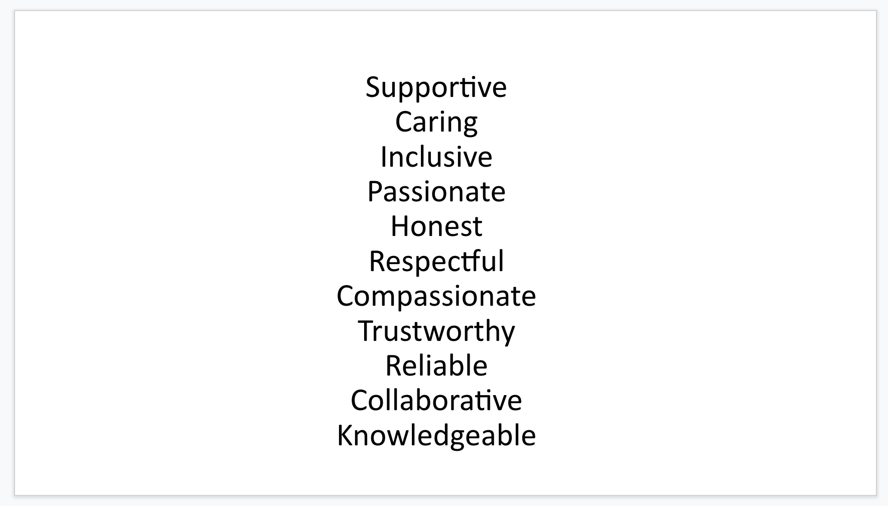
Make the app feel inclusive, friendly and supportive
Keep the design simple and intuitive, while tracking and displaying a robust array of data.
Research
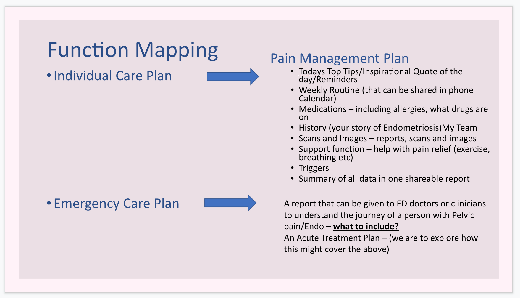
The team provided me with documentation and presentations based on the research they had conducted. This included:
Main screens to start designing
A list of icons
Interaction requests and suggestions
What types of data visualization needed to be designed
Language and “feeling” of the app design
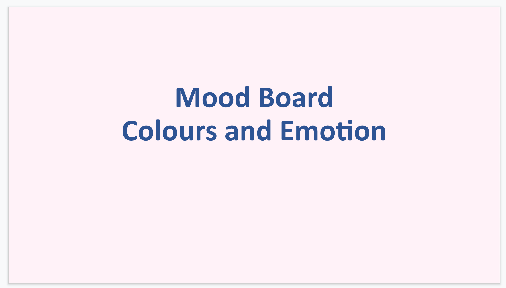
Color palette based on research conducted about mood association and user interviews
One interesting aspect of the research was the color analysis. Along with the “standard” interface palette based on the QENDO branding, the team wanted to allow users to pick different color palettes within the app. They provided detailed findings and reference, along with findings from interviews about what kinds of emotions users associated with various colors.
They also provided some mockups for the main screen layouts & icons, as well as ideation for different palettes.
Design
Branding
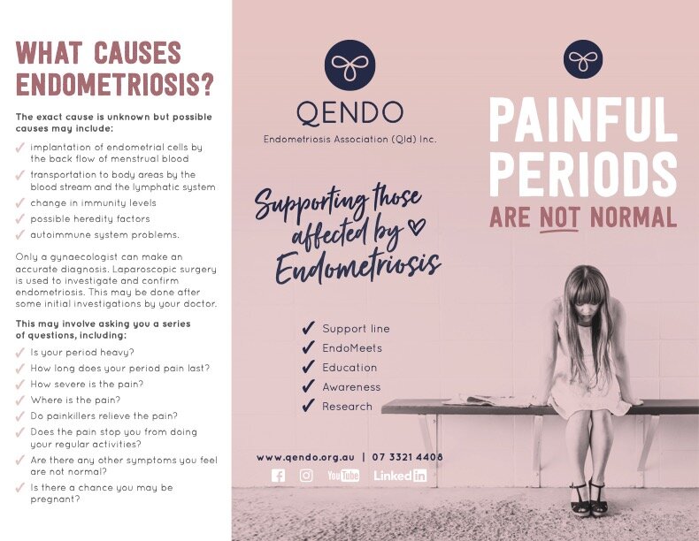
QENDO wanted the app to follow the existing branding, and provided a brochure to reference. They wanted to use the existing color palette and font, which was Josephin Sans.
Note: I have advanced in my skill and knowledge since this project. If I was designing the app now, I would have suggested a more readable font style and a slightly modified color palette for accessibility considerations.
QENDO brochure design
UI Design
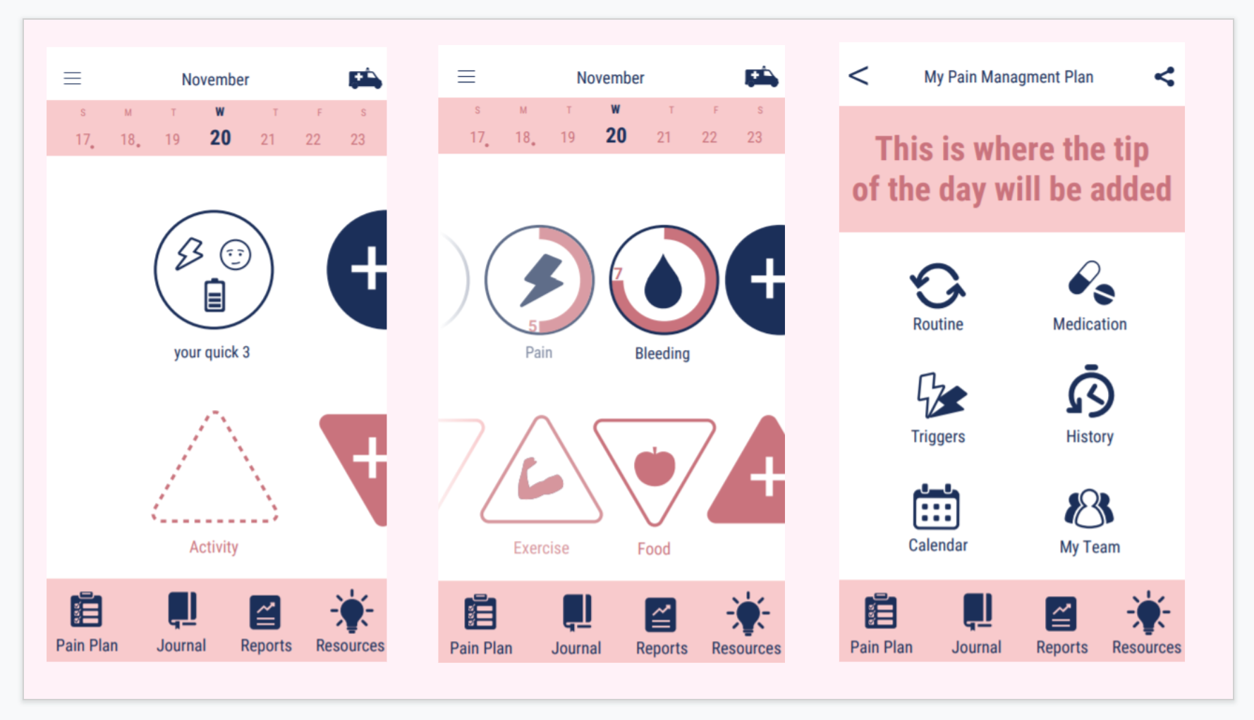
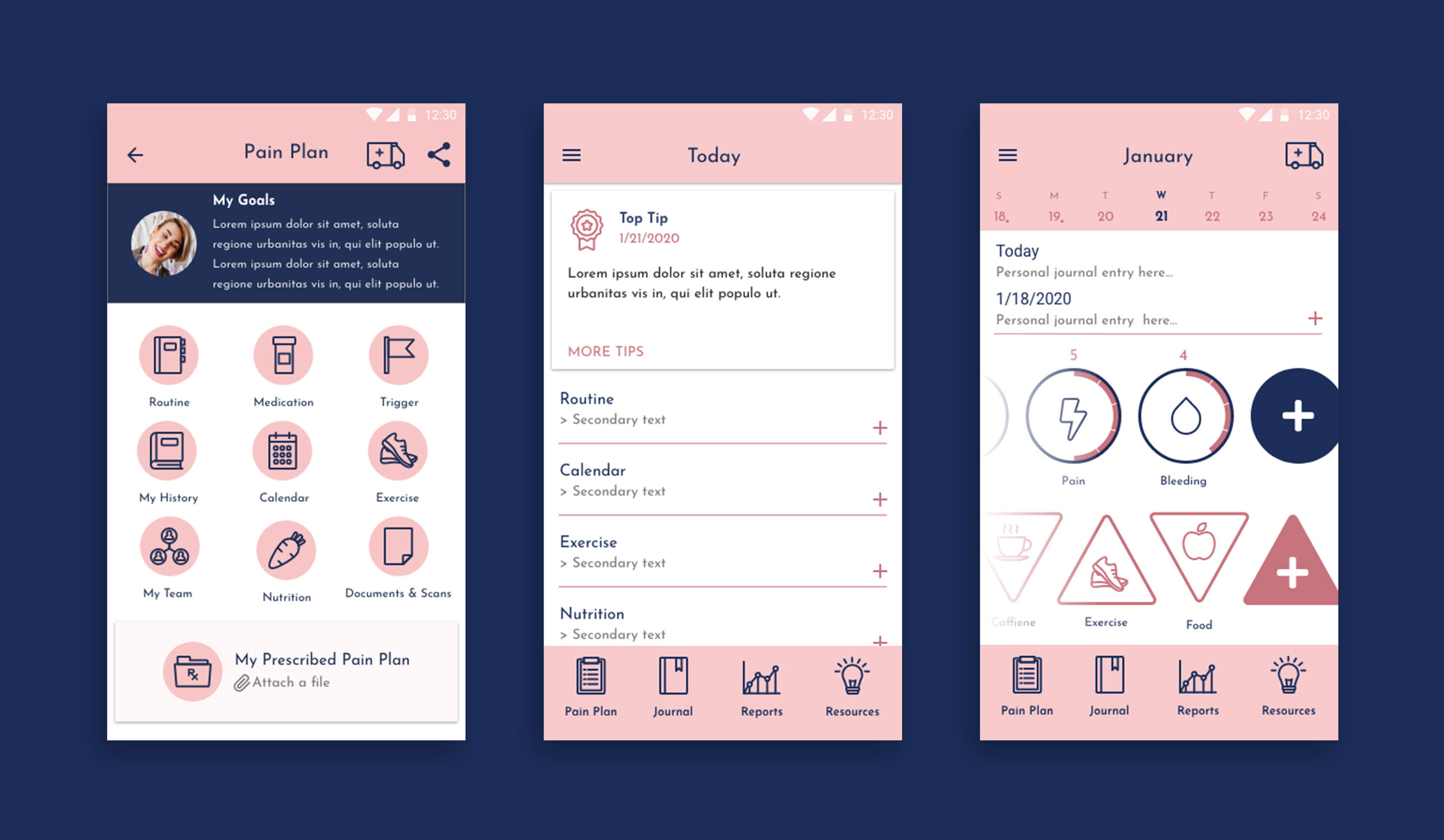
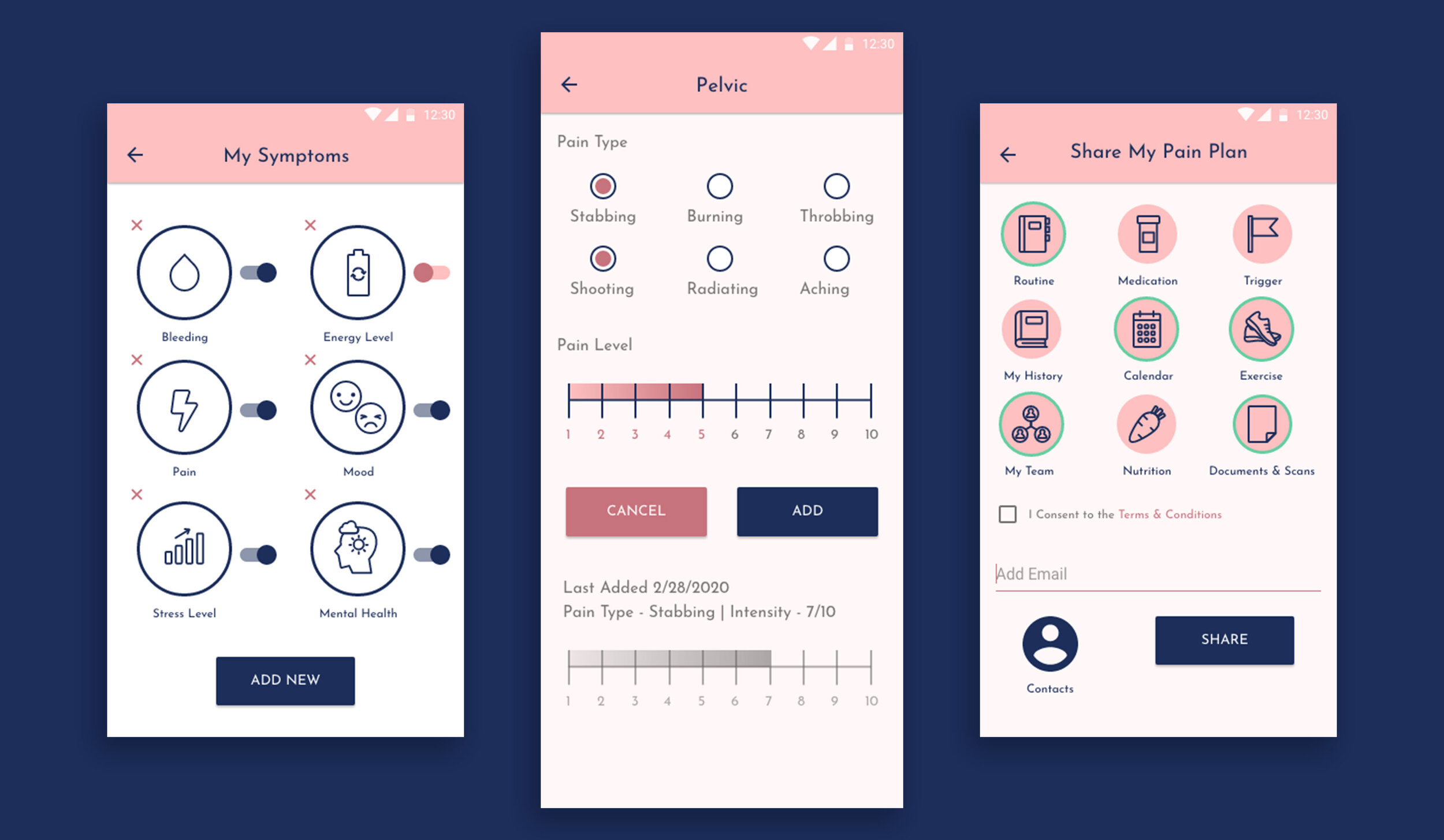
Using the main screen mockups provided, I refined the design and created over 50 additional screens in Adobe XD.
Icons
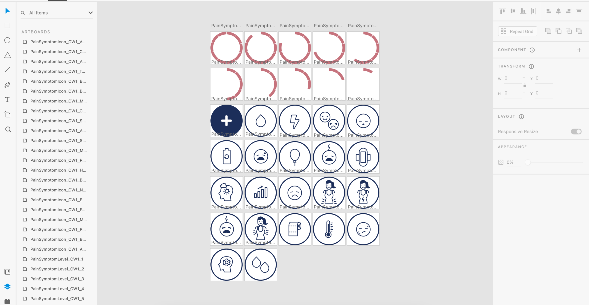
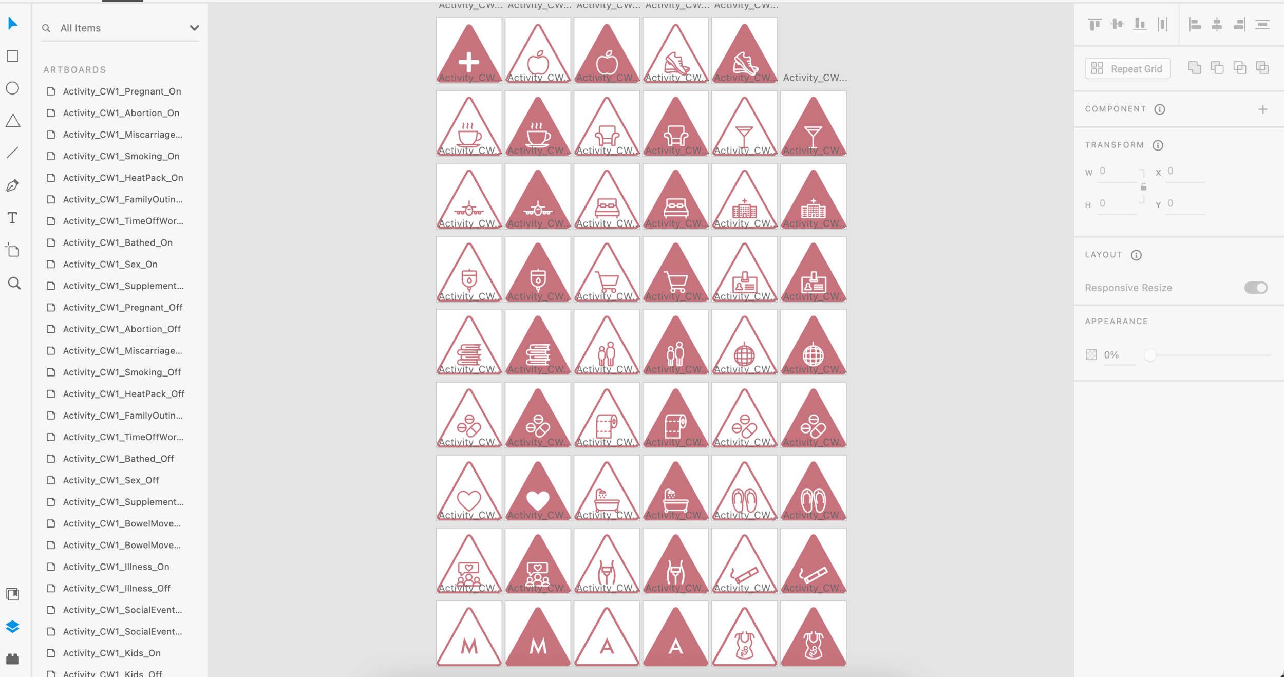
I designed two sets of unique icon types: the Pain Symptoms icons and the Activities icons. These icons were an important part of the design - they allowed users to track and record a wide range of data. They needed to be very illustrative so users could figure out what they were for at a glance.
Color Schemes
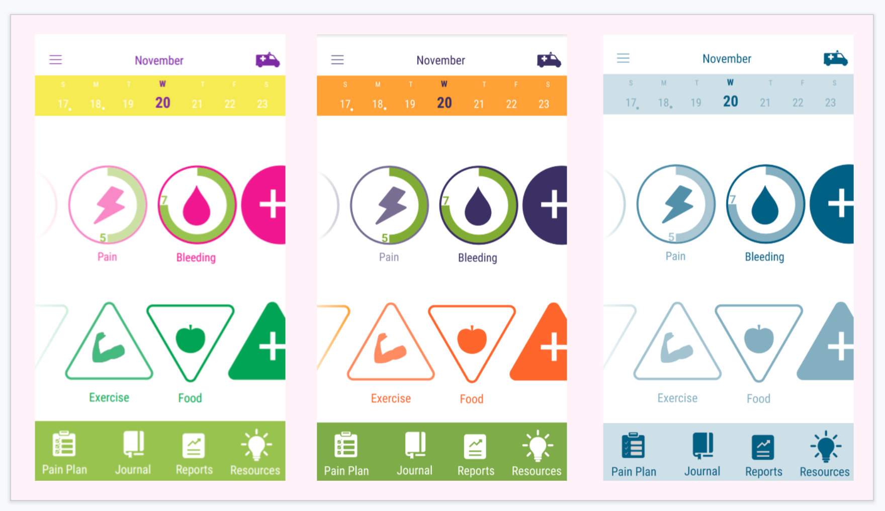
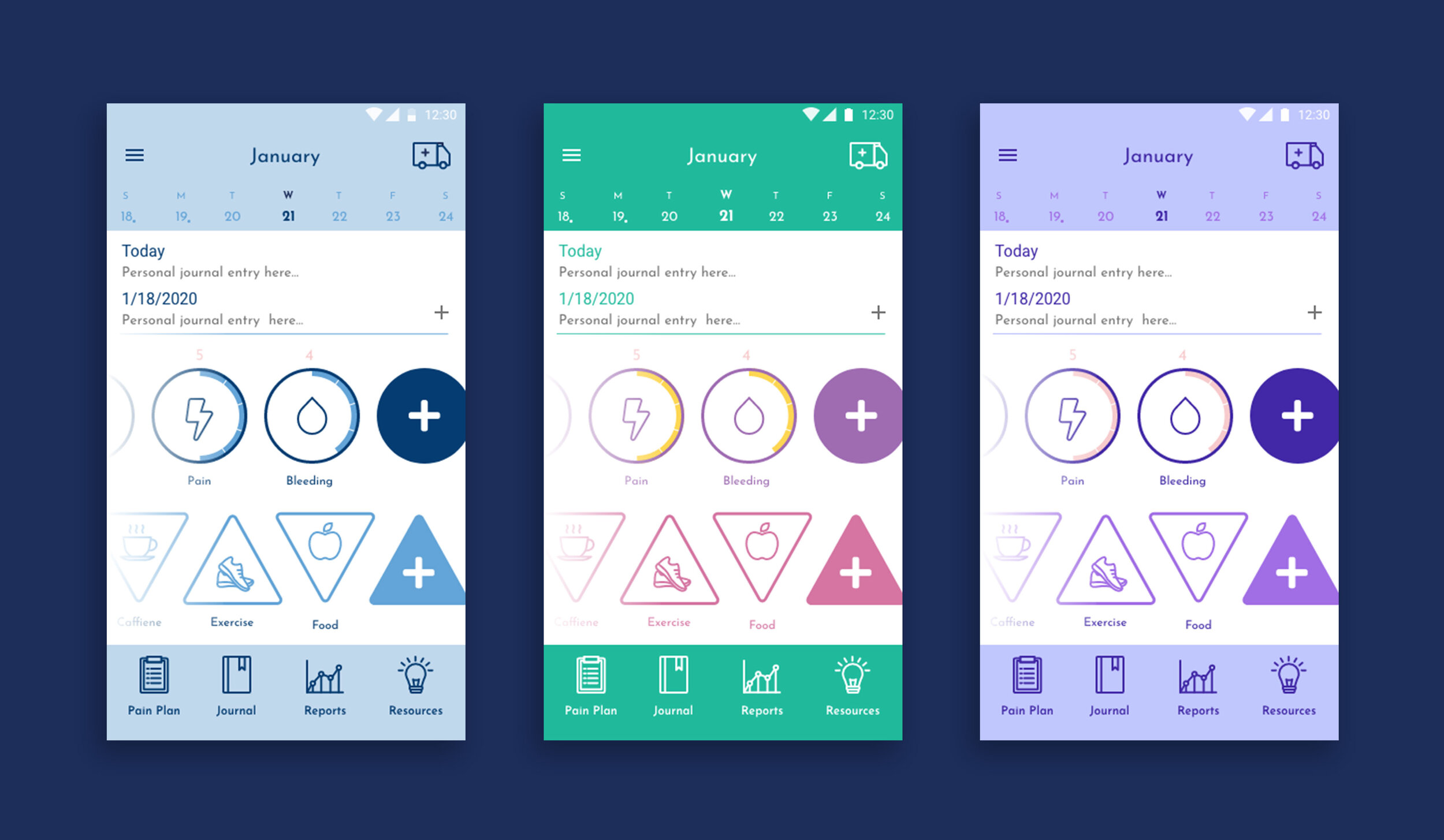
As mentioned above, the team wanted to include an option for users to switch the UI to different color palettes based on preference. Using the provided research, I designed the UI in three additional color schemes : relaxing blues, bright & cheerful, and soothing purples.
Design Iteration
This project involved a lot of communication with the team to iterate on designs. There were a number of things we ironed out along the way:
How to present the most important features like pain tracking and journaling
How to display data for reporting
Wording and tone
Icon imagery
Placement of icons for important actions like reporting a pain flare and sharing data
As a point of interest, here are some excerpts of our communications around various design details:
Onboarding Design
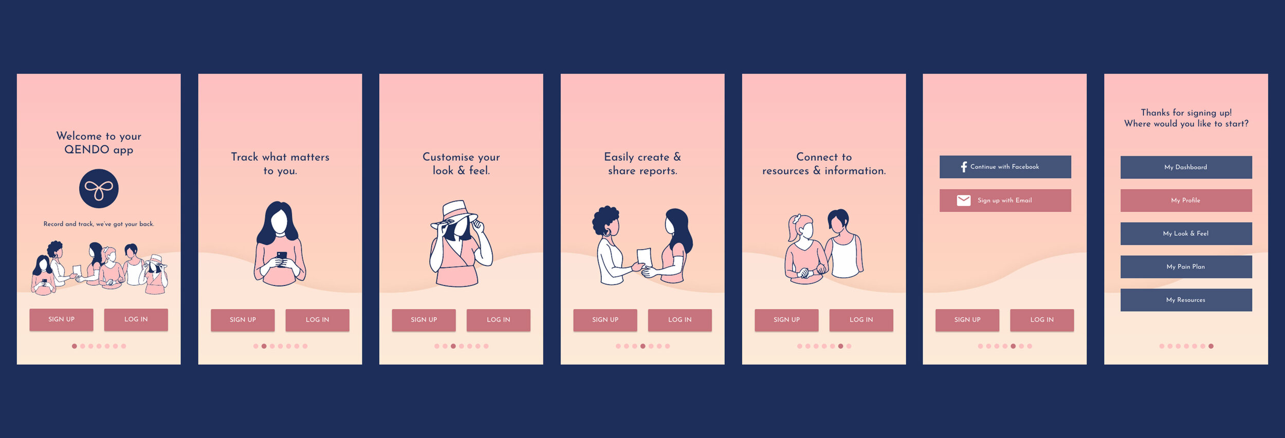
The onboarding sequence was designed to introduce users to the app’s main features, and allow a sign up process. Simple line illustrations were created to show a variety of user types who might experience endometriosis. The end screen allows users to choose a personalized starting option based on what features they were most interested in.
Result
Launch
The official QENDO app launched in 2020 and has great reviews! The clients and users are very happy with the product we designed.
If you’re in Australia or New Zealand, you can download the QENDO app on Google Play or in the Apple App Store!
“Fantastic!!!
This app is simply amazing! It has everything anyone would need to track their period, track their pain, and even track their routine throughout their cycle. I particularly like that the app has features where you can add information about your support team, and a space to add relevant medical documents. It is extremely useful for anyone with endometriosis, adenomyosis, or pcos, who are trying to track their pain and symptoms, and is even helpful for anyone who simply wants to track their period.”
“Convenient and user friendly
This app has a very user friendly layout and is a convenient place to store all your info and anything you could need relating to your wellness. The scope of this app is amazing and you can use it to track any health issues or even to track your everyday sleep, wellness and mood. You can also include your healthcare professionals to create a seamless conversation about symptoms and when they occurred.”
“The only endo app you’ll ever need.
QENDO you’ve done it again! Not only do you bring us amazing resources and support via your website and programs but now you’ve develop an app specifically targeted to those with endometriosis, pcos and fertility issues. It is user friendly, comprehensive, allows your medical team to gain access to your daily tracking information, it can be used when you need to go to A&E but are in too much pain to remember the names of all your meds etc. and it’s full of amazing tips, support and resources to help us all cope better day to day. I can’t praise this app enough and will be sure to continue using it.”

