Virginia Organic Seed Company catalog app
UX Design | UI Design | Illustration | UX Research
The Virginia Organic Seed Company catalog app was created as a final project for the Google UX Design Certificate course. The concept was to create a mobile app in Figma while learning all aspects of User Experience design.
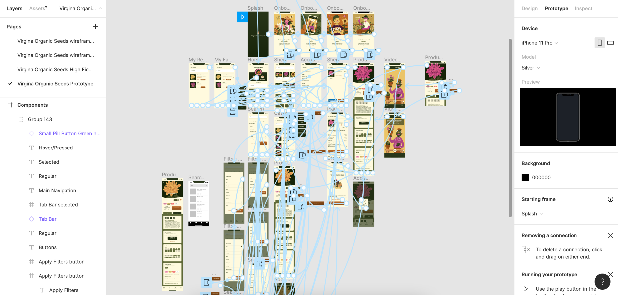
Prototype Demo
View the High Fidelity Prototype and click through yourself! Or watch the video below:
Project Overview
The Challenge:
Buying organic seeds is an outdated process. Consumers can go to a specialty store, use a catalog, or shop on poorly designed websites. Most people shop on their phones, but there are no seed catalog shopping apps.
The Goal:
Design an app for the Virginia Organic Seed Company that allows users to easily shop for seeds on a mobile device. The app should be visually appealing to gardeners and accessible to a variety of users.
My Role:
UX designer creating an app for the Virginia Organic Seed Company from concept to completion.
Responsibilities:
Branding, competitive analysis, user interviews, wireframing, usability studies, UI design, accessibility considerations, and prototyping.
Research
I conducted interviews to better understand the users I was designing for. I utilized both in person interviews and a survey, so I could reach more people. I identified a primary user group: Working adults who garden on evenings and weekends as a relaxing hobby, but lead busy lives and don’t have a lot of time to research and shop for seeds.
This user group confirmed some of my initial assumptions, but research also revealed other key considerations I had not thought of. Time and convenience not the only barrier to seed shopping. User pain points broke into two categories.
The first was gardening related: Seed quality, concern about plant performance, access to unique plants, price and shipping. The second was tech related: Some users were not used to shopping on apps and one found reading text blocks on a phone screen difficult. Other interesting feedback was that users really like to research seeds they plan on growing and compare for a period of time before purchasing.
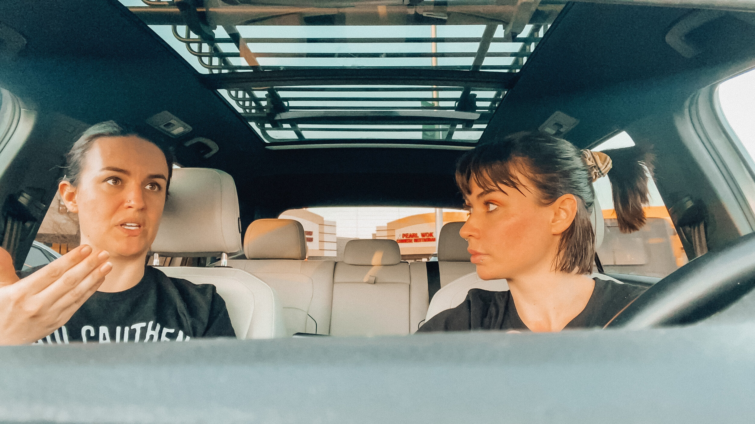
Interviews during COVID times were tough! My sister was in my pod, so we interviewed in the car for privacy.
Research Methods
-
Interviews
In person interviews allowed me to ask follow up questions and observe my user’s tone and affect. This was very valuable for understanding the frustrations they felt around seed shopping - but also the joy and excitement they felt about growing beautiful plants.
-
Survey
I created a survey with the same script I used during interviews. This allowed me to reach a broader range of subjects then I could with interviews only. Although the data was not as rich, I did get some interesting information - some users swap seeds instead of buying! A possible feature to consider.
-
Usability Studies
I asked users to give me feedback and interact with every level of the design - from paper wireframe sketches to different levels of prototype. Getting direct feedback was helpful for narrowing down features and layouts. This allowed me to spend my time wisely and design with users in mind.
Understanding the Data
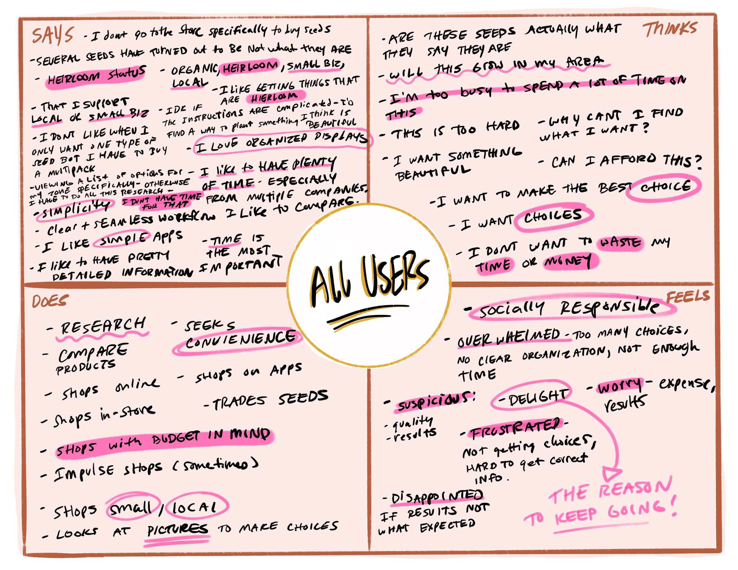
After conducting my interviews, I created written transcripts of each one. Using these and my survey data, I collected quotes and themes to create an empathy map of what my user said, though, felt, and did.
Using these direct data points, I created two user persona. The personas are amalgamations of all my users, and have unique pain points that reflect the most common themes from my research.
Personas
I put a lot of time into creating my personas. I wanted them to accurately reflect my users needs. I carefully considered what each persona would think when I planned the features and visual design of my app. This helped keep me on track and focused on solving real problems.
Next, I used the information from the personas and problem statements I created to build user journey maps. This helped me to get a solid understanding of the main features of the app, and the user flow.
Market Research
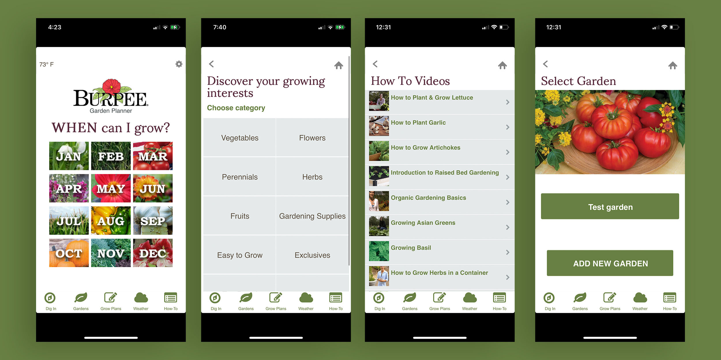
Before beginning my designs, I conducted a competitive analysis of similar companies. No companies had a direct competitor to the app I envisioned. This made direct analysis a little tricky. However, I found some adjacent companies to audit that gave me some useful information.
I prepared a competitive audit report with the strengths and weaknesses from each app I studied. Using this, I was able to zero in on specific features I wanted to include, as well as design errors I wanted to avoid. My main takeaway was that there was not a high bar of visual design, and there was no one serving my particular users in mobile app.
The Burpee Garden Planner app is not a shopping app. It links out to the Burpee website where users can purchase. The visual design is not very appealing. This is the only app offered by a seed company.
Storyboarding
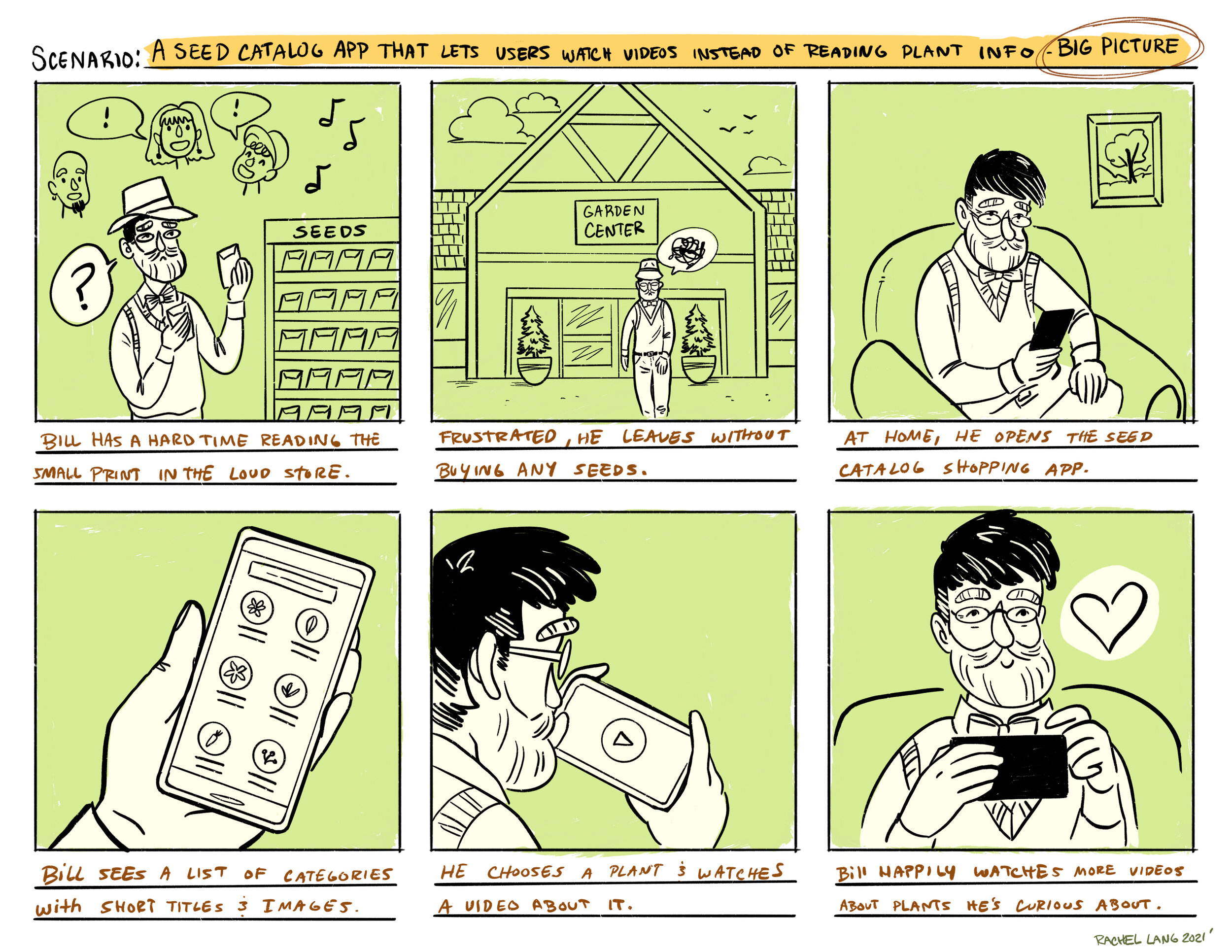
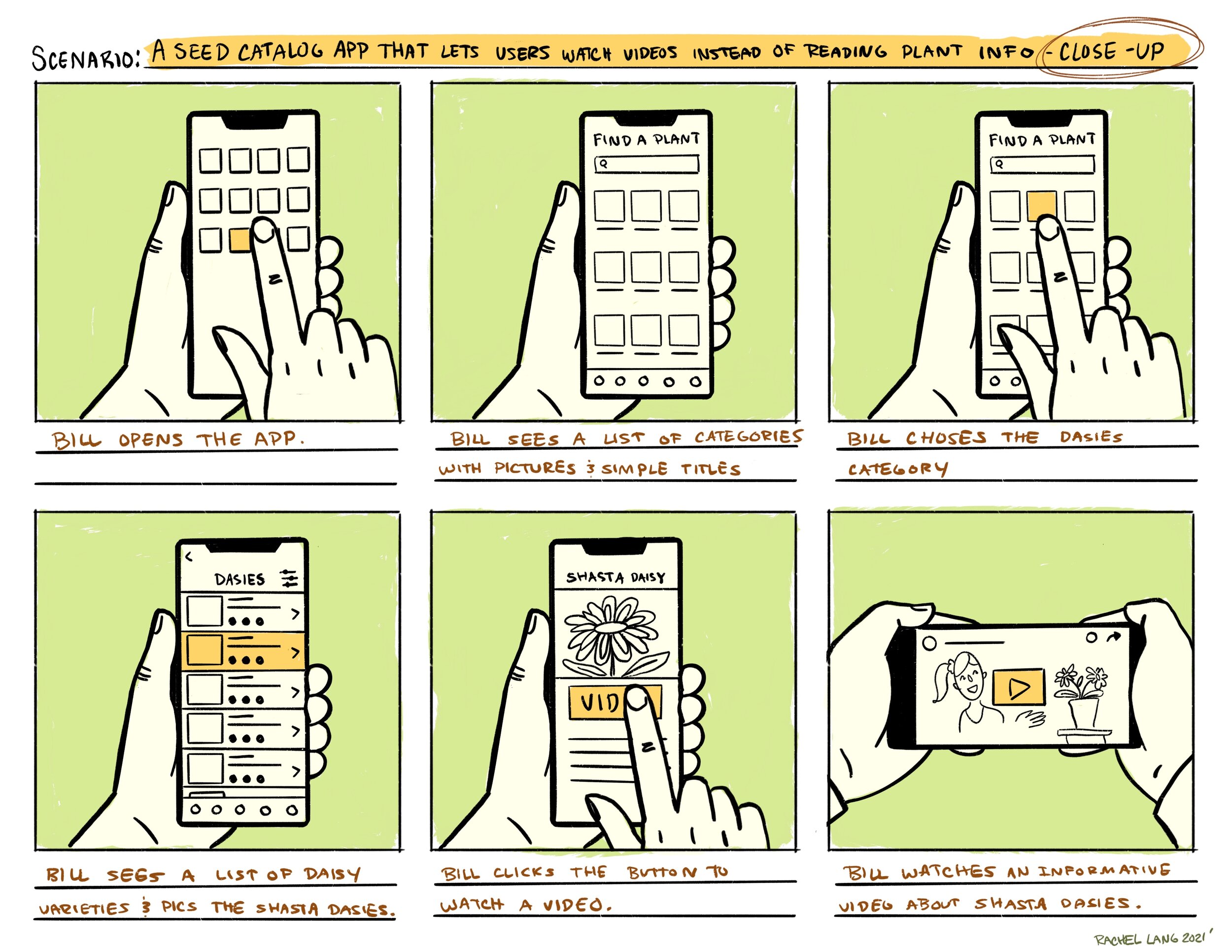
After doing all that fact finding, I created some storyboards to further explore a key feature I was interested in: video. I theorized that a video feature would be useful to users who had a hard time reading text blocks on phone screens - and also engaging for other users as well. Short form video is becoming increasingly popular and many users are very familiar with it. I envisioned users being able to watch a video about the plant information and details instead of reading a description.
Wireframes
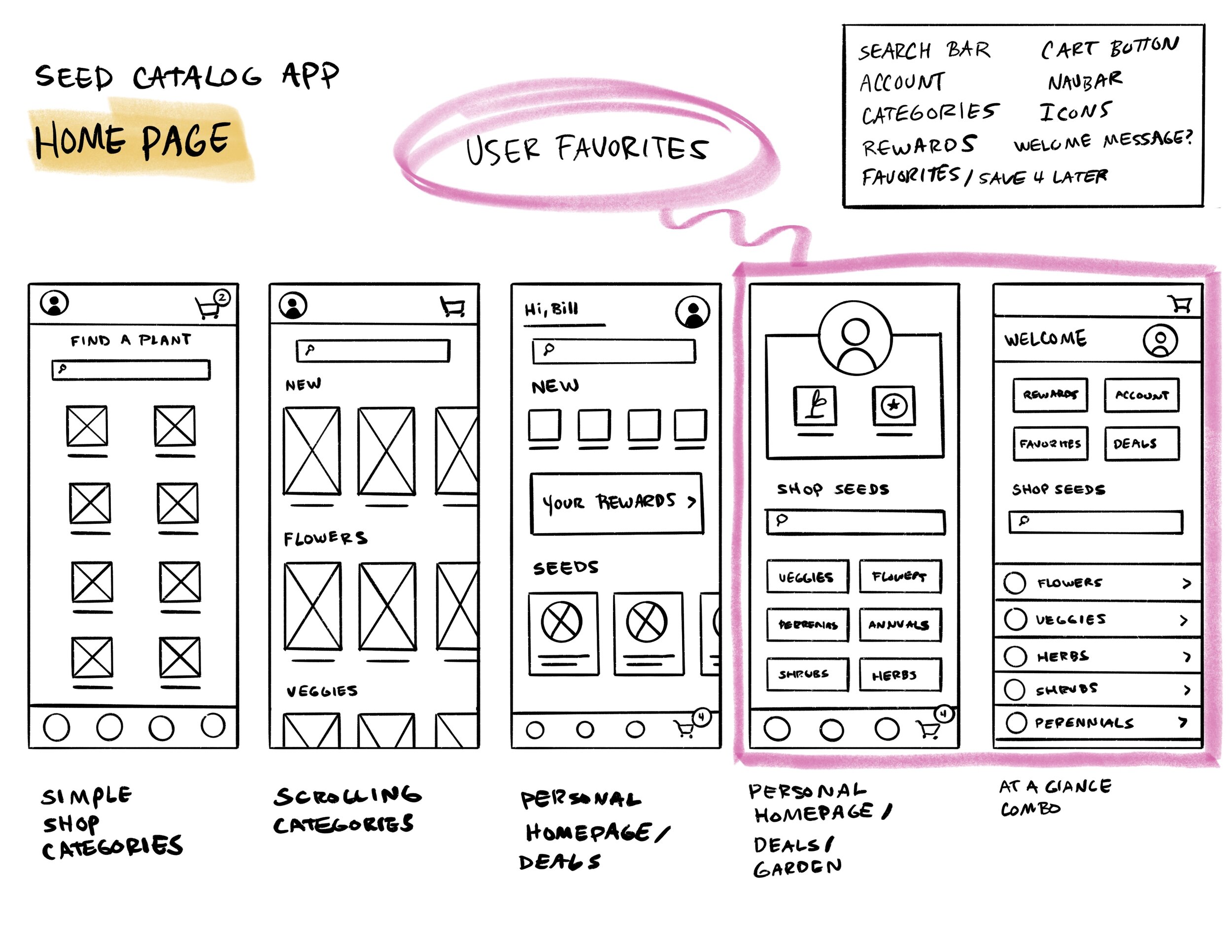
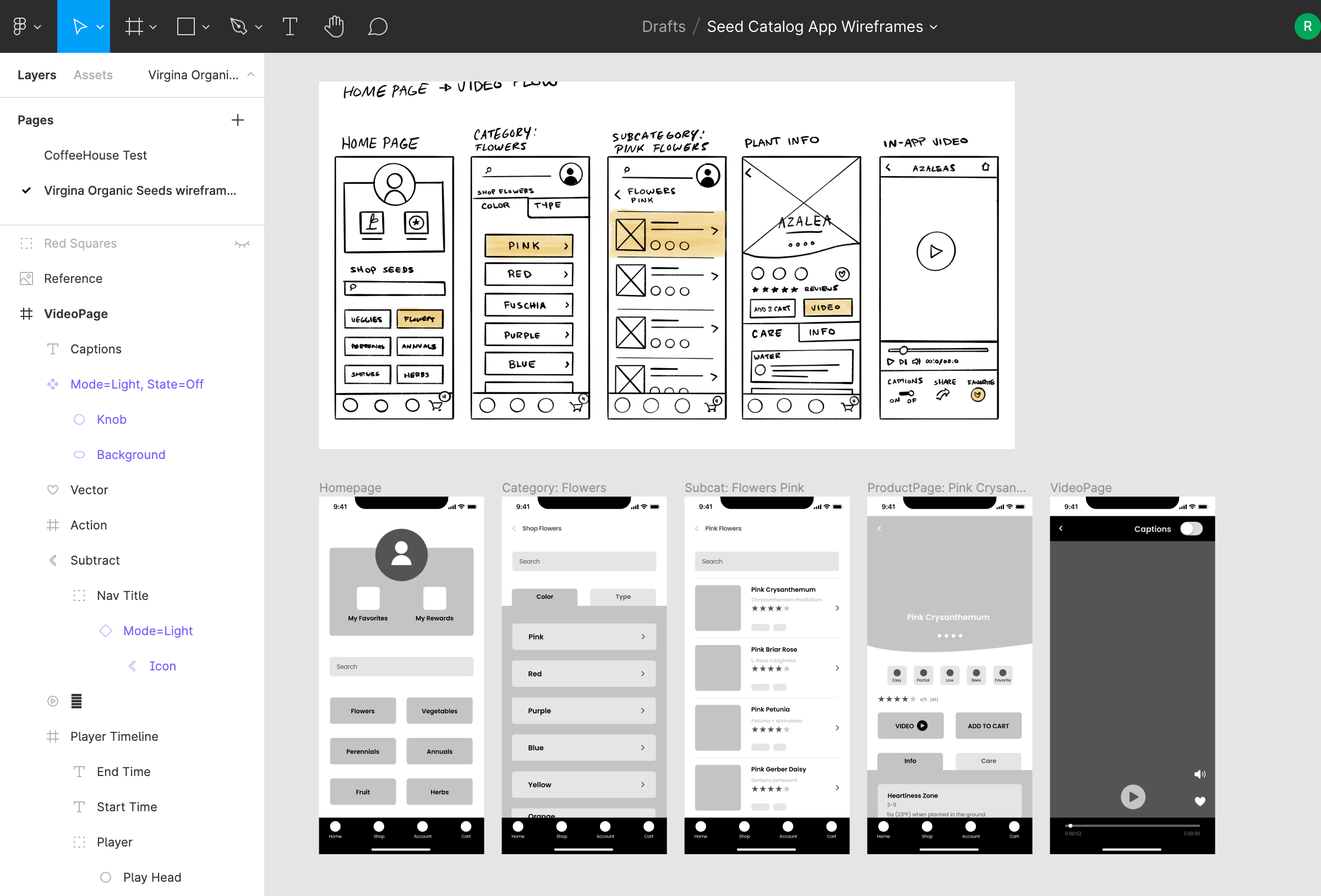
I created wireframe sketches to rough out my design ideas for the main screens. I asked users for feedback on the layout and features before moving into Figma to create lo-fi digital wireframes of the main screens.
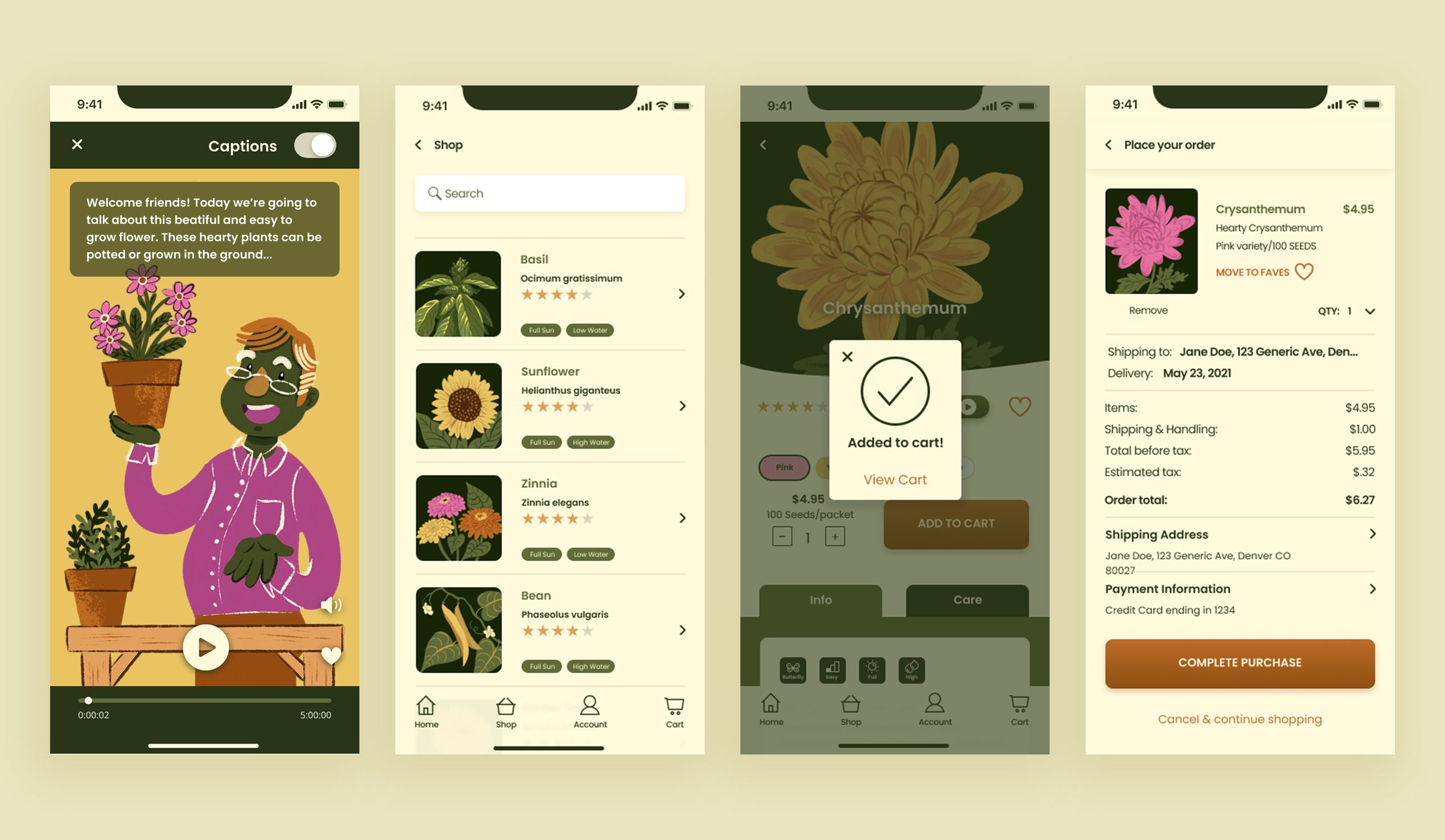
One key change I made was to have the video feature in portrait mode. I wanted these videos to be extremely simple and user friendly, without bells and whistles. That way a less sophisticated user wouldn’t have to rotate the phone to view or puzzle out complex video controls. Because of the adoption of portrait style video by most social media apps, I know that the format works for users. I pared down the controls to a play/pause button, an audio control, a saving/liking feature, and a large, visible caption toggle.
I create my wireframe sketches digitally in Procreate on my iPad. I prefer this to paper, as I can sketch and iterate more quickly. It’s also easier to share the designs, and they are neatly stored in one place and always available to me.
Low Fidelity Prototype
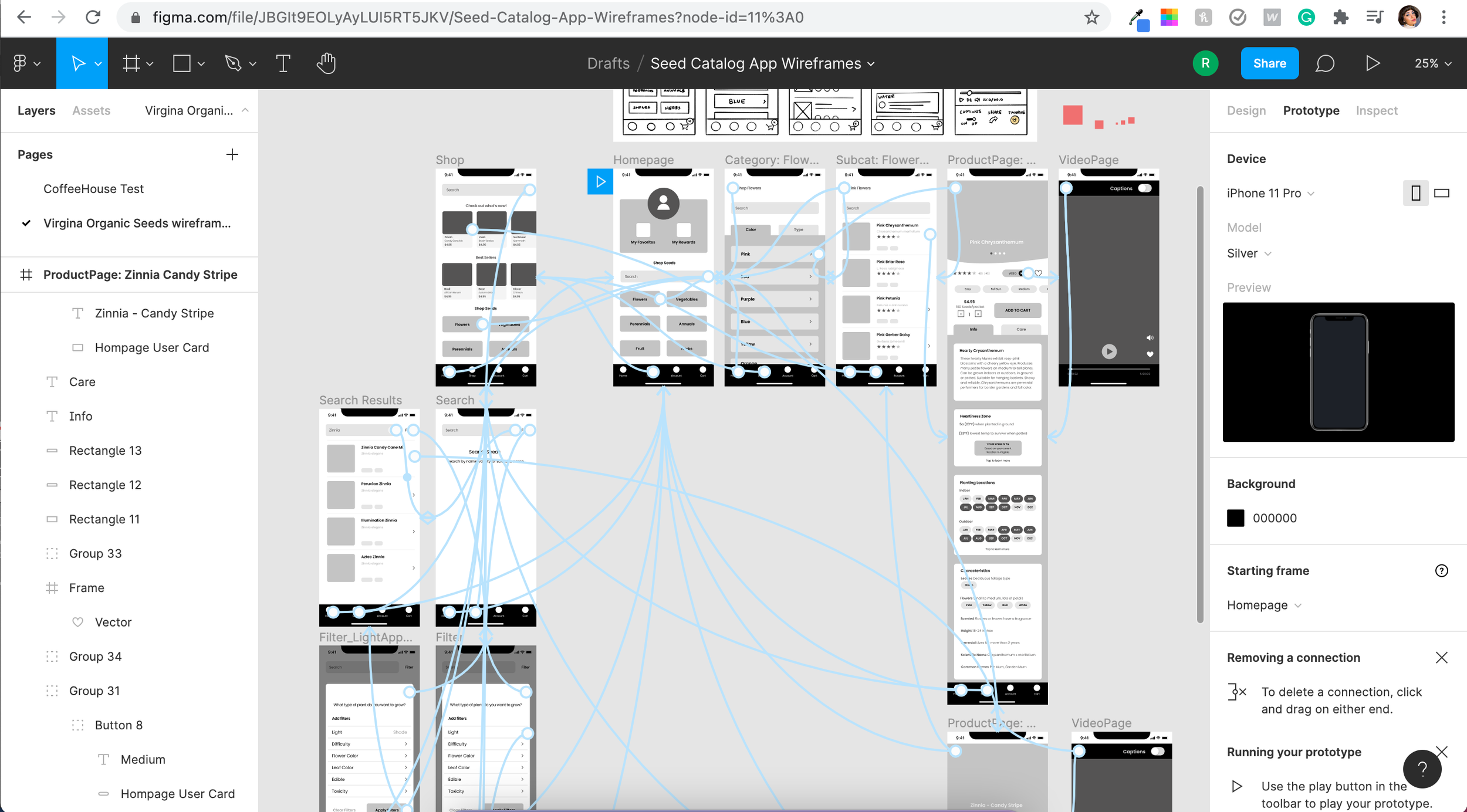
I built out a basic user flow for the search and shopping features in Figma with lo-fi designs. Then I created an interactive prototype to test before moving on to high fidelity designs.
View the Low Fidelity Prototype
Usability Study
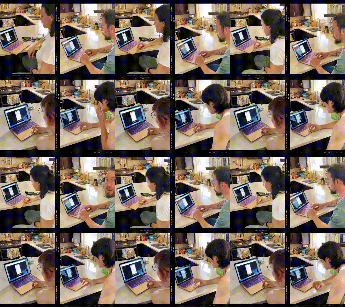
I conducted a moderated usability study with 5 participants ranging in age from 18-60. Users were asked to perform 4 tasks with the prototype, and give feedback.
Research goals were as follows:
If users could easily navigate the app to find seeds using the search and filter tools.
If users could find the plant information they need to make a purchase.
If users could complete the checkout process easily.
What users thought about the video feature.
Usability Study: Findings
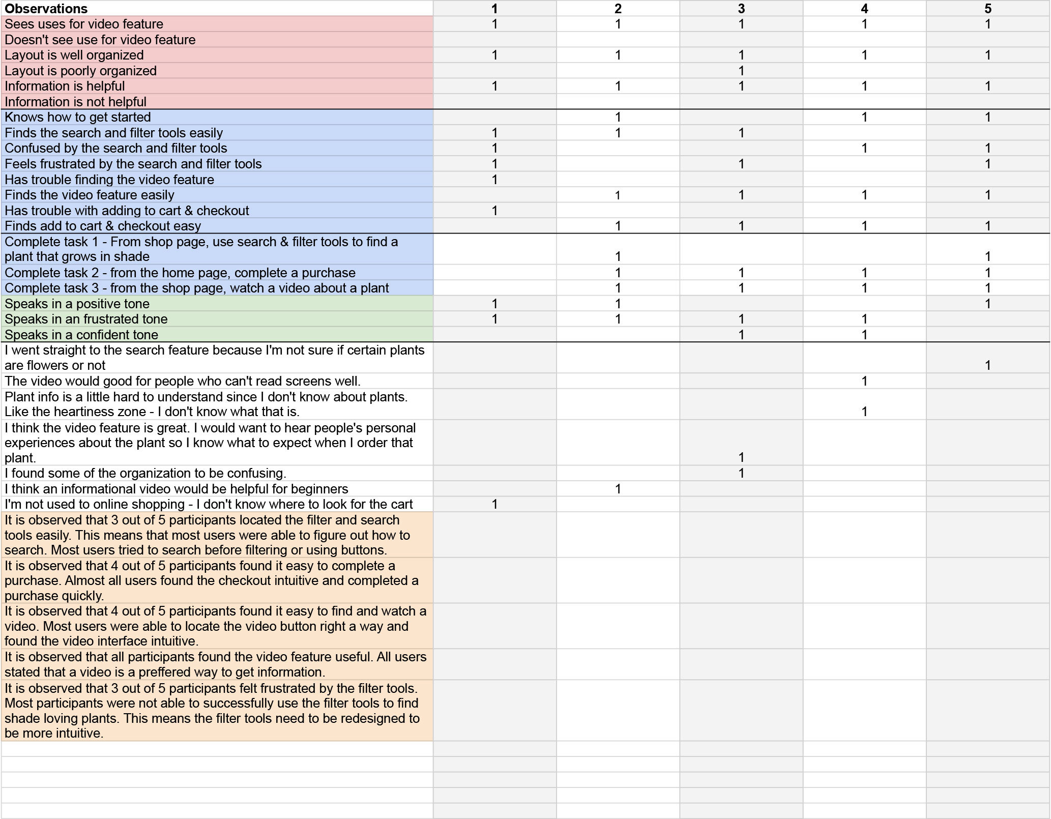
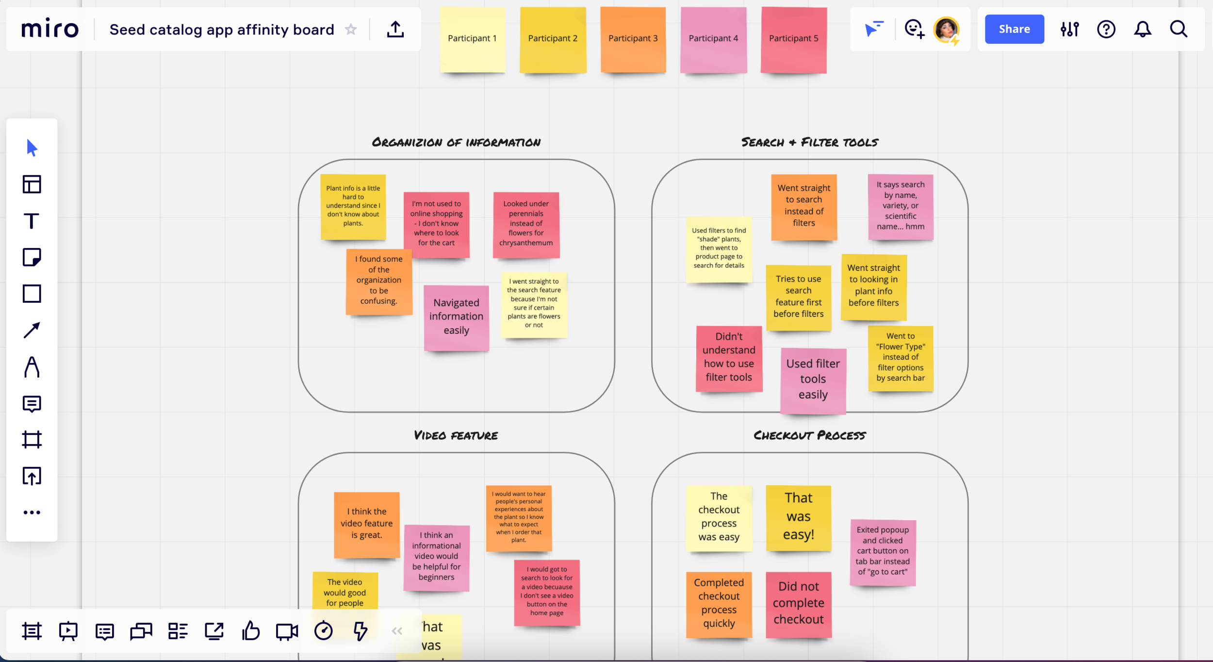
Synthesizing the data from the usability study with a detailed spreadsheet and affinity mapping helped find key insights to guide the next phase of design.
Key Insights
-
Search & Filter Tools
Most users tried to use the search bar instead of using filter or categories.
The search feature needs to be robust and account for plant names as well as plant details, colors, uses, etc.
The filter features were helpful to some users but need to be more intuitive.
Users tried to search for items under multiple categories. Categories need to be redundant if a plant is in multiple categories.
“I went straight to the search feature because I'm not sure if Chrysanthemums are flowers or not.”
-
Checkout Process
Most users completed the checkout process very quickly. One user who has never shopped on an app did not know where to find it.
Having an onboarding tutorial would help users who are not familiar with shopping apps find the features.
“I'm not used to online shopping - I don't know where to look for the cart.”
-
Video Feature
Most users found the video feature very useful, but one user could not locate it because it was not on the home page.
The video feature is regarded as useful. However, users had different ideas about what the videos should include. More testing is needed to determine the best use of video content.
An onboarding tutorial would help users know where features are located.
“I think the video feature is great. I would want to hear people's personal experiences about the plant so I know what to expect when I order that plant.”
Iteration
Using the feedback from the usability study, I modified my initial designs to update key features.
Search & Filter tools - Design # 1
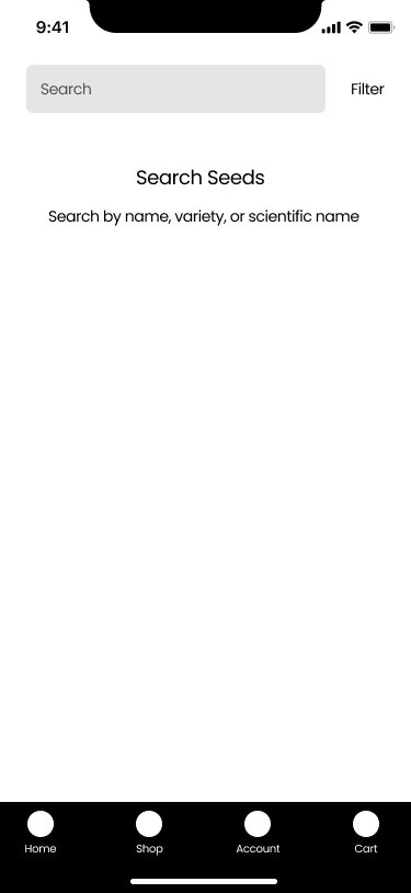
The initial design had the filter feature as a small button next to the search bar. Clicking it opens a separate modal window with filter options. User were confused by this layout.
Search & Filter tools - Design #2
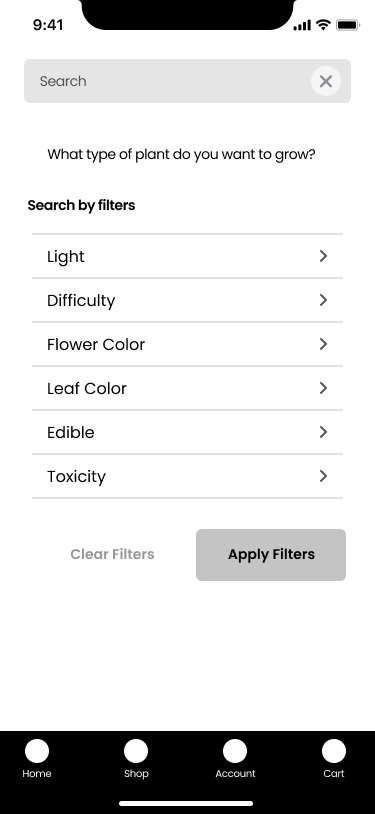
I updated the design to show the filter tools right on the search page. Users can type in a specific plant if they want, but the most common filters are available at a glance.
Category page - Design # 1
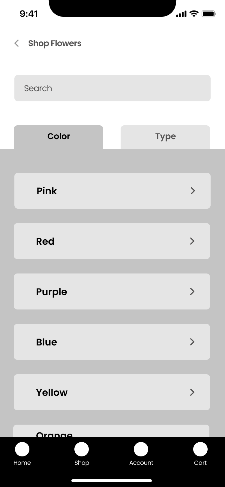
The initial design had large buttons for the category options. Users were confused by this, and thought they could only select by color.
Category page - Design #2
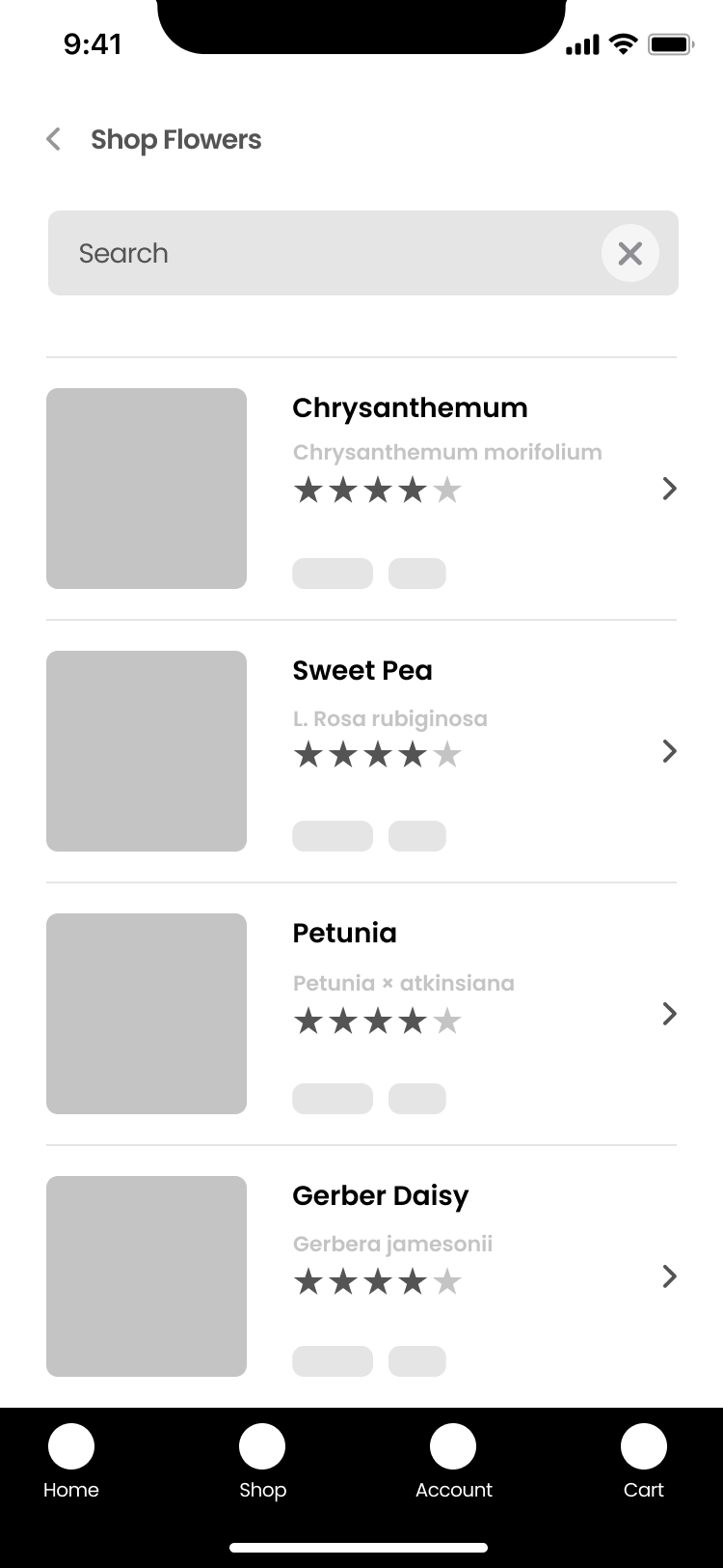
I changed the design to have a scrollable list with thumbnails, a title, and star review. Users can use the search and filter tools to refine.
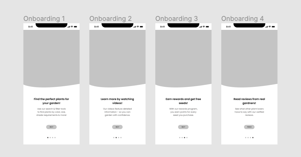
Onboarding
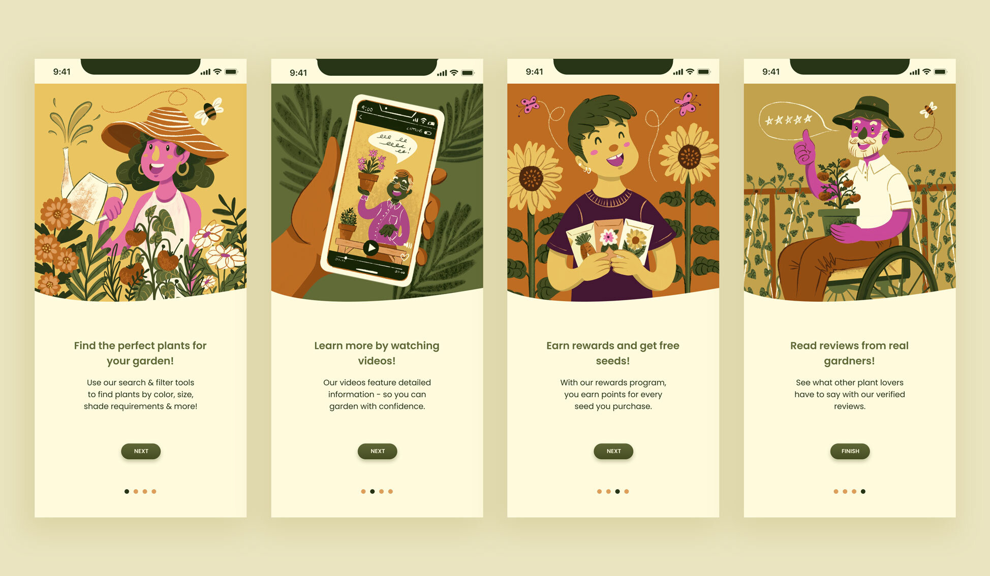
Since some users were confused about what they could do with the app, I made a short onboarding sequence to introduce key features.
High Fidelity Designs
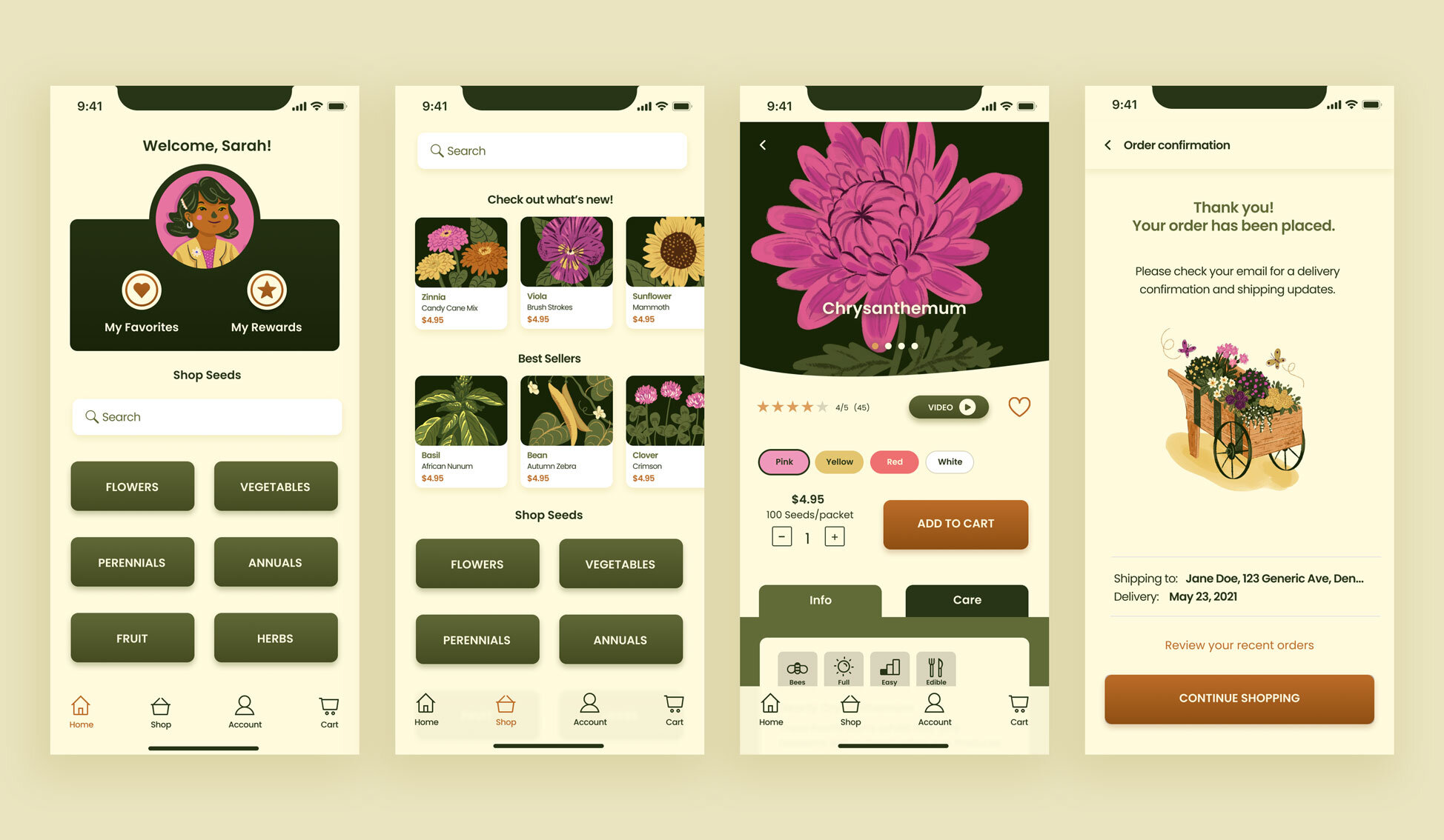
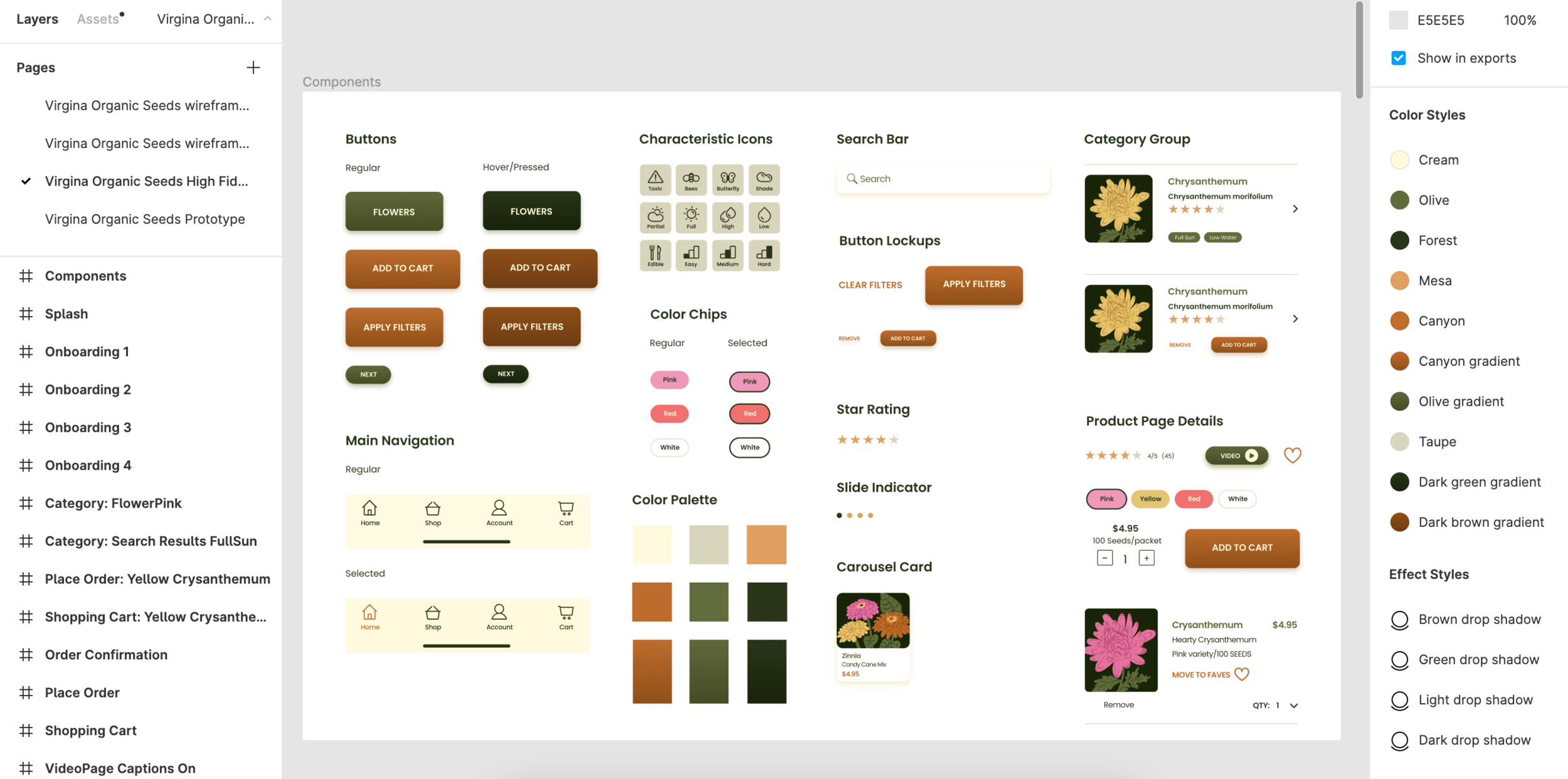
After updating the layouts and features based on feedback, I started creating the final look and feel of the app. During the lo-fi digital wireframe stage, I created the screens based an 8 point grid. I always create my early wireframes with the proper grid, spacing, font sizes etc. That way I’m working with correct information and I can simply apply style changes to create final designs.
Branding
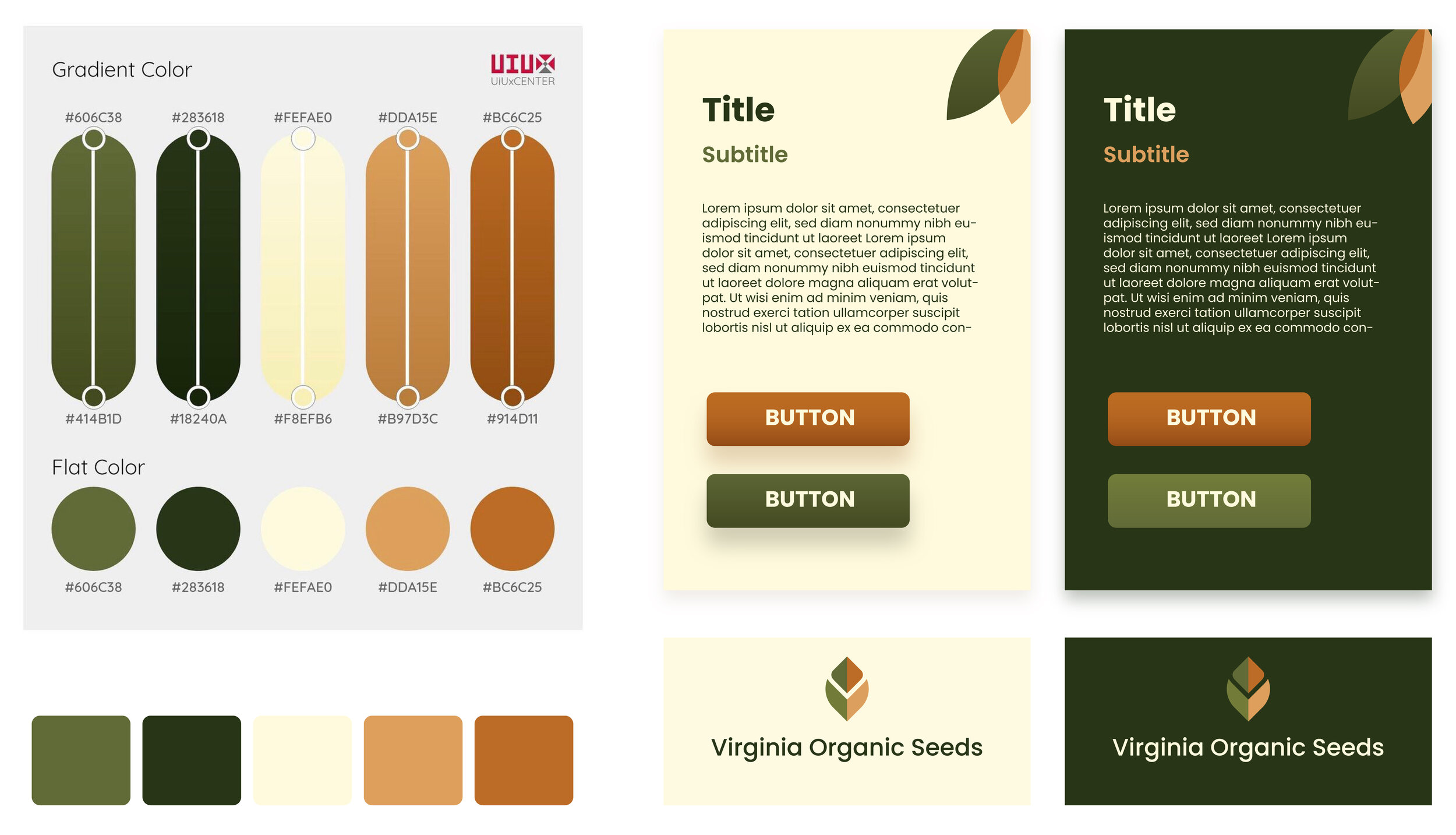
Since this is a fictional company, I created a simple brand guideline to work from before I started designing, to set the look and feel of the design.
I wanted this app to have a unique style. I chose a natural color palette that is both relaxing and dynamic. This beautiful scheme by @UIUXCenter was perfect. It is AAA standard compliant for accessibility.
Instead of relying on stock photos, I created my own whimsical illustrations for the onboarding screens and products.
Final Steps
After completing the final designs, I created a high-fidelity prototype and sent it to users along with a survey for final feedback. Users found the updated designs much easier to navigate. I made a few additional edits based on the feedback, such as making the characteristics icons much larger and a different color.
“As a gardener this is the kind of app I would use to find seeds. I like apps that are functional but also aesthetically pleasing. I want to feel delighted by my experience with an app and satisfied that I’ve found the best option for me and I feel this app checks both those boxes.”
